Quantcast
Channel: EViews
Viewing all 69 articles
Browse latest View live

Beveridge-Nelson Filter

$
0
0
Authors and guest post by Benjamin Wong (Monash University) and Davaajargal Luvsannyam (The Bank of Mongolia)

Analysis of macroeconomic time series often involves decomposing a series into a trend and cycle components. In this blog post, we describe the Kamber, Morley, and Wong (2018) Beveridge-Nelson (BN) filter and the associated EViews add-in.

Table of Contents

  1. Introduction
  2. The BN Decomposition
  3. The BN Filter
  4. Why Use the BN Filter
  5. BN Filter Implementation
  6. Conclusion
  7. Files
  8. References

Introduction

In this blog entry, we will discuss the Beveridge-Nelson (BN) filter - the Kamber, Morley, and Wong (2018) modification of the well-known Beveridge and Nelson (1981) decomposition. In particular, we will discuss the application of both procedures to estimating the output gap, which the US Bureau of Economic Analysis (BEA) and the Congressional Budget Office (CBO) define as the proportional deviation of the real actual gross domestic product (GDP) from the real potential GDP.

The analysis to follow will use quarterly data from the post World War II period 1947Q1 to 2019Q3 and will be downloaded from the FRED database. In this regard, we begin by creating a new quarterly workfile as follows:
  1. From the main EViews window, click on File/New/Workfile....
  2. Under Frequency select Quarterly.
  3. Set the Start date to 1947Q1 and the set the End date to 2019Q3
  4. Hit OK.
Next, we fetch the GDP data as follows:
  1. From the main EViews window, click on File/Open/Database....
  2. From the Database/File Type dropdown, select FRED Database.
  3. Hit OK.
  4. From the FRED database window, click on the Browse button.
  5. Next, click on All Series Search and in the Search for box,type GDPC1. (This is the real actual seasonally adjusted GDP)
  6. Drag the series over to the workfile to make it available for analysis.
  7. Again, in the Search for box, type GDPPOT. (This is the real potential seasonally unadjusted GDP estimated by the CBO)
  8. Drag the series over to the workfile to make it available for analysis.
  9. Close the FRED windows as they are no longer needed.


Figure 1a: FRED Browse
Figure 1b: FRED Search

Next, rename the series GDPC1 to GDP by issuing the following command:

rename gdpc1 gdp
We now show how to obtain the implied estimate of the output gap from the CBO to provide the user some perspective on how to obtain the output gap. In particular, the CBO implied estimate of the output gap is defined using the formula: $$ CBOGAP = 100\left(\frac{GDP - GDPPOT}{GDPPOT}\right) $$ For reference, we will create this series in EViews and call it CBOGAP. This is done by issuing the following command:

series cbogap = 100*(gdp-gdppot)/gdppot
We also plot CBOGAP below:

Figure 2: CBO implied estimate of the output gap

BN Decomposition

Recall here that for any time series $ y_{t} $, the BN decomposition determines a trend process $ \tau_{t} $ and a cycle process $ c_{t} $, such that $ y_{t} = \tau_{t} + c_{t} $. In this regard, the trend component $ \tau_{t} $ is the deviation of the long-horizon conditional forecast of $ y_{t} $ from its deterministic drift $ \mu $. In other words: $$ \tau_{t} = \lim_{h\rightarrow \infty} E_{t}\left(y_{t+h} - h\mu\right) \quad \text{where} \quad \mu = E(\Delta y_{t}) $$ On the other hand, the cyclical component is the deviation of the underlying process from its long-horizon forecast. Intuitively, when $ y_{t} $ represents the GDP of some economy, the cycle process $ c_{t} = y_{t} - \tau_{t}$ is interpreted as the output gap.

In practice, in order to capture the autocovariance structure of $ \Delta y_{t} $, the BN decomposition starts by first fitting an autoregressive moving-average (ARMA) model to $ \Delta(y) $ and then proceeds to derive $ \tau_{t} $ and $ c_{t} $. For instance, when the model of choice is AR(1), the BN decomposition derives from the following steps:

  1. Fit an AR(1) model to $ \Delta y_{t} $: $$ \Delta y_{t} = \widehat{\alpha} + \widehat{\phi}\Delta y_{t-1} + \widehat{\epsilon}_{t} $$
  2. Estimate the deterministic drift as the unconditional mean process: $$ \widehat{\mu} = \frac{\widehat{\alpha}}{1 - \widehat{\phi}} $$
  3. Estimate the BN trend process: $$ \widehat{\tau}_{t} = \left(y_{t} + \left(\frac{\widehat{\phi}}{1 - \widehat{\phi}}\right) \Delta y_{t}\right) - \left(\frac{\widehat{\phi}}{1 - \widehat{\phi}}\right) \widehat{\mu}$$
  4. Estimate the BN cycle component: $$ \widehat{c}_{t} = y_{t} - \widehat{\tau}_{t} $$

As an illustrative example, consider the BN decomposition of US quarterly real GDP. To conform with the Kamber, Morley, and Wong (2018) paper, we will also transform the raw US real GDP as 100 times its logarithm. In this regard, we generate a new EViews series object LOGGDP by issuing the following command:

series loggdp = 100 * log(gdp)
At last, following the 4 steps outlined earlier, we derive the BN decomposition in EViews as follows:

series dy = d(loggdp)
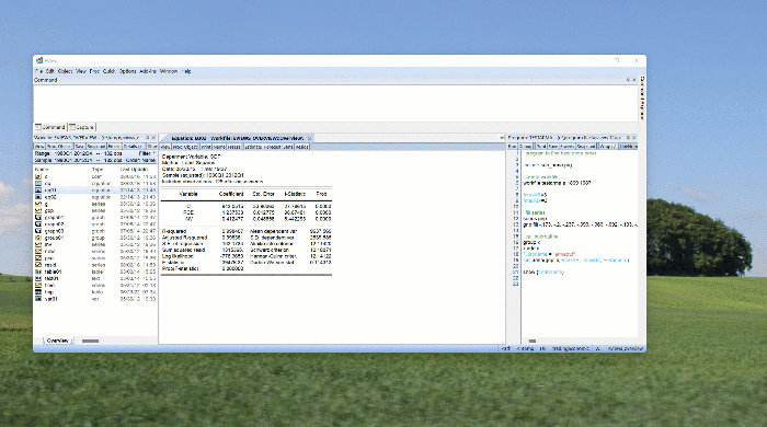
equation ar1.ls dy c dy(-1) 'Step 1
scalar mu = c(1)/(1-c(2)) 'Step 2
series bntrend = loggdp + (dy - mu)*c(2)/(1 - c(2)) 'Step 3
series bncycle = loggdp - bntrend 'Step 4
The BN trend and cycle series are displayed in Figure 2 below.


Figure 3a: BN Trend
Figure 3b: BN Cycle

To see how the BN decomposition estimate of the output gap compares to the CBO implied estimate of the output gap, we plot both series on the same graph.


Figure 4: BN Cycle vs CBO implied output gap estimate

Evidently, the BN cycle series lacks persistence (very noisy), lacks amplitude (low variance), and in general, does not exhibit the characteristics found in the CBO implied estimate of the output gap, CBOGAP.

The BN Filter

First, to explain why the BN estimate of output gap lacks the persistence of its true counterpart, recall the formula for the BN cycle component for an AR(1) model: $$ c_{t} = y_{t} - \tau_{t} = -\frac{\phi}{1-\phi}(\Delta y_{t} - \mu)$$ Clearly, when $ \phi $ is small, $ \Delta y_{t} $ is not very persistent. Since $ c_{t} $ is only as persistent as $ \Delta y_{t} $, the cycle component itself lacks the persistence one expects of the true output gap series.

Next, to explain why $ c_{t} $ lacks the expected amplitude, define the signal-to-noise ratio $ \delta $ for any time series as the ratio of the variance of trend shocks relative to the overall forecast error variance. In other words: $$ \delta \equiv \frac{\sigma^{2}_{\Delta \tau}}{\sigma^{2}_{\epsilon}} = \psi(1)^{2} $$ which follows since $ \Delta\tau = \psi(1)\epsilon_{t} $ and $ \psi(1) = \lim_{h\rightarrow \infty} \frac{\partial y_{t+h}}{\partial \epsilon_{t}} $. Intuitively, $ \psi(1) $ is the long-run multiplier that captures the permanent effect of the forecast error on the long-horizon conditional expectation of $ y_{t} $. Quite generally, as demonstrated in Kamber, Morley, and Wong (2018), for any AR(p) model: \begin{align} \Delta y_{t} = c + \sum_{k=1}^{p}\phi_{k}\Delta y_{t-k} + \epsilon_{t} \label{eq1} \end{align} the signal-to-noise ratio is given by the relation \begin{align} \delta = \frac{1}{(1-\phi(1))^{2}} \quad \text{where} \quad \phi(1) = \phi_{1} + \ldots + \phi_{p}\label{eq2} \end{align} In particular, when the forecasting model is AR(1), as was the case in the BN decomposition above, the signal-to-noise ratio is simply $ \delta = \frac{1}{(1-\phi)^{2}} $ and in the case of the US GDP growth process, it is $ \delta = \frac{1}{(1-0.36)^{2}} = 2.44$. In other words, the BN trend shocks exhibit higher volatility than quarter-to-quarter forecast errors and the signal-to-noise ratio is therefore relatively high. In fact, in the case of a stationary AR(1) model, the condition $ |\phi| < 1 $ implies that $ \delta> 0.25 $. In other words, trend shocks must explain at least 25% of the quarterly forecast error variance - evidently a strong assumption if one expects the cycle shocks (the output gap amplitude) to explain the majority of the systematic forecast variance.

To correct for the aforementioned shortcomings of the BN decomposition, Kamber, Morley, and Wong (2018) exploit the relationship between the signal-to-noise ratio and the AR coefficients in equation \eqref{eq2}. In particular, they note that equation \eqref{eq2} implies that: \begin{align} \phi(1) = 1 - \frac{1}{\sqrt{\delta}} \end{align} In this regard, the idea underlying the BN filter is to fix a specific value to the signal-to-noise ratio, say $ \delta = \bar{\delta} $. Subsequently, the BN decomposition is derived from an AR model, the AR coefficients of which are forced to sum to $ \bar{\phi}(1) \equiv 1 - \frac{1}{\sqrt{\bar{\delta}}} $. In other words, the BN decomposition is derived while imposing a particular signal-to-noise ratio.

It is important to note here that estimation of the BN decomposition under a particular signal-to-noise ratio restriction is in fact straightforward and does not require complicated non-linear routines. To see this, observe that equation \eqref{eq1} can be rewritten as: \begin{align} \Delta y_{t} = c + \rho \Delta y_{t-1} + \sum_{k=1}^{p-1}\phi^{\star}_{k}\Delta^{2} y_{t-k} + \epsilon_{t} \label{eq3} \end{align} where $ \rho = \phi_{1} + \ldots + \phi_{p} $ and $ \phi^{\star}_{k} = -\left(\phi_{k+1} + \ldots + \phi_{p}\right) $. Then, imposing the restriction $ \rho = \bar{\rho} \equiv \bar{\phi}(1) $ reduces the regresion in \eqref{eq3} to: \begin{align} \Delta y_{t} - \bar{\rho} \Delta y_{t-1} = c + \sum_{k=1}^{p-1}\phi^{\star}_{k}\Delta^{2} y_{t-k} + \epsilon_{t} \label{eq4} \end{align} In other words, $ \bar{\rho}\Delta y_{t-1} $ is brought to the left hand side and the regressand in the regression \eqref{eq4} becomes $ \Delta \bar{y}_{t} \equiv \Delta y_{t} - \bar{\rho} \Delta y_{t-1} $.

Why Use the BN Filter?

Before we demonstrate the BN Filter add-in, we quickly outline two reasons why the BN filter might be a reasonable approach, particularly when estimating the output gap.
  1. When analyzing GDP growth, standard ARMA model selection often favours low order AR variants, which, as discussed earlier, produce high signal-to-noise ratios.
  2. Unlike alternative low signal-to-noise ratio procedures such as deterministic quadratic detrending, the Hodrick-Prescott (HP) filter, and the bandpass (BP) filter, which often require large number of estimation revisions (as new data comes in) and are typically unreliable in out-of-sample forecasts (see Orphanides and Van Norden, (2003)), Kamber, Morley and Wong (2018) argue that the BN filter exhibits better out-of-sample performance and generally requires fewer estimation revisions to match observable data characteristics.

To further drive this latter point, we demonstrate the impact of ex-post estimation of the output gap using the HP filter. In particular, we will first estimate the output gap (the cycle component) of the LOGGDP series for the period 1947Q1 to 2008Q3 and call it HPCYCLE, and then again for the period 1947Q1 to 2019Q3 and call it HPCYLCE_EXPOST.

To estimate the HP filter cycle component for the period 1947Q1 to 2008Q3, we first set the sample accordingly by issuing the command:

smpl @first 2008Q3
Next, we estimate the HP filter cycle series as follows:
  1. From the workfile, double click on the series LOGGDP to open the series.
  2. In the series window, click on Proc/Hodrick-Prescott Filter...
  3. In the Cylce series text box, type hpcycle.
  4. Hit OK.

Figure 5: HP Filter

The steps are repeated for the sample period 1947Q1 to 2019Q3. A plot of both cycle series on the same graph is presented below.


Figure 6: HP Cycle vs HP Cycle Ex Post

Evidently, the ex-post HP filter estimation of the output gap diverges from its shorter period counterpart starting from 2006Q1. It is precisely this drawback that we will see is not nearly as pronounced in BN filter estimates.

BN Filter Implementation

To implement the BN Filter, we need to download and install the add-in from the EViews website. The latter can be found at https://www.eviews.com/Addins/BNFilter.aipz. We can also do this from inside EViews itself:
  1. From the main EViews window, click on Add-ins/Download Add-ins...
  2. Click on the the BNFilter add-in.
  3. Click on Install.

Figure 5: Install Add-in

At last, we will demonstrate how to apply the BN Filter add-in using an AR(12) model. To do so, proceed as follows:
  1. From the workfile window, double click on LOGGDP to open the spreadsheet view of the series.
  2. To access the BN filter dialog, click on Proc/Add-ins/BN Filter
  3. Stick with the defaults and hit OK.


Figure 6: BN Filter Dialog

The signal-to-noise ratio, while not specified above, is chosen using the Kamber, Morley, and Wong (2018) automatic selection procedure which balances the trade off between fit and amplitude. Typically, the signal-to-noise ratio for the US using such a procedure is about 0.25, which implies a quarter of the shocks to US GDP are permanent. Below, we show the BN Filter cycle series both alone and in comparison to the CBO implied estimate of the output gap CBOGAP.


Figure 7a: BN Filter Cycle
Figure 7b: BN Filter Cycle vs CBO implied output gap estimate

As we can see, the BN filter estimate of the the US output gap using an AR(12) model resembles what we would get for an output gap that has a low signal-to-noise ratio. The amplitude is reasonably large, we see business cycles, and the troughs line up with the recessions dated by the NBER.

The BN filter add-in also accommodates the ability to incorporate knowledge about structural breaks. In particular, we will use 2006Q1 as a structural break which is consistent with the date found by a Bai and Perron (2003) test, used by Kamber, Morley and Wong (2018), and is consistent with independent work by Eo and Morley (2019). The following steps demonstrate the outcome:
  1. From the workfile window, double click on LOGGDP to open the spreadsheet view of the series.
  2. To access the BN filter dialog, click on Proc/Add-ins/BN Filter
  3. Select the Structural Break box.
  4. In the Date of structural break text box, enter 2006Q1.
  5. Hit OK.


Figure 8: BN Filter Cycle (Structural Break)

Now we see a more positive output gap post-2006 as the structural break accounts for the fact that the average GDP growth rate has fallen.

Suppose however that we were ignorant about the actual date of the break. This might be the case in practice as it could take a decade or more before one could empirically identify a structural break date. In this case, a possible option is to use a rolling window for the average growth rate. In this example, we use a backward window of 40 quarters as the average growth rate. The idea is that if there were breaks, they would be reflected in this window. When this is the case, we proceed as follows:
  1. From the workfile window, double click on LOGGDP to open the spreadsheet view of the series.
  2. To access the BN filter dialog, click on Proc/Add-ins/BN Filter
  3. Select the Dynamic mean adjustment box.
  4. Hit OK.


Figure 9a: BN Filter Cycle (Dynamic Mean Adjustment)
Figure 9a: BN Filter Cycle (Known vs Unknown Structural Break)

Evidently, the estimated output gap looks similar to the one estimated with an explicit structural break in 2006Q1. In general, this suggests that using a backward window to adjust for the mean growth rate might be a useful real-time strategy for dealing with breaks.

Finally, we come back to the issue of revision. As we mentioned earlier, the BN filter should produce output gaps that are less revised as long as the AR forecasting model is stable, especially when compared to the heavily revised HP Filter. Here, we show the output gap estimated using the BN filter with data up to 2008Q3, and one ex-post up to 2019Q3. Clearly, the output gap is hardly revised, which address a key critique of Orphanides and Van Norden (2003).


Figure 10: BN Filter Cycle (Ex-Post)

Conclusion

In this blog post we have outlined the BN filter add-in associated with the work of Kamber, Morley and Wong (2018). In general, we hope the ease of using the add-in, together with some of the useful properties of the BN Filter will encourage practitioners to explore using the procedure in their work.


Files


References

  1. Bai J. and Perron P.: Computation and analysis of multiple structural change models Journal of Applied Econometrics, 18(1) 1–22, 2003.
  2. Beveridge S. and Nelson C. R.: A new approach to decomposition of economic time series into permanent and transitory components with particular attention to measurement of the business cycle Journal of Monetary Economics, 7(2) 151–174, 1981.
  3. Eo Y. and Morley J.: Why has the US economy stagnated since the Great Recession University of Sydeny Working Papers 2017-14, 2019.
  4. Kamber G., Morley J., and Wong B.: Intuitive and reliable estimates of the output gap from a Beveridge-Nelson filter The Review of Economics and Statistics, 100(3) 550–566, 2018.
  5. Orphanides A and Van Norden S.: The unreliability of output-gap estimates in real time The Review of Economics and Statistics, 84(4) 569–583, 2002.
  6. Watson M.: Univariate detrending methods with stochastic trends Journal of Monetary Economics, 18(1) 49–75, 1986.

Mapping COVID-19

$
0
0
With the world currently experiencing the Covid-19 crisis, many of our users are working remotely (aside: for details on how to use EViews at home, visit our Covid licensing page) anxious to follow data on how the virus is spreading across parts of the world. There are many sources of information on Covid-19, and we thought we’d demonstrate how to fetch some of these sources directly into EViews, and then display some graphics of the data.

Table of Contents

  1. Johns Hopkins Data
  2. European Centre for Disease Prevention and Control Data
  3. New York Times US County Data
  4. Sneak Peaks

Johns Hopkins Data

To begin we'll retrieve data from the Covid-19 Time Series collection from Johns Hopkins Whiting School of Engineering Center for Systems Science and Engineering. These data are organized into three csv files, one containing confirmed cases, on containing deaths, and one recoveries at both country and state/province levels. Each file is organized such that the first column contains state/province name (where applicable), the second column the country name, the third and fourth contain average latitude and longitude, and then the remaining columns containing daily values.

There are a number of different approaches that could be used to import these data into an EViews workfile. We’ll demonstrate an approach that will stack the data into a single panel workfile. We’ll start with importing the confirmed cases data. EViews is able to directly open CSV files over the web using the File->Open->Foreign Data as Workfile menu item:


Figure 1: JH open path

Which results in the following workfile:


Figure 2: JH workfile

Each day of data has been imported into its own series, with the name of the series being the date. There are also series containing the country/region name and the province/state name, as well as latitude and longitude.

To create a panel, we’ll want to stack these date series into a single series, which we can do simply with the Proc->Reshape Current Page->Stack in New Page…


Figure 3: JH stack data dialog

Since all of the series we wish to stack have a similar naming structure – they all start with an “_” we can instruct EViews to stack using “_?” as the identifier, where ? is a wildcard. This results in the following stacked workfile page:


Figure 4: JH stack data workfile

Which is close to what we want, we simply need to tidy up some of the variable names, and instruct EViews to structure the page as a true panel. The date information has been imported into the alpha series VAR01, which we can convert into a true date series with:


series date = @dateval(var01, "MM_DD_YYYY")
The actual cases data is stored in the series currently named "_", which we can rename to something more meaningful with:


rename _ cases
And then finally we can structure the page as a panel by clicking on Proc->Structure/Resize current page, selecting Dated Panel as the structure type and filling in the date and filling in the cross-section and date information:


Figure 5: JH workfile restructure

When asked if we wish to remove blank values, we select no. We now have a 3-dimensional panel, with two sets of cross-sectional identifiers – one for province/state and the other for country:


Figure 6: JH 3D Panel

If we want to sum up the state level data to create a traditional 2D panel with just country and time, we can do so by creating a new panel page based upon the indices of this page. Click on the New Page tab at the bottom of the workfile and select Specify by Identifier Series. In the resulting dialog we enter the country series as the cross-section identifier we wish to keep:


Figure 6: JH page by ID

Which results in a 2D panel. We can then copy the cases series from our 3D panel page to the new 2D panel page with standard copy and paste, but ensuring to change the Contraction method to Sum in the Paste Special dialog:


Figure 7: JH paste dialog


Figure 8: JH panel workfile

With the data in a standard panel workfile, all of the standard EViews tools are now available. We can view a graph of the cases by country by opening the cases series, clicking on View->Graph, and then selecting Individual cross sections as the Panel option.


Figure 9: JH graph of all cross-sections

This graph may be a little unwieldy, so we can reduce the number of cross-sections down to, say, only countries that have, thus far, experienced more than 10,000 cases by using the smpl command:


smpl if @maxsby(cases, country_region)>10000

Figure 9: JH cross-sections with more than 10000 cases

Of course, all of this could have been done in an EViews program, and it could be automated to combine all three data files, ending up with a panel containing cases, deaths and recoveries. The following EViews code produces such a panel:


'close all existing workfiles
close @wf

'names of the three topics/files
%topics = "confirmed deaths recovered"

'loop through the topics
for %topic {%topics}
'build the url by taking the base url and then adding the topic in the middle
%url = "https://raw.githubusercontent.com/CSSEGISandData/COVID-19/master/csse_covid_19_data/csse_covid_19_time_series/time_series_covid19_" + %topic + "_global.csv"

'load up the url as a new page
pageload(page=temp) {%url}

'stack the page into a 3d panel
pagestack(page=stack_{%topic}) _? @ *? *

'do some renaming and make the date series
rename country_region country
rename province_state province
rename _ {%topic}

series date = @dateval(var01, "MM_DD_YYYY")

'structure the page
pagestruct province country @date(date)

'delete the original page
pagedelete temp

'create the 2D panel page
pagecreate(id, page=panel) country @date @srcpage stack_{%topic}
next

'loop through the topics copying each from the 3D panel into the 2D panel
for %topic {%topics}
copy(c=sum) stack_{%topic}\{%topic} * @src @date country @dest @date country
pagedelete stack_{%topic}
next

European Centre for Disease Prevention and Control Data

The second repository we'll use is data provided by the ECDC's Covid-19 Data site. They provide an extremely easy to use data for each country, along with population data. Importing these data into EViews is trivial – you can open the XLSX file directly using the File->Open-Foreign Data as Workfile dialog and entering the URL to the XLSX in the File name box:


Figure 10: ECDC open path

The resulting workfile will look like this:


Figure 11: ECDC workfile

All we need to do is structure it as a panel, which we can do by clicking on Proc->Structure/Resize Current Page and then entering the cross-section and date identifiers (we also choose to keep an unbalanced panel by unchecking the Balance between starts & ends box).


Figure 12: ECDC strcture WF dialog

The result is an EViews panel workfile:


Figure 13: ECDC series

The data provided by ECDC contains the number of new cases and deaths each day. Most presentation of Covid-19 data has been with the total number of cases and deaths per country. We can create the totals with the @cumsum function which will produce the cumulative sum, resetting to zero as the start of each cross-section.


series ccases = @cumsum(cases)
series cdeaths = @cumsum(deaths)
With this panel we can perform standard panel data analysis, or produce graphs (see the Johns Hopkins examples above). However, since the ECDC have included standard ISO country codes for the countries, we can also tie the data to a geomap.

We found a simple shapefile of the world online, and downloaded it to our computer. In EViews we then click on Object->New Object->GeoMap to create a new geomap, and then drag the .prj file we downloaded onto the geomap.

In the properties box that appears, we tie the countries defined in the shapefile to the identifiers in the workfile. Since the shapefile uses ISO codes, and we have those in the countriesandterritories series, we can use those to map the workfile to the shapefile:


Figure 14: Geomap properties

Which results in the following global geomap:


Figure 15: Global geomap

We can use the Label: dropdown to remove the country labels to give a clearer view of the map (note this feature is a recent addition, you may need to update your copy of EViews to see the None option).

To add some color information to the map we click on Properties and then the Color tab. We'll add two custom color settings – a gradient fill so show differences in the number of cases, and a single solid color for countries with a large number of cases:


Figure 3a: ECDC geomap color range
Figure 3b: ECDC geomap color threshold

And then entering ccases as the coloring series. This results in a map:


Figure 17: ECDC geomap

Again, this could all be done programmatically with the following program (note the ranges for coloring will need to be changed as the virus becomes more wide spread):


'download data
wfopen https://www.ecdc.europa.eu/sites/default/files/documents/COVID-19-geographic-disbtribution-worldwide.xlsx
rename countryterritorycode iso3
pagecontract if iso3<>""
pagestruct(bal=m) iso3 @date(daterep)

'make cumulative data
series ccases = @cumsum(cases)
series cdeaths = @cumsum(deaths)

'make geomap for cases
geomap cases_map
cases_map.load ".\World Map\TM_WORLD_BORDERS_SIMPL-0.3.prj"
cases_map.link iso3 iso3
cases_map.options -legend
cases_map.setlabel none
cases_map.setfillcolor(t=custom) mapser(ccases) naclr(@RGB(255,255,255)) range(lim(0,12000,cboth), rangeclr(@grad(@RGB(255,255,255),@RGB(0,0,255))), outclr(@trans,@trans), name("Range")) thresh(12000, below(@trans), above(@RGB(0,0,255)), name("Threshold"))

'make geomaps for deaths
geomap deaths_map
deaths_map.load ".\World Map\TM_WORLD_BORDERS_SIMPL-0.3.prj"
deaths_map.link iso3 iso3
deaths_map.options -legend
deaths_map.setlabel none
deaths_map.setfillcolor(t=custom) mapser(cdeaths) naclr(@RGB(255,255,255)) range(lim(1,500,cboth), rangeclr(@grad(@RGB(255,128,128),@RGB(128,64,64))), outclr(@trans,@trans), name("Range")) thresh(500,cleft,below(@trans),above(@RGB(128,0,0)),name("Threshold"))

New York Times US County Data

The final data repository we will look at is the New York Times data for the United States at county level. These data are also trivial to import into EViews, you can again just enter the URL for the CSV file to open it. Rather than walking through the UI steps, we'll simply post the two lines of code required to import and structure as a panel:


'retrieve data from NY Times github
wfopen(page=covid) https://raw.githubusercontent.com/nytimes/covid-19-data/master/us-counties.csv

'structure as a panel based on date and FIPS ID
pagestruct(dropna) fips @date(date)
Note that the New York Times have conveniently provided the FIPS code for each county, which means we can also produce some geomaps. We've downloaded a US county map from the Texas Data Repository, and then linked the FIPS series in the workfile with the FIPS_BEA attribute of the map:


Figure 17: Geomap FIPS properties

The full code to produce such a map is:


'retrieve data from NY Times github
wfopen(page=covid) https://raw.githubusercontent.com/nytimes/covid-19-data/master/us-counties.csv

'structure as a panel based on date and FIPS ID
pagestruct(dropna) fips @date(date)

'set displaynames for use in geomaps
cases.displayname Confirmed Cases
deaths.displayname Deaths

'make geomap
geomap cases_map
cases_map.load ".\Us County Map\CountiesBEA.prj"
cases_map.link fips_bea fips
cases_map.options -legend
cases_map.setlabel none
cases_map.setfillcolor(t=custom) mapser(cases) naclr(@RGB(255,255,255)) range(lim(1,200,cboth), rangeclr(@grad(@RGB(204,204,255),@RGB(0,0,255))), outclr(@trans,@trans), name("Range")) thresh(200, below(@trans), above(@RGB(0,0,255)), name("Threshold"))

Sneak Peaks

One of the features our engineering team have been working on for the next major release of EViews is the ability to produce animated graphs and geomaps (the keen eyed amongst you may have noticed the Animate button on a few of our screenshots). Whilst this feature is a little far away from release, the Covid-19 data does give an interesting set of testing procedures, and we thought we'd share some of the results.


Animation 1: US counties cases evolution


Animation 2: Confirmed cases

Mapping COVID-19: Follow-up

$
0
0
As a follow up to our previous blog entry describing how to import Covid-19 data into EViews and produce some maps/graphs of the data, this post will produce a couple more graphs similar to ones we've seen become popular across social media in recent days.

Table of Contents

  1. Deaths Since First Death
  2. One Week Difference

Deaths Since First Death

The first is a graph showing the 3 day moving average of the number of deaths per day since the first death was recorded in a country, for countries with a current number of deaths greater than 160:


Figure 1: 3-Day moving average

The graph shows that for most countries the growth rate of deaths (approximated by using log-scaling) is increasing, but at a slower rate. The code to produce this graph, including importing the death data from Johns Hopkins is:


'import the death data from Johns Hopkins
%url = "https://raw.githubusercontent.com/CSSEGISandData/COVID-19/master/csse_covid_19_data/csse_covid_19_time_series/time_series_covid19_deaths_global.csv"

'load up the url as a new page
pageload(page=temp) {%url}

'stack the page into a 2d panel
pagestack(page=stack) _? @ *? *

'do some renaming and make the date series
rename country_region country
rename province_state province
rename _ deaths
series date = @dateval(var01, "MM_DD_YYYY")

'structure the page
pagestruct province country @date(date)

'delete the original page
pagedelete temp

'create the panel page
pagecreate(id, page=panel) country @date @srcpage stack

'copy the deaths series to the panel page
copy(c=sum) stack\deaths * @src @date country @dest @date country
pagedelete stack

'contract the page to only include countries with greater than 160 deaths
pagecontract if @maxsby(deaths,country)>160

'create a series containing the number of days since the first death was recorded in each country. This series is equal to 0 if the number of deaths on a date is equal to the minimum number of deaths for that country (nearly always 0, but for China, the data starts after the first recorded death), and then counts up by one for dates after the minimum.
series days = @recode(deaths=@minsby(deaths,country), 0, days(-1)+1)

'contract the page so that days before the second recorded death in each country are removed
pagecontract if days>0

'restructure the page to be based on this day count rather than actual dates
pagestruct(freq=u) @date(days) country

'set sample to be first 45 days
smpl 1 45

'make a graph of the 3 day moving average of deaths
freeze(d_graph) @movav(log(deaths),3).line(m, panel=c)
d_graph.addtext(t, just(c)) Deaths Since First Death\n(3 day moving average, log scale)
d_graph.addtext(br) Days
d_graph.addtext(l) log(deaths)
d_graph.legend columns(5)
d_graph.legend position(-0.6,3.72)
show d_graph

One Week Difference

The second graph is an interesting approach plotting the one-week difference in the number of new confirmed cases of COVID-19 against the total number of confirmed cases for each country, with both shown using log-scales. We have only included countries with more than 140 deaths, and have highlighted just three countries – China, South Korea and the US.


Figure 2: One week difference

The code to generate this graph is:


'names of the three topics/files
%topics = "confirmed deaths recovered"

'loop through the topics
for %topic {%topics}

'build the url by taking the base url and then adding the topic in the middle
%url = "https://raw.githubusercontent.com/CSSEGISandData/COVID-19/master/csse_covid_19_data/csse_covid_19_time_series/time_series_covid19_" + %topic + "_global.csv"

'load up the url as a new page
pageload(page=temp) {%url}

'stack the page into a 2d panel
pagestack(page=stack_{%topic}) _? @ *? *

'do some renaming and make the date series
rename country_region country
rename province_state province
rename _ {%topic}
series date = @dateval(var01, "MM_DD_YYYY")

'structure the page
pagestruct province country @date(date)

'delete the original page
pagedelete temp
next

'create the panel page
pagecreate(id, page=panel) country @date @srcpage stack_{%topic}

'loop through the topics copying each from the 2D panel
for %topic {%topics}
copy(c=sum) stack_{%topic}\{%topic} * @src @date country @dest @date country
pagedelete stack_{%topic}
next

'contract the page to only include countries with more than 140 deaths
pagecontract if @maxsby(deaths, country)>140

'make a group, called DATA, containing confirmed cases and the one week difference in confirmed cases
group data confirmed confirmed-confirmed(-7)

'set the sample to remove periods with fewer than 50 cases
smpl if confirmed > 50

'produce a panel plot of confirmed against 7 day difference in confirmed
freeze(c_graph) data.xyline(panel=c)

' Add titles
c_graph.addtext(t) "COVID-19: New vs. Total Cases\n(Countries with >140 deaths)"
c_graph.addtext(bc, just(c)) "Total Confirmed Cases\n(log scale)"
c_graph.addtext(l, just(c))"New Confirmed Cases (in the past week)\n(log scale)"
c_graph.setelem(1) legend("")

' Adjust axis to use logs
c_graph.axis(b) log
c_graph.axis(l) log

' Adjust lines - remove lines after this if you want to show all countries
c_graph.legend -display
for !i = 1 to @rows(@uniquevals(country))
c_graph.setelem(!i) linewidth(.75) linecolor(@rgb(192,192,192))
next

c_graph.setelem(8) linecolor(@rgb(128,64,0))
c_graph.setelem(3) linecolor(@rgb(0,64,128))
c_graph.setelem(15) linecolor(@rgb(0,128,0))

'add some text
c_graph.addtext(3.29, 1.92, font(Calibri,10)) "S. Korea"
c_graph.addtext(4.87, 2.35, font(Calibri,10)) "China"
c_graph.addtext(5.31, 0.23, font(Calibri,10)) "United States"

show c_graph

Time Series Methods for Modelling the Spread of Epidemics

$
0
0
Authors and guest post by Eren Ocakverdi

This blog piece intends to introduce two new add-ins (i.e. SEIRMODEL and TSEPIGROWTH) to EViews users’ toolbox and help close the gap between epidemiological models and time series methods from a practitioner’s point of view.

Table of Contents

  1. Introduction
  2. Susceptible-Exposed-Infected-Recovered (SEIR) model
  3. Observational Models
  4. Application to COVID-19 Data from Turkey
  5. Files
  6. References

Introduction

Spread of infectious diseases are usually described through compartmental models in mathematical epidemiology instead of observational time series models since analytical derivation of their dynamics are quite straightforward. These are merely structural models that divide the population into several states and then define the equations that govern the transition behavior from one state to another. In other words, state space models.

Susceptible-Exposed-Infected-Recovered (SEIR) model

I have written an add-in (SEIRMODEL) for interested EViews users, who would want to carry out their own analyses and gain basic insights into the systemic nature of an epidemic. The add-in implements a deterministic version of the SEIR model, which does not take into account vital dynamics like birth and death. Still, it offers a simplified framework for those who are not familiar with these concepts.

In order to run simulations, users need to provide required inputs (e.g. population size, calibration parameters, initial conditions etc.), details of which can be found in the documentation file that comes with the add-in:


Figure 1: SEIR Add-In Dialog

The default output is a chart showing the evolution of compartments/states during the spread of the epidemic. You can also save these series for further analysis.


Figure 2: SEIR Add-In Output

Observational Models

Structural modelling of epidemics becomes increasingly complex when the heterogeneity in the population, mobility issues, interactions, etc. are considered in the computations. Functions fitted to observed data for calibration purposes are mostly nonlinear, which can further complicate the estimation process. Harvey and Kuttman (2020) recently proposed useful observational time series methods particularly for generalized logistic and Gompertz growth curves. I have written an add-in (TSEPIGROWTH) that implements those methods outlined in the paper.

Suppose we wanted to fit these nonlinear curves to the number of infected individuals from the simulation of our earlier SEIR model:


Figure 3a: SEIR: Generalized Logistic Fit
Figure 3b: SEIR: Gompertz Growth Curve Fit

Above, c(4) denotes the growth rate parameter. At this point I would also suggest EViews users to try the GBASS add-in, which incorporates the generalized BASS model developed for modelling how new products (or new viruses for that matter!) get adopted into a population.

If we wanted to take the other venue offered by Harvey and Kuttman (2020) and estimate these parameters via observational methods, then we could simply run the add-in:


Figure 4: TSEPIGROWTH Add-In Dialog

Output from the state space specification of these models are as follows:


Figure 5a: TSEPIGROWTH: Generalized Logistic SS Model
Figure 5b: TSEPIGROWTH: Gompertz Growth Curve SS Model

Here, the final value of the state variable CHANGE, corresponds to the growth rate parameter and is more or less close to that of fitted nonlinear curves.

Application to COVID-19 Data From Turkey

Examples above may be important or useful from a pedagogical point of view, but we need to try these models on actual data to gain more insight from a practical perspective. Naturally, COVID-19 data would be the most recent and most appropriate place to start. Users can visit the previous blog post to learn how to fetch COVID-19 data from various sources. Here, I’ll use another data source provided by the WHO.

First, we fit a Gompertz curve to the level and make forecasts until the end of year. Next, we do the same exercise with the observational counterparts of the Gompertz model that focus on estimation of the growth rate.

The chart below visually compares the fitted values of growth:


Figure 6: Gompertz Fit Curves

The next plot displays the forecasted values for the level:

Figure 7: Gompertz Forecast Curves

These forecasts indicate different saturation levels, of which the nonlinear curve is the lowest. This is mainly because the inflection point of the fitted nonlinear curve implies levelling off at an earlier date. The first observational model has a deterministic trend, but performs better since it focuses on the growth rate. There is an obvious change in trend at the beginning of June as Turkey then announced the first phase of COVID-19 restriction easing and marked the start of the normalization process. Observational models allow us to model this change explicitly as a slope intervention:

Figure 8: Policy Intervention SS Model

The coefficient C(3) verifies that the growth rate has risen significantly as of June. Dynamic versions of the observational model of Gompertz fits a flexible trend to data so it adapts to changes in growth rates without any need for explicit modelling of the intervention. It also allows the analysis of the impact of policy/intervention from a counterfactual perspective. The plot below compares the out-of-sample forecasts of the dynamic model before and after the normalization period. The shift in the forecasted level of total cases is obvious!

Figure 9: Policy Intervention Out of Sample Forecast

Files


References

  1. Harvey, A. C. and Kattuman, P.: Time Series Models Based on Growth Curves with Applications to Forecasting Coronavirus Covid Economics: Vetted and Real-Time Papers, 24(1) 126–157, 2020.

Wavelet Analysis: Part I (Theoretical Background)

$
0
0
This is the first of two entries devoted to wavelets. Here, we summarize the most important theoretical principles underlying wavelet analysis. This entry should serve as a detailed background reference when using the new wavelet features released in EViews 12. In part 2 we will apply these principles and demonstrate how they are used with the new EViews 12 wavelet engine.

Table of Contents

  1. Introduction to Wavelets
  2. Wavelet Transforms
  3. Practical Considerations
  4. Wavelet Thresholding
  5. Conclusion
  6. References

Introduction to Wavelets

What characterizes most economic time series are time-varying features such as non-stationarity, volatility, seasonality, and structural discontinuities. Wavelet analysis is a natural framework for analyzing these phenomena without imposing any simplifying assumptions such as stationarity. In particular, wavelet filters can decompose and reconstruct a time series (as well as its correlation structure) across timescales so that constituent elements at one scale are uncorrelated with those at another. This is clearly useful in isolating features which materialize only at certain timescales.

Wavelet analysis is also, in many respects, like Fourier spectral analysis. Both methods can represent a time series signal in a different space by re-expressing a time series signal as a linear combination of basis functions. In the context of Fourier analysis, these basis functions are sines and cosines. While these basis functions approximate global variation well, they are poorly adapted to capturing local variation, otherwise known as time-variation in time series analysis. To see this, observe that trigonometric basis functions are sinusoids of the form: $$ R\cos\left(2\pi(\omega t + \phi)\right) $$ where $ R $ is the amplitude, $ \omega $ is the frequency (in cycles per unit time) or period $ \frac{1}{\omega} $ (in units of time), and $ \phi $ is the phase. Accordingly, if the time variable $ t $ is shifted and scaled to $ u = \frac{t - a}{b} $, the associated sinusoid becomes: $$ R\cos\left(2\pi(\omega^{\star} u + \phi^{\star})\right) $$ where $ \omega^{\star} = \omega b $ and $ \phi^{\star} = \phi + \omega a $.

Evidently, the amplitude $ R $ is invariant to shifts in location and scale. Furthermore, notice that if $ b > 1 $, the frequency $ \omega^{\star} $ increases, but time $ u $ decreases, and vice versa. Accordingly, frequency information is gained when time information is lost, and vice versa.

Ultimately, trigonometric functions are ideally adapted to stationary processes characterized by impulses which wane with time, but are otherwise poorly adapted to discontinuous, non-linear, and non-stationary processes whose impulses persist and evolve with time. To surmount this fixed time-frequency relationship, a new set of basis functions are needed.

In contrast to Fourier transforms, wavelet transform rely on a reference basis function called the mother wavelet. The latter is stretched (scaled) and shifted across time to capture time-dependent features. Thus, the wavelet basis functions are localized both in scale and time. In this sense, the wavelet basis function scale is the analogue of frequency in Fourier transforms. The fact that the wavelet basis function is also shifted (translated) across time, implies that wavelet basis functions are similar in spirit to performing a Fourier transform on a moving and overlapping window of subsets of the entire time series signal.

In particular, the mother wavelet function $ \psi(t) $ is any function satisfying: $$ \int_{-\infty}^{\infty} \psi(x) dx = 0 \qquad\qquad \int_{-\infty}^{\infty} \psi(x)^{2} dx = 1 $$ In other words, wavelets are functions that have mean zero and unit energy. Here, the term energy originates from the signal processing literature and is formalized as $ \int_{-\infty}^{\infty} |f(t)^{2}| dt$ for some function $ f(t) $. In fact, the concept is interchangeable with the idea of variance for non-complex functions.

From the mother wavelet, the wavelet basis functions are now derived as: $$ \psi_{a,b}(t) = \frac{1}{\sqrt{b}}\psi\left(\frac{t - a}{b}\right) $$ where $ b $ is the location constant, whereas $ a $ is the scaling factor which corresponds to the notion of frequency in Fourier analysis. Observe further that the analogue of the amplitude $ R $ in Fourier analysis, here captured by the term $ \frac{1}{\sqrt{b}} $, is in fact a function of the scale $ b $. Accordingly, wavelet basis functions will adapt to scale-dependent phenomena much better than their trigonometric counterparts.

Since wavelet basis functions are de facto location and scale transformations of a single function, they are also an ideal tool for multiresolution analysis (MRA) - the ability to analyze a signal at different frequencies with varying resolutions. In fact, MRA is in some sense the inverse of the wavelet transform. It can derive representations of the original time-series data, using only those features which are characteristic at a given timescale. For instance, a highly noisy but persistent time series, can be decomposed into a portion which represents only the noise (features captured at high frequency), and a portion which represents only the persistent signal (features captured at low frequencies). Thus, moving along the time domain, MRA allows one to zoom to a desired level of detail such that high (low) frequencies yield good (poor) time resolutions and poor (good) frequency resolutions. Since economic time series often exhibit multiscale features, wavelet techniques can effectively decompose these series into constituent processes associated with different timescales.


Wavelet Transforms

In the context of continuous functions, the continuous wavelet transform (CWT) of a time series $ y(t) $ is defined as: $$ W(a, b) = \int_{-\infty}^{\infty} y(t)\psi_{a,b}(t) \,dt $$ Moreover, the inverse transformation to reconstruct the original process is given as: $$ y(t) = \int_{-\infty}^{\infty} \int_{0}^{\infty} W(a,b)\psi_{a,b}(t) \,da \,db $$ See Percival and Walden (2000) for a detailed discussion.

Since continuous functions are rarely observed, the CWT is empirically rarely exploited and a discretized analogue known as the discrete wavelet transform (DWT) is used. In its most basic form, series observation length $ T = 2^{M} $ for $ M \geq 0 $ is assumed dyadic (a power of 2), and the DWT manifests as a collection of CWT slices at nodes $ (a, b) \equiv (a_{k}, b_{j}) $ such that $ a_{k} = 2^{j}k $ and $ b_{j} = 2^{j} $ where $ j = 1, \ldots, M $. In other words, the discrete wavelet basis functions assume the form: $$ \psi_{k,j}(t) = 2^{-j/2}\psi\left( 2^{-j}t - k \right) $$ Unlike the CWT which is highly redundant in both location and scale, the DWT can be designed as an orthonormal transformation. If the location discretization is restricted to the index $ k = 1, \ldots, 2^{-j}T $, at each scale $ \lambda_{j} = 2^{j - 1} $, half the available observations are lost in exchange for orthonormality. This is the classical DWT framework. Alternatively, if the location index is restricted to the full set of available observations with $ k = 1, \ldots, T $, the discretized transform is no longer orthonormal, but does not suffer from observation loss. The latter framework is typically referred to as the maximal overlap discrete wavelet transform (MODWT), and sometimes as the non-decimated DWT. Since the DWT is formally characterized by wavelet filters, we devote some time to those next.

Discrete Wavelet Filters

Formally, the DWT is characterized via $h = \rbrace{h_{0}, \ldots, h_{L-1}}$ and $g = \rbrace{ g_{0}, \ldots, g_{L-1} }$ -- the wavelet (high pass) and scaling (low pass) filters of length $L$, respectively, for some $ L \geq 1 $. Recall that the low and high pass filters are defined in the context of frequency response functions, otherwise known as transfer functions. The latter are Fourier transforms of impulse response functions. Since the impulse response function describes, in the time domain, the evolution (response) of a time series signal to a given stimulus (impulse), the transfer function describes, in the frequency domain, the response of a time series signal to a given impulse in the frequency domain. In this regard, when the magnitude of the transfer function, otherwise known as the gain function, is large at low frequencies and small at high frequencies, the filter associated with that transfer function is said to be a low-pass filter. Otherwise, when the gain function is small at low frequencies but high at high frequencies, the transfer function is associated with a high-pass filter.

Like traditional time series filters which are used to extract features (eg. trends, seasonalities, business cycles, noise, etc.), wavelets filters perform a similar role. They are designed to capture low and high frequencies, and have a particular length. This length governs how much of the original series information is used to extract low and high frequency phenomena. This is very similar to the role of the autoregressive (AR) order in traditional time series models where higher AR orders imply more historical observations influence the present.

The simplest and shortest wavelet filter is of length $ L = 2 $ and is called the Haar wavelet. Formally, it is characterized by its high-pass filter definition: \begin{align*} h_{l} = \begin{cases} \frac{1}{\sqrt{2}} \quad \text{if} \quad l = 0\\ \frac{-1}{\sqrt{2}} \quad \text{if} \quad l = 1 \end{cases} \end{align*} This is a sequence of rescaled rectangular functions and is therefore ideally suited to analyzing signals with sudden and discontinuous changes. In this regard, it is ideally suited for outlier detection. Unfortunately, this filter is typically too simple for most other applications.

To help mitigate the limitations of the Haar filter, Daubechies (1992) introduced a family of filters (known as daublets) of even length that are indexed by the polynomial degree they are able to capture -- rather the number of vanishing moments. Thus, the Haar filter, which is of length 2, can only capture constants and linear functions. The Daubechies wavelet filter of length 4 can capture everything from a constant to a cubic function, and so on. Accordingly, higher filter lengths are associated with higher smoothness. Unlike the Haar filter which has a closed form solution in the time domain, the Daubechies family of wavelet filters have a closed form solution only in the frequency domain.

Unfortunately, Daubechies filters are typically not symmetric. If a more symmetric version of the daublet filters is required, then the class known as least asymmetric, or symmlets, is used. The latter define a family of wavelet filters which are as close to symmetric as possible.


Figure 1: Haar Wavelet


Figure 2: Daubechies - Daublet (L=8) Wavelet


Figure 3: Least Asymmetric - Symmlet (L=8) Wavelet

Mallat's Pyramid Algorithm

In practice, DWT coefficients are derived through the pyramid algorithm of Mallat (1989). In case of the classical DWT with $T=2^{M}$, let $\mathbf{y} = \series{y}{t}{1}{T}$ and define $\mathbf{W} = \sbrace{\mathbf{W}_{1}, \ldots, \mathbf{W}_{M}, \mathbf{V}_{M}}^{\top}$ as the matrix of DWT coefficients. Here, $\mathbf{W}_{j}$ is a vector of wavelet coefficients of length $T/2^{j}$ and is associated with changes on a scale of length $\lambda_{j} = 2^{j-1}$. Moreover, $\mathbf{V}_{M}$ is a vector of scaling coefficients of length $T/2^{j}$ and is associated with averages on a scale of length $\lambda_{M} = 2^{M-1}$. $\mathbf{W}$ now follows from $\mathbf{W} = \mathcal{W}\mathbf{y}$ where $\mathcal{W}$ is some $T\times T$ orthonormal matrix generating the DWT coefficients. The algorithm can now be formalized as follows.

If $\mathbf{W}_{j} = \rbrace{W_{1,1} \ldots W_{T/2^{j},j}}^{\top}$ and $\mathbf{V}_{j} = \rbrace{V_{1,1} \ldots V_{T/2^{j},j}}^{\top}$, the $j^{th}$ iteration of the algorithm convolves an input signal with filters $h$ and $g$ respectively to derive the $j^{th}$ level DWT matrix $\sbrace{\mathbf{W}_{1}, \ldots \mathbf{W}_{j}, \mathbf{V}_{j}}^{\top}$. Explicitly, the convolution is formalized as: \begin{align*} W_{t,1} &= \xsum{l}{0}{L-1}{h_{l}y_{2t-l\hspace{-5pt}\mod T}} && V_{t,1} = \xsum{l}{0}{L-1}{g_{l} y_{2t-l\hspace{-5pt}\mod T}} && j=1\\ W_{t,j} &= \xsum{l}{0}{L-1}{h_{l} V_{2t-l\hspace{-5pt}\mod T,j-1}} && V_{t,j} = \xsum{l}{0}{L-1}{g_{l} V_{2t-l\hspace{-5pt}\mod T,j-1}} && j=2,\ldots,M \end{align*} where $t=1,\ldots,T/2^{j}$. In particular, each iteration therefore convolves the scaling coefficients from the preceding iteration, namely $V_{t,j-1}$, with both the high and low pass filters, and the input signal in the first iteration is $y_{t}$. The entire algorithm continues until the $M^{th}$ iteration although it can be stopped earlier.

In effect, at each scale, the DWT algorithm partitions the frequency spectrum into equal subsets -- the low and high frequencies. At the first scale, low-frequency phenomena of the original signal $ \mathbf{y} $ are captured by $ \mathbf{V}_{1} $, whereas high frequency phenomena are captured by $ \mathbf{W}_{1} $. At scale 2, the same procedure is performed not on the original time series signal, but on the low-frequency components $ \mathbf{V}_{1} $. This in turn generates $ \mathbf{V}_{2} $, which is in a sense those phenomena that would be captured in the first quarter of the frequency spectrum, as well as $ \mathbf{W}_{2} $ -- the high-frequency components at scale 2, or those phenomena that would be captured in the second quarter of the frequency range. This continues at finer and finer levels as we increase scale. In this regard, increasing scale can isolate increasingly more persistent (lower frequency) features of the original time-series signal, with the wavelet coefficients $ \mathbf{W}_{j} $ capturing the remaining, cumulated, ``noisy'' features.

Boundary Conditions

It's important to note that both the DWT and the MODWT make use of circular filtering. When a filtering operation reaches the beginning or end of an input series, otherwise known as the boundaries, the filter treats the input time series as periodic with period $ T $. In other words, we assume that $ y_{T-1}, y_{T-2}, \ldots $ are useful surrogates for unobserved values $ y_{-1}, y_{-2}, \ldots $. Those wavelet coefficients which are affected are also known as boundary coefficients. Note that the number of boundary coefficients only depends on the filter length $ L $ and is independent of the input series length $ T $. Furthermore, the number of boundary coefficients increases with filter length $ L $. In particular, the formula for the number of boundary coefficients for the DWT and MODWT respectively, are given by: \begin{align*} \kappa_{\text{DWT}, j} &\equiv L_{j}^{\prime}\\ \kappa_{\text{MODWT}, j} &\equiv \min \cbrace{L_{j}, T} \end{align*} where $ L_{j}^{\prime} = \left\lceil (L - 2)\rbrace{1 - \frac{1}{2^{j}}} \right\rceil $ and $ L_{j} = (L - 1)(2^{j - 1} - 1) $.

Furthermore, both DWT and MODWT boundary coefficients will appear at the beginning of $ \mathbf{W}_{j} $ and $ \mathbf{V}_{j} $. Refer to Percival and Walden (2000) for further details.

Variance Decomposition

The orthonormality of the DWT generating matrix $\mathcal{W}$ has important implications. First, $\mathcal{W}\times\mathcal{W} = I_{T}$, is an identity matrix of dimension $T$. More importantly, $\norm{\mathbf{y}}^{2} = \norm{\mathbf{W}}^{2}$. To see this, recall that $\mathbf{y} = \mathcal{W}^{\top}\mathbf{W}$ and $\norm{\mathbf{y}}^{2} = \mathbf{y}^{\top}\mathbf{y}$. The DWT is therefore an energy (variance) preserving transformation. Coupled with this preservation of energy is also the decomposition of energy on a scale by scale basis. The latter formalizes as: \begin{align} \norm{\mathbf{y}}^{2} = \xsum{j}{1}{M}{\norm{\mathbf{W}_{j}}^{2}} + \norm{\mathbf{V}_{M}}^{2} \label{eq2.5.1} \end{align} where $\norm{\mathbf{W}_{j}}^{2} = \xsum{t}{t}{T/2^{j}}{W^{2}_{t,j}}$ and $\norm{\mathbf{V}_{M}}^{2} = \xsum{t}{t}{T/2^{M}}{V^{2}_{t,M}}$. Thus, $\norm{\mathbf{W}_{j}}^{2}$ quantifies the energy of $ y_{t} $ accounted for at scale $\lambda_{j}$. This decomposition is known as the wavelet power spectrum (WPS) and is arguably the most insightful of the properties of the DWT.

The WPS bares resemblance to the spectral density function (SDF) used in Fourier analysis. Whereas the SDF decomposes the variance of an input series across frequencies, in wavelet analysis, the variance of an input series is decomposed across scales $ \lambda_{j} $. One of the advantages of the WPS over the SDF is that the latter requires an estimate of the input series mean, whereas the former does not. In particular, note that the total variance in $ \mathbf{y} $ can be decomposed as: $$ \xsum{j}{0}{\infty}{\nu^{2}(\lambda_{j})} = \var(\mathbf{y}) $$ where $ \nu^{2}(\lambda_{j}) $ is the contribution to $ \var(\mathbf{y}) $ due to scale $ \lambda_{j} $ and is estimated as: $$ \hat{\nu}^{2}(\lambda_{j}) \equiv \frac{1}{T} \xsum{t}{1}{T}{W_{t,j}^{2}} $$ Note that $ \hat{\nu}^{2}(\lambda_{j}) $ is the energy of $ y_{t} $ at scale $ \lambda_{j} $ divided by the number of observations. Unfortunately, this estimator is biased due to the presence of boundary coefficients. To derive an unbiased estimate, boundary coefficients should be dropped from consideration. Accordingly, an unbiased estimate of variance contributed at scale $ \lambda_{j} $ is given by: $$ \tilde{\nu}^{2}(\lambda_{j}) \equiv \frac{1}{M_{j}} \xsum{t}{\kappa_{j} + 1}{T}{W_{t,j}^{2}}$$ where $ M_{j} = T - \kappa_{j}$ and $ \kappa_{j} \equiv L_{j}^{\prime} $ when wavelet coefficients are derived using the DWT, whereas $ \kappa_{j} \equiv L_{j} $ in case wavelet coefficients derive from the MODWT.

It is also possible to derive confidence intervals for the contribution to the overall variance at each scale. In particular, dealing with unbiased estimators $ \tilde{\nu}(\lambda_{j}) $ and a level of significance $ \alpha \in (0,1) $, a confidence interval for $ \nu(\lambda_{j}) $ with coverage $ 1 - 2\alpha $ is given by: \begin{align*} \sbrace{\tilde{\nu}^{2}(\lambda_{j}) - \Phi^{-1}(1 - \alpha) \rbrace{\frac{2A_{j}}{M_{j}}}^{1/2} \quad ,\quad \tilde{\nu}^{2}(\lambda_{j}) + \Phi^{-1}(1 - \alpha) \rbrace{\frac{2A_{j}}{M_{j}}}^{1/2}} \end{align*} Above, $ A_{j} $ is the integral of the squared spectral density function of wavelet coefficients $ \mathbf{W_{j}} $ excluding any boundary coefficients. As shown in Percival and Walden (2000), $ A_{j} $ can be estimated as the sum of squared serial correlations among $ \mathbf{W_{j}} $ excluding any boundary coefficients. In other words: $$ \hat{A}_{j} = \frac{1}{M_{j}}\xsum{t}{\kappa_{j}}{T - |\tau|}{W_{j, t}W_{j, t+ |\tau|}} \, \quad 0 \leq |\tau| \leq M_{j} - 1 $$ Unfortunately, as argued in Priestley (1981), there is no condition that prevents the lower bound of the confidence interval above from becoming negative. Accordingly, Percival and Walden (2000) suggest the approximation: $$ \frac{\eta \tilde{\nu}^{2}(\lambda_{j})}{\nu^{2}(\lambda_{j})} \stackrel{d}{=} \chi^{2}_{\eta} $$ where $ \eta $ is known as the equivalent degrees of freedom (EDOF) and is formalized as: $$ \eta = \frac{2 E\rbrace{\tilde{\nu}^{2}(\lambda_{j})}^{2}}{\var \rbrace{\tilde{\nu}^{2}(\lambda_{j})}} $$ The confidence interval of interest with coverage $ 1 - 2\alpha $ can now be stated as: \begin{align*} \sbrace{\frac{\eta \tilde{\nu}^{2}(\lambda_{j})}{Q_{\eta}(1 - \alpha)} \,,\, \frac{\eta \tilde{\nu}^{2}(\lambda_{j})}{Q_{\eta}(\alpha)}} \end{align*} where $ Q_{\eta}(1 - \alpha) $ is the $ \alpha- $ quantile for the $ \chi^{2}_{\eta} $ distribution.

Remaining is the issue of EDOF estimation. Two suggestions in Percival and Walden (2000): \begin{align*} \eta_{1} \equiv \frac{M_{j}\tilde{\nu}^{4}(\lambda_{j})}{\hat{A}_{j}}\\ \eta_{2} \equiv \max \cbrace{2^{-j}M_{j} \, , \, 1} \end{align*} The first estimate above relies on large sample theory and in practice requires a sample of at least $ T = 128 $ to yield a decent approximation. The second assumes that the SDF of the wavelet coefficients at scale $ \lambda_{j} $ is a band-pass. See Percival and Walden (2000) for details.

Multiresolution Analysis

Similar to Fourier, spline, and linear approximations, a principal feature of the DWT is the ability to approximate an input series as a function of wavelet basis functions. In wavelet theory this is known as multiresolution analysis (MRA) and refers to the approximation of an input series at each scale (and up to all scales) $ \lambda_{j} $.

To formalize matters, recall that $ \mathbf{W} = \mathcal{W}\mathbf{y} $ and partition the rows of $ \mathcal{W} $ commensurate with the row partition of $ \mathbf{W} $ into $ \mathbf{W}_{1}, \ldots, \mathbf{W}_{M} $ and $ \mathbf{V}_{M} $. In other words, let $ \mathcal{W} = \sbrace{\mathcal{W}_{1}, \ldots, \mathcal{W}_{M}, \mathcal{V}_{M}}^{\top} $, where $ \mathcal{W}_{j} $ and $ \mathcal{V}_{j} $ have dimensions $ 2^{-j}T \times T $. Then, note that for any $ m \in \cbrace{1, \ldots, M} $: \begin{align*} \mathbf{y} &= \mathcal{W}^{\top}\mathbf{W}\\ &= \xsum{j}{1}{m}{\mathcal{W}^{\top}\mathbf{W}_{j}} + \mathcal{V}^{\top}\mathbf{V}_{m}\\ &= \xsum{j}{1}{m}{\mathcal{D}_{j}} + \mathcal{S}_{m} \end{align*} where $ \mathcal{D}_{j} = \mathcal{W}^{\top}_{j} \mathbf{W}_{j} $ and $ \mathcal{V}_{m} = \mathcal{V}^{\top}_{m} \mathbf{V}_{m} $ are $ T- $ dimensional vectors, respectively called the $ j^{\text{th}} $ level detail and $ m^{\text{th}} $ level smooth series. Furthermore, since the low-pass (high-pass) wavelet coefficients are associated with changes (averages) at scale $ \lambda_{j} $, the detail and smooth series are associated with changes and average at scale $ \lambda_{j} $, respectively, in the input series $ \mathbf{y} $.

The MRA is typically used to derive approximations for the original series using its lower and upper frequency components. Since upper frequency components are associated with transient features and are captured by the wavelet coefficients, the detail series will in fact extract those features of the original series which are typically associated with ``noise''. Alternatively, since lower frequency components are associated with perpetual features and are captured by the scaling coefficients, the smooth series will in fact extract those features of the original series which are typically associated with the ``signal''.

It's worth noting that because wavelet filtering can result in boundary coefficients, the detail and smooth series will have observations affected by the same. The latter are given as: \begin{align*} \text{DWT} &\quad t = \begin{cases} 1, \ldots, 2^{j}L_{j}^{\prime} &\quad \text{lower portion}\\ T - \rbrace{L_{j} + 1 - 2^{j}} + 1, \ldots, T &\quad \text{upper portion} \end{cases}\\ \\ \text{MODWT} &\quad t = \begin{cases} 1, \ldots, L_{j} &\quad \text{lower portion}\\ T - L_{j} + 1, \ldots, T &\quad \text{upper portion} \end{cases} \end{align*}

Practical Considerations

The exposition above introduces basic theory underlying wavelet analysis. Nevertheless, there are several practical (empirical) considerations which should be addressed. We focus here on three in particular:
  • Wavelet filter selection
  • Handling boundary conditions
  • Non-dyadic series length adjustments

Choice of Wavelet Filter

The type of wavelet filter is typically chosen to mimic the data to which it is applied. Shorter filters don't approximate the ideal band pass filter well, but longer ones do. On the other hand, if the data derives from piecewise constant functions, the Haar wavelet or other shorter wavelets may be more appropriate. Alternatively, if the underlying data is smooth, longer filters may be more appropriate. In this regard, it's important to note that longer filters expose more coefficients to boundary condition effects than shorter ones. Accordingly, the rule of thumb strategy is to use the filter with the smallest length that gives reasonable results. Furthermore, since the MODWT is not orthogonal and its wavelet coefficients are correlated, wavelet filter choice is not as vital as in the case of the orthogonal DWT. Nevertheless, if alignment to time is important (i.e. zero phase filters), the least asymmetric family of filters may be a good choice.

Handling Boundary Conditions

As previously mentioned, wavelet filters exhibit boundary conditions due to circular recycling of observations. Although this may be an appropriate assumption for some series such as those naturally exhibiting cyclical effects, it is not appropriate in all circumstances. In this regard, another popular approach is to reflect the original series to generate a series of length $ 2T $. In other words, wavelet filtering proceeds on observations $ y_{1}, \ldots, y_{T}, y_{T}, y_{T-1}, \ldots, y_{1} $. In either case, any proper wavelet analysis ought, at the very least, quantify how many wavelet coefficients are affected by boundary conditions.

Adjusting Non-dyadic Length Time Series

Recall that the DWT requires an input series of dyadic length. Naturally, this condition is rarely satisfied in practice. In this regard, there are two broad strategies. Either shorten the input series to dyadic length at the expense of losing observations, or ``pad'' the input series with observations to achieve dyadic length. In the context of the latter strategy, although the choice of padding values is ultimately arbitrary, there are three popular choices, neither of which has proven superior:
  • Pad with zeros
  • Pad with mean
  • Pad with median


Wavelet Thresholding

A key objective in any empirical work is to discriminate noise from useful information. In this regard, suppose that the observed time series $ y_{t} = x_{t} + \epsilon_{t} $ where $ x_{t} $ is an unknown signal of interest obscured by the presence of unwanted noise $ \epsilon_{t} $. Traditionally, signal discernment was typically achieved using discrete Fourier transforms. Naturally, this assumes that any signal is an infinite superposition of sinusoidal functions; a strong assumption in empirical econometrics where most data exhibits unit roots, jumps, kinks, and various other non-linearities.

The principle behind wavelet-based signal extraction, otherwise known as wavelet shrinkage, is to shrink any wavelet coefficients not exceeding some threshold to zero and then exploit the MRA to synthesize the signal of interest using the modified wavelet coefficients. In other words, only those wavelet coefficients associated with very pronounced spectra are retained with the additional benefit of deriving a very sparse wavelet matrix.

To formalize the idea, let $ \mathbf{x} = \series{x}{t}{1}{T} $ and $ \mathbf{\epsilon} = \series{\epsilon}{t}{1}{T} $. Next, recall that the DWT can be represented as $ T\times T $ orthonormal matrix $ \mathcal{W} $, yielding: $$ \mathbf{z} \equiv \mathcal{W}\mathbf{y} = \mathcal{W}\mathbf{x} + \mathcal{W}\mathbf{\epsilon} $$ where $ \mathcal{W}\mathbf{\epsilon} \sim N(0, \sigma^{2}_{\epsilon}) $. The idea now is to shrink any coefficients not surpassing a threshold to zero.

Thresholding Rule

While there are several thresholding rules, by far, the two most popular are:
  • Hard Tresholding Rule (``kill/keep'' strategy), formalized as: $$ \delta_{\eta}^{H}(x) = \begin{cases} x \quad \text{if } |x| > \eta\\ 0 \quad \text{otherwise} \end{cases} $$
  • Soft Thresholding Rule, formalized as: $$ \delta_{\eta}^{S}(x) = \sign(x)\max\cbrace{0 \,,\, |x| - \eta} $$
where $ \eta $ is the threshold limit.

Optimal Threshold

The threshold value $ \eta $ is key to wavelet shrinkage. In particular, optimal thresholding is achieved when $ \eta = \sigma_{\epsilon} $ where $ \sigma_{\epsilon} $ is the standard deviation of the noise process $ \mathbf{\epsilon} $. In this regard, several threshold strategies have emerged over the years.
  • Universal Threshold, proposed in Donoho and Johnstone (1994), and formalized as: $$ \eta^{\text{U}} = \hat{\sigma}_{\epsilon} \sqrt{2\log(T)} $$ where $ \hat{\sigma}_{\epsilon} $ is estimated using wavelet coefficients only at scale $ \lambda_{1} $, regardless of what scale is under consideration. When this threshold rule is coupled with soft thresholding, the combination is commonly referred to as VisuShrink.

  • Adaptive Universal Threshold is identical to the universal threshold above, but estimates $ \hat{\sigma}_{\epsilon} $ using those wavelet coefficients associated with the scale under consideration. In other words: $$ \eta^{\text{AU}} = \hat{\sigma}_{\epsilon, j} \sqrt{2\log(T)} $$ where $ \sigma_{\epsilon, j} $ is the variance of the wavelet coefficients at scale $ \lambda_{j} $.

  • Minimax Estimation proposed in Donoho and Johnstone (1994), and is formalized as the solution to: $$ \inf_{\hat{\mathbf{x}}}\sup_{\mathbf{x}} R(\hat{\mathbf{x}}, \mathbf{x}) $$ Unfortunately, a closed form solution is not available, although tabulated values exist. Furthermore, when this threshold is coupled with soft thresholding, the combination is commonly referred to as RiskShrink.

  • Stein's Unbiased Risk Estimate (SURE), formalized as the solution to: $$ \min_{\hat{\mathbf{\mu}}} \norm{\mathbf{\mu} - \hat{\mathbf{\mu}}}^{2} $$ where $ \mathbf{\mu} = (\mu_{1}, \ldots, \mu_{s})^{\top} $ and $ \mu_{k} $ is the mean of some variable of interest $ q_{k} ~ N(\mu_{k}, 1) $, for $ k = 1, \ldots, s $. In the framework of wavelet coefficients, $ q_{k} $ would represent the standardized wavelet coefficients at a given scale.

    Furthermore, while the optimal threshold $ \eta $ based on this rule depends on the thresholding rule used, the solution may not be unique and so the SURE threshold value is the minimum such $ \eta $. In case of the soft thresholding rule, the solution was proposed in Donoho and Johnstone (1994). Alternatively, for the hard thresholding rule, the solution was proposed in Jansen (2010).

  • False Discovery Rate (FDR), proposed in Abramovich and Benjamini (1995), determines the threshold value through a multiple hypotheses testing problem. The procedure is summarized in the following algorithm:

    1. For each $ W_{t,j} \in \mathbf{W}_{j} $ consider the hypothesis $ H_{t,j}: W_{t,j} = 0 $ and its associated two-sided $ p- $value: $$ p_{t,j} = 2\rbrace{1 - \Phi\rbrace{\frac{|W_{t,j}|}{\sigma_{\epsilon, j}}}} $$ where as before, $ \sigma_{\epsilon, j} $ is the variance of the wavelet coefficients at scale $ \lambda_{j} $ and $ \Phi(\cdot) $ is the standard Gaussian CDF.

    2. Sort the $ p_{t,j} $ in ascending order so that: $$ p_{(1)} \leq p_{(2)} \leq \ldots \leq p_{(m_{j})} $$ where $ m_{j} $ denotes the cardinality (number of elements) in $ \mathbf{W}_{j} $. For instance, when $ \mathbf{W}_{j} $ are derived from a DWT, then $ m_{j} = T/2^{j} $.

    3. Let $ \alpha $ define the significance level of the hypothesis tests and let $ i^{\star} $ denote the largest $ i \in \cbrace{1, \ldots, m_{j}} $ such that $ p_{(i)} \leq (\frac{i}{m_{j}})\alpha $. For this $ i^{\star} $, the quantity: $$ \eta^{\text{FDR}}_{j} = \sigma_{\epsilon, j}\Phi^{-1}\rbrace{1 - \frac{p_{i^{\star}}}{2}} $$ is the optimal threshold for wavelet coefficients at scale $ \lambda_{j} $.
For further details, Donoho, Johnstone, et. al. (1998), Gencay, Selcu, and Whitcher (2001), and Percival and Walden (2000).

Wavelet Coefficient Variance

Before summarizing the entire threshold procedure, there remains the issue of how to estimate the variance of the wavelet coefficients, $ \sigma^{2}_{\epsilon} $. If the assumption is that the observed data $ \mathbf{y} $ is obscured by some noise process $ \mathbf{\epsilon} $, the usual estimator of variance will exhibit extreme sensitivity to noisy observations. Accordingly, let $ \mu_{j} $ and $ \zeta_{j} $ denote the mean and median, respectively, of the wavelet coefficients $ \mathbf{W}_{j} $ at scale $ \lambda_{j} $, and let $ m_{j} $ denote its cardinality (total number of coefficients at said scale). Then, several common estimators have been proposed in the literature:
  • Mean Absolute Deviation formalized as: $$ \hat{\sigma}_{\epsilon, j} = \frac{1}{m_{j}}\xsum{i}{1}{m_{j}}{|W_{i, j} -\mu_{j}|} $$

  • Median Absolute Deviation formalized as: $$ \hat{\sigma}_{\epsilon, j} = \med\rbrace{|W_{1, j} -\zeta_{1}|, \ldots, |W_{m_{j}, j} -\zeta_{m_{j}}|} $$

  • Mean Median Absolute Deviation formalized as: $$ \hat{\sigma}_{\epsilon, j} = \frac{1}{m_{j}}\xsum{i}{1}{m_{j}}{|W_{i, j} -\zeta_{j}|} $$

  • Median (Gaussian) formalized as: $$ \hat{\sigma}_{\epsilon, j} = \frac{\med\rbrace{|W_{1, j}|, \ldots, |W_{m_{j}, j}|}}{0.6745} $$

Thresholding Implementation

The previous sections were devoted to describing thresholding rules and optimal threshold values. Here the focus is on summarizing thresholding implementations.

Effectively all wavelet thresholding procedures follow the algorithm below:
  1. Compute a wavelet transformation of the original data up to some scale $ J^{\star} < J $. In other words, derive a partial wavelet transform and derive the wavelet and scaling coefficients $ \mathbf{W}_{1}, \ldots, \mathbf{W}_{J^{\star}}, \mathbf{V}_{J^{\star}} $.

  2. Select an optimal threshold $ \eta $ from one of the methods discussed earlier.

  3. Threshold the coefficients at each scale $ \lambda_{j} $ for $ j \in \cbrace{1, \ldots, J^{\star}} $ using the threshold value selected in 2 and some thresholding rule (hard or soft). This will generate a set of modified (thresholded) wavelet coefficients $ \mathbf{W}^{\text{(T)}}_{1}, \ldots, \mathbf{W}^{\text{(T)}}_{J^{\star}} $. Observe that scaling coefficients $ \mathbf{V}_{J^{\star}} $ are not thresholded.

  4. Use MRA with the thresholded coefficients to reconstruct the signal (original data) as follows: \begin{align*} \hat{\mathbf{y}} &= \xsum{j}{1}{J^{\star}}{\mathcal{W}^{\top}\mathbf{W}^{\text{(T)}}_{j}} + \mathcal{V}^{\top}\mathbf{V}_{J^{\star}}\\ &= \xsum{j}{1}{J^{\star}}{\mathcal{D}^{\text{(T)}}_{j}} + \mathcal{S}_{J^{\star}} \end{align*}

Conclusion

In this first entry of our series on wavelets, we provided a theoretical overview of the most important aspects in wavelet analysis. In the second part, we will see how to apply these concepts by using the new wavelet features released with EViews 12.


References

  1. Abramovich F and Benjamini Y (1995), "Thresholding of wavelet coefficients as multiple hypotheses testing procedure", In Wavelets and Statistics. , pp. 5-14. Springer.
  2. Daubechies I (1992), "Ten lectures on wavelets, CBMS-NSF Conference Series in Applied Mathematics", SIAM Ed. , pp. 122-122.
  3. Donoho DL and Johnstone IM (1994), "Ideal spatial adaptation by wavelet shrinkage", biomeliika. Vol. 81(3), pp. 425-455. Oxford University Press.
  4. Donoho DL and Johnstone IM (1995), "Adapting to unknown smoothness via wavelet shrinkage", Journal of the american statistical association. Vol. 90(432), pp. 1200-1224. Taylor & Francis Group.
  5. Donoho DL, Johnstone IM and others (1998), "Minimax estimation via wavelet shrinkage", The annals of Statistics. Vol. 26(3), pp. 879-921. Institute of Mathematical Statistics.
  6. Gençay R, Selçuk F and Whitcher BJ (2001), "An inlioduction to wavelets and other filtering methods in finance and economics" Academic press.
  7. Jansen M (2010), "Minimum risk methods in the estimation of unknown sparsity", Technical report.
  8. Mallat S (1989), "A theory for multiresolution signal decomposition: The wavelet representation", Pattern Analysis and Machine Intelligence, IEEE liansactions on. Vol. 11(7), pp. 674-693.
  9. Percival D and Walden A (2000), "Wavelet methods for time series analysis" Vol. 4 Cambridge Univ Pr.
  10. Priestley MB (1981), "Speclial analysis and time series: probability and mathematical statistics" (04; QA280, P7.)

Wavelet Analysis: Part II (Applications in EViews)

$
0
0
This is the second of two entries devoted to wavelets. Part I was devoted to theoretical underpinnings. Here, we demonstrate the use and application of these principles to empirical exercises using the wavelet engine released with EViews 12.

Table of Contents

  1. Introduction
  2. Wavelet Transforms
  3. Variance Decomposition
  4. Wavelet Thresholding
  5. Outlier Detection
  6. Conclusion
  7. Files
  8. References

Introduction to Wavelets

The new EViews 12 release has introduced several new statistical and econometric procedures. Among them is an engine for wavelet analysis. This is a complement to the existing battery of techniques in EViews used to analyze and isolate features which characterize a time series. While there are undoubtedly numerous applications to wavelets such as regression, unit root testing, fractional integration order estimation, and bootstrapping (wavestrapping), here we highlight the new EViews wavelet engine. In particular, we focuses on four popular and most often used areas of wavelet analysis:
  • Transforms
  • Variance decomposition
  • Thresholding
  • Outlier detection


Wavelet Transforms

The first step in wavelet analysis is usually a wavelet transform of a time series of interest. This is similar in spirit to a Fourier transform. The time series is decomposed into its constituent spectral (frequency) features on a scale-by-scale basis. Recall that the idea of scale in wavelet analysis is akin to frequency in Fourier analysis. This is nothing more than a re-expression of time series observations in time, to their behaviour in the frequency domain. This allows us to see which scales (frequencies) dominate in terms of activity.

Example 1: Wavelet Transforms as Informal Tests for (Non-)Stationarity

Many important and routine tasks in time series analysis require classifying data as stationary or non-stationary. Any of the unit root tests available in EViews are designed to formally address such classifications. Nevertheless, wavelet transforms such as the discrete wavelet transform (DWT) or the maximum overlap discrete wavelet transform (MODWT) can also be used for a similar purpose. While formal wavelet-based unit root tests are available in the literature, here we focus on demonstrating how wavelets can be used as an exploratory tool for stationarity determination in lieu of a formal test.

Recall from the theoretical discussion of Mallat's algorithm in Part I that discrete wavelet transforms partition the frequency range into finer and finer blocks. For instance, at the first scale, the frequency range is split into two equal parts. The first, lower frequency part, is captured by the scaling coefficients and corresponds to the traditional (Fourier) frequency range $ \sbrace{0,\, \pi} $. The second, higher frequency part, is captured by the wavelet coefficients and corresponds to the traditional frequency range $ \sbrace{\pi,\, 2\pi} $. At the second stage, the lower frequency from the previous scale, namely the frequency region roughly corresponding to $ \sbrace{0,\, \pi} $ in the traditional Fourier context, is again split into two equal portions. Accordingly, the wavelet coefficients at scale 2 would roughly correspond to the traditional frequency region $ \sbrace{\frac{\pi}{2},\, \pi} $, whereas the scaling coefficients would roughly correspond to the traditional frequency region $ \sbrace{0,\, \frac{\pi}{2}} $, and so on.

This decomposition affords the ability to identify which features of the original time series data are dominant at which scale. In particular, if the spectra (read wavelet/scaling coefficient magnitudes) at a given scale are high, this would indicate that those coefficients are registering behaviours in the underlying data which dominate at said scale and frequency region. For instance, in the traditional Fourier context, if a series has very pronounced spectra near the frequency zero, this indicates that observations of that time series are very persistent (die off slowly). Naturally, one would classify such a series as non-stationary, possibly exhibiting a unit root. Alternatively, if a series has very pronounced spectra at higher frequencies, this indicates that the time series is driven by dynamics that frequently appear and disappear. In other words, the time series is driven by transient features and one would classify the time series as stationary. The analogue of this analysis in the context of wavelet analysis would proceed as follows.

At the first scale, if wavelet spectra dominate scaling spectra, the underlying series is dominated by higher frequency (transitory) forces and the series is most likely stationary. At scale two, if the scaling spectra dominate the wavelet spectra from the first and second scales, this indicates that lower frequency forces dominate higher frequency dynamics, providing evidence of non-stationarity. Naturally, this scale-based analysis carries on until the final decomposition scale.

To demonstrate the dynamics outlined above, we'll consider Canadian real exchange rate data extracted from the dataset in Pesaran (2007). This is a quarterly time series running from 1973Q1 to 1998Q4. The data can be found in WAVELETS.WF1. The series we're interested in is CANADA_RER. We'll demonstrate with a discrete wavelet transform (DWT) and the Haar wavelet filter. To facilitate the discussion to follow, we will consider the transformation only up to the first scale.

Looking at the magnitude of spectra across these scales, it is evident that transient features persist into the third scale, but after that, don't seem to contribute much. Alternatively, the scaling coefficients at the final scale (scale 6), while not necessarily large in relative magnitude, are roughly twice as large (0.20) as the largest wavelet spectrum (0.10) which manifests at scales 1 and 2.

To perform the transform, proceed in the following steps:
  1. Double click on CANADA_RER to open the series window.
  2. Click on View/Wavelet Analysis/Transforms...
  3. From the Max scale dropdown, select 1.
  4. Click on OK.


Figure 2a: Canadian RER: Discrete Wavelet Transform Part 1
Figure 2b: Canadian RER: Discrete Wavelet Transform Part 2

The output is a spool object with the spool tree listing the summary, original series, as well as wavelet and scaling coefficients for each scale (in this case just 1). The first of these is a summary of the wavelet transformation performed. Note here that since the number of available observations is 104 a dyadic adjustment using the series mean was applied to achieve dyadic length.

The first plot in the output is a plot of the original series, in addition to the padded values in case a dyadic adjustment was applied. The last two plots are respectively the wavelet and scaling coefficients. Recall that at the first scale, the wavelet decomposition effectively splits the frequency spectrum into two equal portions: the low and high frequency portions, respectively. Recall further that the low frequency portion is associated with the scaling coefficients $ \mathbf{V} $ whereas the high frequency portion is associated with the wavelet coefficients $ \mathbf{W} $.

Evidently, the spectra characterizing the wavelet coefficients are significantly less pronounced than those characterizing the scaling coefficients. This is an indication that the Canadian real exchange series is possibly non-stationary. Furthermore, observe that the wavelet plot has two dashed red lines. These represent the $ \pm 1 $ standard deviation of the coefficients at that scale. This is particularly useful in visualizing which wavelet coefficients should be shrunk to zero (are insignificant) in wavelet shrinkage applications. (We will return to this later when we discuss wavelet thresholding outright.) Recall that coefficients exceeding some threshold bound (in this case the standard deviation) ought to be retained, while the remaining coefficients are shrunk to zero. From this we see that the majority of wavelet coefficients at scale 1 can be discarded. This is further evidence that high frequency forces in the CANADA_RER series are not very pronounced.

To justify the intuition, we can perform a quick ADF unit root test on CANADA_RER. To do so, from the open CANADA_RER series window, proceed as follows:
  1. Click on View/Unit Root Tests/Standard Unit Root Test...
  2. Click on OK.


Figure 3: Canadian RER Unit Root Test

Our intuition is indeed correct. From the unit root test output it is clear that the p-value associated with the ADF unit root test is 0.7643 -- too high to reject the null hypothesis of a unit root at any meaningful significance level.

While the wavelet decomposition is not a formal test, it is certainly a great way of identifying which scales (read frequencies) dominate the underlying series behaviour. Naturally, this analysis is not limited to the first scale. To see this, we will repeat the exercise above using the maximum overlap discrete wavelet transform (MODWT) with the Daubechies (daublet) filter of length 6. We will also perform the transform upto the maximum scale possible, and also indicate which and how many wavelet coefficient are affected by the boundary. (See Part I for a discussion of boundary conditions.)

From the open CANADA_RER series window, we proceed in the following steps:
  1. Click on View/Wavelet Analysis/Transforms...
  2. Change the Decomposition dropdown to Overlap transform - MODWT.
  3. Change the Class dropdown to Daubechies.
  4. From the Length dropdown select 6.
  5. Click on OK.


Figure 4a: Canadian RER: MODWT Part 1
Figure 4b: Canadian RER: MODWT Part 2
Figure 4c: Canadian RER: MODWT Part 3

As before, the output is a spool object with wavelet and scaling coefficients as individual spool elements. Since the MODWT is not an orthonormal transform and since it uses all of the available observations, wavelet and scaling coefficients are of input series length and do not require length adjustments. Notice the significantly more pronounced ''wave'' behvaviour across wavelet coefficients and scales. This is a consequence of the fact that the MODWT is not an orthonormal transform and is significantly more redundant than the DWT counterpart. In other words, patterns retain their momentum as they evolve.

Analogous to the DWT, the MODWT partitions the frequency range into finer and finer blocks. At the first scale, we see that only a few wavelet coefficients exhibit significant spikes (ie. exceed the threshold bounds). At scales two and three, it is evident that transient features persist, but after that, don't seem to contribute much. Alternatively, the scaling coefficients at the final scale (scale 6) are roughly twice as large (0.20) as the largest wavelet spectrum (0.10) which manifests at scales 1 and 2. These are all indications that lower frequency forces dominate those at higher frequencies and that the underlying series is most likely non-stationary.

Finally, notice that for each scale, those coefficients affected by the boundary are displayed in red, and their count reported in the legends. A vertical dashed black line shows the region upto which the boundary conditions persist. Boundary coefficients are an important consequence of longer filters and higher scales. Evidently, as the scale is increased, boundary coefficients consume the entire set of coefficients. Moreover, since the MODWT is a redundant transform, the number of boundary coefficients will always be greater than those in the orthonormal DWT. As before the $ \pm 1 $ standard deviation bounds are available for reference.

Example 2: MRA as Seasonal Adjustment

It's worth noting that multiresolution analysis (MRA) is often used as an intermediate step toward some final inferential procedure. For instance, if the objective is to run a unit root test on some series, we may we wish to do so on the true signal, having discarded the noise, in order to get a more reliable test. Similarly, we may wish to run regressions on series which have been smoothed. Discarding noise from regressors may prevent clouding of inferential conclusions. This is the idea behind most existing smoothing techniques in the literature.

In fact, wavelets are very well adapted to isolating many different kinds of trends and patterns, whether seasonal, non-stationary, non-linear, etc. Here we demonstrate their potential using an artificial dataset with a quarterly seasonality. In particular, we generate 128 random normal variates and excite every first quarter with a shock. These modified normal variates are then fed as innovations into a stationary autoregressive (AR) process. This is achieved with a few commands in the command window or an EViews program as follows:

rndseed 128 'set the random seed
wfcreate q 1989 2020 'make quarterly workfile with 128 quarter

series eps = 8*(@quarter=1) + @rnorm 'create random normal innovations with each first quarter having mean 8
series x 'create a series x
x(1) = @rnorm 'set the first observation to a random normal value

smpl 1989q2 @last 'start the sample at the 2nd quarter
x = 0.75*x(-1) + eps 'generate an AR process using eps as innovations

smpl @all 'reset the sample to the full workfile range
To truly appreciate the idea behind MRA, one ought to set the maximum decomposition level to a lower value. This is because the smooth series extracts the ''signal'' from the original series for all scales beyond the maximum decomposition level, whereas the ''noise'' portion of the original series is decomposed on a scale-by-scale basis for all scales upto the maximum decomposition level. We now perform a MODWT MRA on the X series using a Daubechies filter of length 4 and maximum decomposition level 2, as follows:
  1. Double click on X to open the series.
  2. Click on View/Wavelet Analysis/Transforms...
  3. Change the Decomposition dropdown to Overlap multires. - MODWT MRA.
  4. Set the Max scale textbox to 2.
  5. Change the Class dropdown to Daubechies.
  6. Click on OK.


Figure 6a: Quarterly Seasonality: MODWT MRA Part 1
Figure 6b: Quarterly Seasonality: MODWT MRA Part 2

The output is again a spool object with smooth and detail series as individual spool elements. The first plot is that of the smooth series at the maximum decomposition level overlaying the original series for context. Any observations affected by boundary coefficients will be reported in red and their number reported in the legend. Furthermore, since observations affected by the boundary will be split between the beginning and end of original series observations, two dashed vertical lines are provided at each decomposition scale. These isolate the areas which partition the total set of observations into those affected by the boundary, and those which are not.

It is clear from the smooth series that seasonal patterns have been dropped from the underlying trend approximation of the original data. This is precisely what we want and the idea behind other well known seasonal adjustments techniques such as TRAMO/SEATS, X-12, X-13, STL Decompositions, etc., all of which can also be performed in EViews for comparison. In fact, the figure below plots our MRA smooth series against the STL decomposition trend series performed on the same data.


Figure 7: MODWT MRA Smooth vs. STL Trend

The two series are undoubtedly very similar, as they should be!

This figure above also suggests that the STL seasonal series should be very similar to the details from our MODWT MRA decomposition. Before demonstrating this, we remind readers that whereas the STL decomposition produces a single series estimate of the seasonal pattern, wavelet MRA procedures decompose noise (in this case seasonal patterns) on a scale by scale basis. Accordingly, at scale 1, the the MRA detail series captures all movements on a scale of 0 to 2 quarters. At scale 2, the MRA detail series captures movements on a scale of 2 to 4 quarters, and so on. In general, for each scale $ j $, the detail series capture patterns on a scale $ 2^{j-1} $ to $ 2^{j} $ units, whereas the smooth series captures patterns on a scale of $ 2^{j} $ units.

Finally, turning to the comparison of seasonal variation estimates between the MRA and STL, we need to sum all detail series to compound their effect and produce a single series estimate of noise. We can then compare this with single series estimate of seasonality from the STL decomposition.


Figure 8: MODWT MRA Details vs. STL Seasonality

As expected, the series are nearly identical.

To demonstrate this in the context of non-artificial data, we'll run a MODWT MRA on the Canadian real exchange rate data using a Least Asymmetric filter of length 12 and a maximum decomposition scale 3.


Figure 5a: Canadian RER: MODWT Multiresolution Analysis Part 1
Figure 5b: Canadian RER: MODWT Multiresolution Analysis Part 2

Recall that the main use for MRA is the separation of the true ''signal'' of the underlying series from its noise, at a given decomposition level. Here, the ''Smooths 3'' series is the signal approximation and from the plot seems to follow the contours of the original data. The remaining three series - ''Details 3'', ''Details 2'', and ''Details 1'' - approximate the noise at their scales. Clearly at the first scale, noise is rather negligible. This is an indication that the majority of the signal is in the lower frequency range. As we move to the second scale, the noise becomes more prominent, but still relatively negligible. Again, this confirms that the true signal is in a frequency range lower still, and so on. More importantly, this is indicative that the dynamics driving the noise are not particularly transitory. Accordingly, this would rule out traditional seasonality as a force driving the noise, but would not necessarily preclude the existence of non-stationary seasonality such as seasonal unit roots.

Example 3: DWT vs. MODWT

We have already mentioned that the primary difference between the DWT and MODWT is redundancy. The DWT is an orthonormal decomposition whereas the MODWT is not. This is certainly an advantage of the DWT over its MODWT counterpart since it guarantees that at each scale, the decomposition captures only those features which characterize that scale, and that scale alone. Nevertheless, the DWT requires input series to be of dyadic length, whereas the MODWT does not. This is an advantage of the MODWT since information is never dropped or added to derive the transform. Nevertheless, the MODWT has an additional advantage over the DWT and it has to do with spectral-time alignment - any pronounced observations in the time domain register as spikes in the wavelet domain at the same time spot. This is unlike the DWT where this alignment fails to hold. Formally, it is said that the MODWT is associated with a zero-phase filter, whereas the DWT does not. In practice, this means that outlying characteristics (spikes) in the DWT MRA will not align with outlying features of the original time series, whereas they will in the case of the MODWT MRA.

To demonstrate this difference we will generate a time series of length 128 and fill it with random normal observations. We will then introduce a large outlying observation at observation 64. We will then perform a DWT MRA and a MODWT MRA decomposition of the same data using a Daubechies filter of length 4 and study the differences. We will also only consider the first scale since the remaining scales do little to further the intuition.

We can begin by creating our artificial data by typing in the following set of commands in the command window:

wfcreate u 128
series x = @rnorm
x(64) = 40
These commands create a workfile of length 128, and a series X filled with random normal variates. The 64th observation is then set to 40 - roughly 10 times as large as observations in the top 1\% of the Gaussian distribution.

We then generate a DWT MRA and a MODWT MRA transform of the same series. The output is summarized in the plots below.


Figure 9a: Outlying Observation: DWT MRA
Figure 9b: Outlying Observation: MODWT MRA

Evidently the peak of the ''shark fin'' pattern in the DWT MRA smooth series does not align with the outlying observation that generated it in the original data. In other words, whereas the outlying observation is at time $ t = 64 $, the peak of the smooth series occurs at time $ t = 63 $. This in contrast to the MODWT MRA smooth series which clearly aligns its peak with the outlying observation in the original data.


Variance Decomposition

Another traditional application of wavelets is to variance decomposition. Just as wavelet transforms can decompose a series signal across scales, they can also decompose a series variance across scales. In particular, this is a decomposition of the amount of original variation attributed to a given scale. Naturally, the conclusions derived above on transience would hold here as well. For instance, if the contribution to overall variation is largest at scale 1, this would indicate that it is transitory forces which contribute most to overall variation. The opposite is true if higher scales are associated with larger contributions to overall variation.

Example: MODWT Unbiased Variance Decomposition

To demonstrate the procedure, we will use Japanese real exchange rate data from 1973Q1 to 1988Q4, again extracted from the Pesaran (2007) dataset. The series of interest is called JAPAN_RER. We will produce a scale-by-scale decomposition of variance contributions using the MODWT with a Daubechies filter of length 4. Furthermore, we'll produce a 95% confidence intervals using the asymptotic Chi-squared distribution with a band-pass estimate for the EDOF. The band-pass EDOF is preferred here since the sample size is less than 128 and the asymptotic approximation to the EDOF requires a sample size of at least 128 observations for decent results.

From the open series window, proceed in the following steps:
  1. Click on View/Wavelet Analysis/Variance Decomposition...
  2. Change the CI type dropdown to Asymp. Band-Limited.
  3. From the Decomposition dropdown select Overlap transform - MODWT.
  4. Set the Class dropdown to Daubechies.
  5. Click on OK.


Figure 11a: Japanese RER: MODWT Variance Decomp. Part 1
Figure 11b: Japanese RER: MODWT Variance Decomp. Part 2

The output is a spool object with the spool tree listing the summary, spectrum table, variance distribution across-scales, confidence intervals (CIs) across scales, and the cumulative variance and CIs. The spectrum table lists the contribution to overall variance by wavelet coefficients at each scale. In particular, the column titled Variance shows the variance contributed to the total at a given scale. Columns titled Rel. Proport. and Cum. Proport. display, respectivel, the proportion of overall variance contributing to the total at a given scale and its cumulative total. Lastly, in case CIs are produced, the last two columns display, respectively, the lower and upper confidence interval values at a given scale.

The first plot is a histogram of variances at each given scale. It is clear that the majority of variation in the JAPAN_RER series comes from higher scales, or lower frequencies. This is indicative of persistent behaviour in the original data, and possibly evidence of a unit root. A quick unit root test on the series will confirm this intuition. The plot below summarizes the output of a unit root test on JAPAN_RER.


Figure 12: Japanese RER Unit Root Test

Returning to the wavelet variance decomposition output, following the distribution plot is a plot of the variance values along with their 95% confidence intervals at each scale. At last, the final plot displays variances and CIs accumulated across scales.


Wavelet Thresholding

A particularly important aspect of empirical work is discerning useful data from noise. In other words, if an observed time series is obscured by the presence of unwanted noise, it is critical to obtain an estimate of this noise and filter it from the observed data in order to retain the useful information, or the signal. Traditionally, this filtration and signal extraction was achieved using Fourier transforms or a number of previously mentioned routines such as the STL decomposition. While the former is typically better suited to stationary data, the latter can accommodate non-stationarities, non-linearities, and seasonalities of arbitrary type. This makes STL an attractive tool in this space and similar (but ultimately different) in function to wavelet thresholding. The following examples explores these nuances.

Example: Thresholding as Signal Extraction

Given a series of observed data, recall that STL decomposition produces three curves:
  • Trend
  • Seasonality
  • Remainder

The last of these is obtained by subtracting from the original data the first two curves. As an additional byproduct, STL also produces a seasonally adjusted version of the original data which derives by subtracting from the original data the seasonality curve.

In contrast, recall from the theoretical discussion in Part I of this series that the principle governing wavelet-based signal extraction, otherwise known as wavelet thresholding or wavelet shrinkage, is to shrink any wavelet coefficients not exceeding some threshold to zero and then exploit the MRA to synthesize the signal of interest using the modified wavelet coefficients. This produces two curves:
  • Signal
  • Residual
where the latter is just the original data minus the signal estimate.

Because wavelet thresholding treats any insignificant transient features as noise, it is very likely that any reticent cylclicality would be treated as noise and driven to zero. In this regard, the extracted signal, while perhaps free of cyclical dynamics, would really be so only by technicality, and not by intention. This is in contrast to STL which derives an explicit estimate of seasonal features, and then removes those from the original data to derive the seasonally adjusted curve. Nevertheless, in many instances, the STL seasonally adjusted curve may behave quite similarly to the signal extracted via wavelet thresholding. To demonstrate this, we'll use French real exchange rate data from 1973Q1 to 1988Q4 extracted from the Pesaran (2007) dataset. The series of interest is called FRANCE_RER. We'll also start with performing a MODWT threshold using a Least Asymmetric filter of length 12, and maximum decomposition level 1.

Double click on the FRANCE_RER series to open its window and proceed as follows:
  1. Click on View/Wavelet Analysis/Thresholding (Denoising)...
  2. Change the Decomposition dropdown to Overlap transform - MODWT.
  3. Set the Max scale to 1.
  4. Change the Class dropdown to Least Asymmetric.
  5. Set the Length dropdown to 12.
  6. Click on OK.


Figure 14: French RER: MODWT Thresholding

The output is a spool object with the spool tree listing the summary, denoised function, and noise. The table is a summary of the thresholding procedure performed. The first plot is the de-noised function (signal) superimposed over the original series for context. The second plot is the noise process extracted from the original series.

Next, let's derive the STL decomposition of the same data. The plots below superimpose the wavelet signal estimate on top of the STL seasonally adjusted curve, as well as the wavelet thresholded noise on top of the STL remainder series.


Figure 15a: Japanese RER: STL Seas. Adj. vs. Wavelet Tresh. Signal
Figure 15b: Japanese RER: STL Remainder vs. Wavelet Tresh. Noise

Clearly the STL seasonally adjusted series is very similar to the wavelet signal curve. However, this is really only because the cyclical components in the underlying data are negligible. This can be confirmed by looking at the magnitude of the STL seasonality curve. Nevertheless, a close inspection of the STL remainder and wavelet threshold noise series reveals noticeable differences. It is these differences that drive any differences in the STL seasonal adjustment and wavelet threshold signal curves.


Outlier Detection

A particularly important and useful application of wavelets is outlier detection. While the subject matter has received some attention over the years starting with Greenblatt (1996), we focus here on a rather simple and appealing contribution by Bilen and Huzurbazar (2002). The appeal of their approach is that it doesn't require model estimation, is not restricted to processes generated via ARIMA, and works in the presence of both additive and innovational outliers. The approach does assume that wavelet coefficients are approximately independent and identically normal variates. This is a rather weak assumption since the independence assumption (the more difficult to satisfy) is typically guaranteed using the DWT. While EVIews offers the ability to perform this procedure using a MODWT, it's generally better suited to the orthonormal transform.

Bilen and Huzurbazar (2002) also suggest that Haar is the preferred filter here. This is because the latter yields coefficients large in magnitude in the presence of jumps or outliers. They also suggest that the transformation be carried out only at the first scale. Nevertheless, EViews does offer the ability to stray away from these suggestions.

The overall procedure works on the principle of thresholding and the authors suggest the use of the universal threshold. The idea here is that extreme (outlying) values will register as noticeable spikes in the spectrum. As such, those values would be candidates for outlying observations. In particular, if $ m_{j} $ denotes the number of wavelet coefficients at scale $ \lambda_{j} $, the entire algorithm is summarized (and generalized) as follows:
  1. Apply a wavelet transform to the original data up to some scale $ J \leq M $.

  2. Specify a threshold value $ \eta $.

  3. For each $ j = 1, \ldots, J $:

    1. Find the set of indices $ S = \cbrace{s_{1}, \ldots, s_{m_{j}}} $ such that $ |W_{i, j}| > \eta $ for $ i = 1, \ldots, m_{j} $.

    2. Find the exact location of the outlier among original observations. For instance, if $ s_{i} $ is an index associated with an outlier:

  • If the wavelet transform is the DWT, the original observation associated with that outlier is either $ 2^{j}s_{i} $ or $ (2^{j}s_{i} - 1) $. To discern between the two, let $ \tilde{\mu} $ denote the mean of the original observations with observations located at $ 2s_{i} $ and $ (2s_{i} - 1) $. That is: $$ \tilde{\mu} = \frac{1}{T-2}\sum_{t \neq 2^{j}s_{i}\, ,\, (2^{j}s_{i} - 1)}{y_{t}} $$ If $ |y_{2^{j}s_{i}} - \tilde{\mu}| > |y_{2^{j}s_{i} - 1} - \tilde{\mu}| $, the location of the outlier is $ 2^{j}s_{i} $, otherwise, the location of the outlier is $ (2^{j}s_{i} - 1) $.

  • If the wavelet transform is the MODWT, the outlier is associated with observation $ i $.

Example: Bilen and Huzurbazar (2002) Outlier Detection

To demonstrate outlier detection, data is obtained from the US Geological Survey website https://www.usgs.gov/. As discussed in Bilen and Huzurbazar (2002), data collected in this database comes from many different sources and is generally notorious for input errors. Here we focus on a monthly dataset, collected at irregular intervals from May 19876 to June 2020, measuring water conductance at the Green River near Greendale, UT. The dataset is identified by site number 09234500.

A quick summary of the series indicates that there is a large drop from typical values (500 to 800 units) in September 1999. The value recorded at this date is roughly 7.4 units. This is an unusually large drop and is almost certainly an outlying observation.

In an attempt to identify the aforementioned outlier, and perhaps uncover others, we use aforementioned wavelet outlier detection method. We stick with the defaults suggested in the paper and use a DWT transform with a Haar filter, universal threshold, a mean median absolute deviation estimator for wavelet coefficient variance, and a maximum decomposition scale set to unity.

To proceed, either download the data from the source, or open the tab Outliers in the workfile provided. The series we're interested in is WATER_CONDUCTANCE. Next, open the series window and proceed as follows:
  1. Click on View/Wavelet Analysis/Outlier Detection...
  2. Set the Max scale dropdown to 1.
  3. Under the Threshold group, set the Method dropdown to Hard.
  4. Under the Wavelet coefficient variance group, set the Method dropdown to Mean Med. Abs. Dev..
  5. Click on OK.


Figure 16: Water Conductance: Outlier Detection

The output is a spool object with the spool tree listing the summary, outlier table, and outlier graphs for each scale (in this case just one). The first of these is a summary of the outlier detection procedure performed. Next is a table listing the exact location of a detected outlier along with its value and absolute deviation from the series mean and median, respectively. The plot that follows is that of the original series with red dots identifying outlying observations along with a dotted vertical line at said locations for easier identification.

Evidently, the large outlying observation in September 1999 is accurately identified. In addition there are three other possible outlying observations identified in September 1988, January 1992, and June 2020.


Conclusion

In this first entry of our series on wavelets, we provided a theoretical overview of the most important aspects in wavelet analysis. Here we demonstrated how these principles are applied to real and artificial data using the new EViews 12 wavelet engine.


Files


References

  1. Bilen C and Huzurbazar S (2002), "Wavelet-based detection of outliers in time series", Journal of Computational and Graphical Statistics. Vol. 11(2), pp. 311-327. Taylor & Francis.
  2. Greenblatt SA (1996), "Wavelets in econometrics", In Computational Economic Systems. , pp. 139-160. Springer.
  3. Pesaran MH (2007), "A simple panel unit root test in the presence of cross-section dependence", Journal of applied econometrics. Vol. 22(2), pp. 265-312. Wiley Online Library.

Nowcasting GDP with PMI using MIDAS-GETS

$
0
0
Nowcasting, the act of predicting the current or near-future state of a macro-economic variable, has become one of the more popular research topics performed in EViews over the past decade.

Perhaps the most important technique in nowcasting is mixed data sampling, or MIDAS. We have discussed MIDAS estimation in EViews in a couple of prior guest blog posts, but with the introduction of a new MIDAS technique in the recently released EViews 12, we thought we'd give another demonstration.

Table of Contents

  1. MIDAS – A Brief Background
  2. MIDAS as a Nowcasting Tool
  3. Nowcasting Exercises

MIDAS – A Brief Background

MIxed DAta Sampling (MIDAS) is a regression technique that handles the case where the dependent variable is sampled or reported at a lower frequency than that of one, or more, of the independent regressors. This is common in macroeconomics where a number of important indicators, such as GDP, are usually reported on a quarterly basis, and other indicators, such as unemployment or stock prices, are reported on a monthly or even weekly basis.

The traditional approach to dealing with this mixed-frequency problem is to aggregate the higher-frequency variable into the same frequency as the lower. For example, when dealing with quarterly GDP and monthly unemployment, it's common practice to use the average monthly unemployment rate over the three months in a quarter as a single quarterly observation. Whilst simple to implement, this approach loses fidelity in the higher-frequency variables. Any within-quarter movements in unemployment are lost, and the dataset is reduced by 2/3 (converting three observations into one).

MIDAS alleviates this issue by adding the individual components of the higher-frequency variable as independent regressors, allowing a separate coefficient for each component. For example, unemployment could have three separate regressors, one for the first month of the quarter, one for the second, and one for the third. This simple approach is called U-MIDAS.

A drawback of creating a regressor for each high-frequency component is that, in certain cases, one quickly saturates the equation with many regressors (curse of dimensionality). For instance, whereas monthly unemployment and quarterly GDP would generate 3 regressors for the one underlying variable, annual data would generate 12 regressors. If we had daily interest rates regressed with quarterly data, we would have over 90 regressors for the one underlying variable.

To mitigate this expansion of regressors, traditional MIDAS utilizes a selection of weighting schemes that parameterize the higher frequency variables into a smaller number of coefficients. The most common of these weighting schemes is Almon/PDL weighting.

A last note on MIDAS – although it is natural to want to include a number of high-frequency variables equal to the number of high-frequency periods per low frequency period (i.e. include three monthly variables since there are three months in a quarter), there is nothing that mathematically imposes this restriction in the MIDAS framework, and it is quite common to use many more variables than the natural number.

Going back to our unemployment/GDP example, you may want to utilize 9 months of unemployment data to explain GDP, and thus create 9 variables. In other words, you may determine that Q1 GDP is determined by unemployment in March, February, January (the three natural months), as well as 6 months previous (December, November, October, September, August, July).

Of course, you can also impose a lag structure to postulate that Q1 GDP is determined by February, January, …., June (a one month lag), or is determined by December, November, …, April (a three month lag). These 9 variables may then be reduced to a smaller number of coefficients using MIDAS weighting schemes, or, if the sample size permits, kept at 9 separate regressors.

MIDAS-GETS

EViews 12 introduces a new MIDAS estimation method, MIDAS-GETS. Rather than using a weighting scheme to reduce the number of variables, MIDAS-GETS controls the curse of dimensionality with the Auto-Search/GETS variable selection algorithm to select which of the high frequency variables to include in the regression.

Since the Auto-Search/GETS algorithm is also used in EViews' indicator saturation detection routines, indicator saturation is available to MIDAS-GETS too. This means that the estimation can automatically include indicator variables that allow for outliers and structural changes in the model, which can dramatically enhance the forecasting performance of a model.


MIDAS as a Nowcasting Tool

Although MIDAS was not necessarily introduced as a tool for nowcasting, its applicability to nowcasting is obvious; whilst traditional macroeconomic variables are typically sampled at low frequencies and with a reporting delay, high frequency data is available in a timely fashion that can often be used to estimate the current state of a low frequency variable.

More concretely, take Eurozone GDP. This important macro variable is released by Eurostat on a quarterly basis, usually 3 months after the quarter has ended. Thus, if you are at the end of July and want to know what the current GDP is, you must wait until December to receive the official statistics.

However, there may be monthly, or even daily variables, available without a delay. Unlike their latent counterparts, these can be used to estimate the current value of GDP immediately.

PMI as a Nowcasting Instrument

One of the more popular variables used in nowcasting exercises are economic surveys. Surveys can be released at a high frequency with little delay and are often highly correlated with more traditional macroeconomic variables. Here at EViews we're fans of the Purchasing Manager's Index (PMI). The latter is derived from surveys of senior executives at private sector companies, is released monthly, and reflects the current state of the economy (i.e., has little delay between the survey and the release). In particular, we like the Eurozone composite measure which consistently shows a high correlation with growth in Eurozone GDP:


Figure 1: Eurozone PMI
(Click to expand)

Nowcasting Exercises

As a simple demonstration of nowcasting with various MIDAS approaches, we're going to run a little exercise that uses monthly Eurozone composite PMI to nowcast quarterly Eurozone GDP growth.

Specifically, we have an EViews workfile with two pages: the first contains quarterly data from 1998q3 to 2020q3 with Eurozone GDP Growth (GDP_GR), whereas the second contains monthly data over the same period with Eurozone Composite PMI (PMICMPEMU).


Figure 2: Workfile
(Click to expand)

MIDAS-PDL

To begin, we'll pretend we are currently at the start of March 2019 and wish to nowcast the current (2019Q1) value of Eurozone GDP growth. We have our February PMI data handy (and all previous months). We'll estimate a standard MIDAS equation in EViews, using data until Q4 2018 to estimate our model, then use the February PMI with that equation to nowcast Q1 2019. We'll assume that GDP growth is explained by 12 months of PMI data and by the previous quarterly value of GDP growth. The steps we perform are:
  1. Ensure we have the Quarterly page selected.
  2. Quick->Estimate Equation
  3. Select MIDAS as the Method.
  4. Enter GDP_GR C GDP_GR(-1) as the dependent variable and quarterly regressors (a constant and the lagged value of GDP growth).
  5. Enter Monthly\PMICMPEMU(-1) as the high frequency regressor. The (-1) here indicates that we wish to use data up until the second month of the quarter (the default is the third/last month of the quarter, so by lagging it one month, we use data until the second month).
  6. Set the Sample to end in 2018q4.


Figure 3: MIDAS PDL Estimation Dialog
(Click to expand)

The default MIDAS weighting method in EViews is PDL/Almon weighting with a polynomial degree of 3, which is what we'll use if we just click OK:


Figure 4: MIDAS PDL Estimation Output
(Click to expand)

Since this is a forecasting/nowcasting exercise, we won't delve into interpretation of these results, other than to note that all three MIDAS PDL terms are statistically significant.

Now, to perform the nowcast, we can simply use EViews' built in forecast engine and forecast for the “current” quarter (2019Q1). This is done with the following steps:
  1. Click the Forecast button to bring up the forecast dialog.
  2. Change the Forecast sample to 2019Q1 2019Q1 (just a single period).
  3. Click OK.


Figure 5: Forecast Dialog
(Click to expand)

The forecast will produce a new series in the workfile, GDP_GRF containing actual values for all observations other than 2019Q1, where it will contain the forecasted value. We can open this series together with the actual series in a group, and then graph it to see how close the single forecasted value is to the historical actual:


Figure 6: MIDAS Forecast
(Click to expand)

The results seem a little underwhelming despite being just a single observation. Let's see if we can improve this forecast with the new MIDAS-GETS weighting method.

MIDAS-GETS

To perform the new estimation, we undertake the same steps as before, but additionally change the weighting method:
  1. Quick->Estimate Equation
  2. Select MIDAS as the Method.
  3. Enter GDP_GR C GDP_GR(-1) as the dependent variable and quarterly regressors.
  4. Enter Monthly\PMICMPEMU(-1) as the high frequency regressor.
  5. Enter 12 as the Fixed Lags parameter to indicate each quarter is explained by 12 months of data.
  6. Set the Sample to end in 2018q4.
  7. Switch the Options Tab.
  8. Change MIDAS weights to Auto/GETS.


Figure 7a: MIDAS-GETS Estimation Dialog
(Click to expand)
Figure 7b: MIDAS-GETS Estimation Output
(Click to expand)

Again, we won't delve into interpretation of these results, other than to mention that out of the 12 months of possible PMI data that could be used to explain each quarter, the equation chose to use only the two most recent months (denoted lags). We'll follow the exact same steps as previously to produce a forecast from this equation:


Figure 8: MIDAS-GETS Forecast
(Click to expand)

The nowcast looks better than the previous model's, although again it is only a single data point.

MIDAS-GETS with Indicator Saturation

Finally, we'll estimate a MIDAS-GETS model that includes indicator saturation. This will automatically model outliers and structural changes in our equation. We follow the same steps as before but use the Auto/GETS options button to include searching for indicator variables. We will, in this case, search for outliers by only selecting impulse indicators.


Figure 9a: MIDAS-GETS (Indicator Saturation) Estimation Dialog
(Click to expand)
Figure 9b: MIDAS-GETS (Indicator Saturation) Estimation Output
(Click to expand)

The results are worth a quick mention. The GETS routine selected eight periods with outliers. In particular, it included dummy variables for 8 quarters (2001Q1, 2005Q3, 2008Q2, 2008Q3, 2009Q1, 2010Q2, 2011Q2, 2013Q2), and chose to include more months of PMI data: namely, the first and second months of the current quarter, as well as 6, 9 and 12 months prior. In concrete terms, this means, for example, in 2018Q1, the equation chose to use February 2018, January 2018, September 2017, June 2017 and March 2017 as regressors.

Forecasting is performed in the same way, and produces a similar looking forecast to the previous MIDAS-GETS model:


Figure 10: MIDAS-GETS (Indicator Saturation) Forecast
(Click to expand)

Evaluating Nowcasting Models

The previous examples all performed a single point nowcast of GDP growth and a quick eyeball-test showed that MIDAS-GETS performed well. Here we'll demonstrate a formal nowcast evaluation exercise. In particular, we'll estimate a handful of different models on a rolling basis. The first estimation will again assume we are in February 2018, estimating on data from 1999Q3 through 2017Q4, and will then nowcast 2018Q1. We'll then move a quarter and assume we're in May 2018, estimate through 2018Q1 and nowcast 2018Q2. Next, we'll move another quarter and so on until 2019Q4, meaning we have eight rolling nowcasts.

We'll estimate and nowcast from six different equation specifications:
  1. A simple AR(1) model with no PMI (GDP growth regressed against a lag and a constant).
  2. Simple AR(1) model with aggregated PMI (average of the available monthly PMI data).
  3. PDL/Almon MIDAS with 12 monthly lags of PMI and lagged GDP growth.
  4. U-MIDAS with 12 monthly lags of PMI and lagged GDP growth.
  5. MIDAS-GETS with 12 monthly lags of PMI and lagged GDP growth and no indicators.
  6. MIDAS-GETS with 12 monthly lags of PMI and lagged GDP growth with impulse indicators.

Models 3, 5 and 6 are identical to those we estimated in the early examples. We've written a quick EViews program that will perform these nowcasts:

'create gdp growth series
series gdp_gr = @pca(eur_gdp)

'keep a list of equation names for easier referencing later
%eqlist = "eq_umid eq_agg eq_pdl eq_simple eq_getsis eq_gets"

'create empty forecast series for each equation
group forcs gdp_gr
for %j {%eqlist}
series gdp_{%j}
forcs.add gdp_{%j}
next

'estimate/nowcast loop
for !i=0 to 7
'estimate
smpl @first 2017q4+!i
equation eq_simple.ls gdp_gr c gdp_gr(-1)
equation eq_agg.ls gdp_gr c gdp_gr(-1) agg_pmi
equation eq_pdl.midas(fixedlag=12) gdp_gr c gdp_gr(-1) @ monthly\pmicmpemu(-1)
equation eq_umid.midas(midwgt=umidas, fixedlag=12) gdp_gr c gdp_gr(-1) @ monthly\pmicmpemu(-1)
equation eq_gets.midas(fixedlag=12, midwgt=autogets) gdp_gr c gdp_gr(-1) @ monthly\pmicmpemu(-1)
equation eq_getsis.midas(fixedlag=12, midwgt=autogets, iis) gdp_gr c gdp_gr(-1) @ monthly\pmicmpemu(-1)

'nowcast
smpl 2018q1+!i 2018q1+!i
for %j {%eqlist}
{%j}.forecast temp
gdp_{%j} = temp
d temp
next
next
Once we have the six nowcast series of eight periods each, we can use EViews' built in forecast evaluation engine to compare the nowcasts, by opening up the series containing the true value (GDP_GR) and clicking on View->Forecast Evaluation, and then giving the names of the nowcast series. The results of the is evaluation are:


Figure 11: MIDAS Evaluation
(Click to expand)

From the evaluation statistics, we see that the MIDAS-GETS nowcast, GDP_EQ_GETSIS performs very well, with the indicator saturation version giving the lowest RMSE, MAE and SMAPE. The non-indicator version, GDP_EQ_GETS, also performs better than the other traditional MIDAS methods.


Using Indicator Saturation to Detect Outliers and Structural Shifts

$
0
0
One of the potential pitfalls when working with time series datasets is that the data may have temporary or permanent changes to its levels. These changes could be single time-period outliers, or a fundamental structural shift.

EViews 12 introduces a new technique to detect and model these outliers and structural changes through indicator saturation. in the recently released EViews 12, we thought we'd give another demonstration.

Table of Contents

  1. Indicator Saturation
  2. AutoSearch/GETS
  3. An Application with Consumption and Income

Indicator Saturation

Identifying changes in data is essential if we are to properly estimate models based upon these data. One way to detect changes would be to include dummy or indicator variables for potential observations where the change occurs in your regression, and then decide whether that included indicator is a valid regressor. Such variables could include:
  • Impulse Indicators (IIS): a dummy variable equal to zero everywhere other than a single value of one at period $ t $. This indicator can be used to model single observation outliers, and is equivalent to the @isperiod EViews function used at the date corresponding to $ t $.
  • Step Indicators (SIS): a step function variable equal to zero until $ t $ and one thereafter. This indicator can be used to model a shift in the intercept of an equation, and is equivalent to the @after EViews function used at the date corresponding to $ t $.
  • Trend Indicators (TIS): a trend-break variable that is equal to zero until period $ t $ and then a follows a trend afterward. This indicator can be used to model a change in the trend of an equation (or the introduction of a trend term if one didn’t previously exist), and is equivalent to the @trendbr function used at the date corresponding to t.

The problem with the approach of including these variables in a traditional regression setting is that unless you know the specific dates where changes occur, you can quickly run into a situation where you have more variables than observations (since you’ll be adding at least one indicator variable for each observation in your estimation sample!).

Fortunately, recent advancements in variable selection techniques have meant that we can now perform variable selection on models with many more variables than observations, and so can saturate our regression with complex combinations of indicator variables and let the variable selection technique choose which are the most appropriate indicators to use.


AutoSearch/GETS

One of the new technologies introduced in EViews 12 is the AutoSearch/GETS algorithm for variable selection.

AutoSearch/GETS is a method of variable selection that follows the steps suggested by AutoSEARCH algorithm of Escribano and Sucarrat (2011), which in turn builds upon the work in Hoover and Perez (1999), and is similar to the technology behind the Autometrics™ module in PcGive™.

Mechanically the algorithm is similar to a backwards uni-directional stepwise method:
  1. The model with all search variables (termed the general unrestricted model, GUM) is estimated, and checked with a set of diagnostic tests.
  2. A number of search paths are defined, one for each insignificant search variable in the GUM.
  3. For each path, the insignificant variable defined in 2) is removed and then a series of further variable removal steps is taken, each time removing the most insignificant variable, and each time checking whether the current model passes the set of diagnostic tests. If the diagnostic tests fail after the removal of a variable, that variable is placed back into the model and prevented from being removed again along this path. Variable removal finishes once there are no more insignificant variables, or it is impossible to removal a variable without failing the diagnostic tests.
  4. Once all paths have been calculated the final models produced by the paths are compared using an information criteria selection. The best model is then selected.

One of the advantages of AutoSearch/GETS is that the set of candidate variables can be split into sets, with search performed on each sets one at a time, then the selected variables from each set can be combined into a final set to be searched. This allows you to test more candidate variables than you have observations without creating singularities (as long as enough candidate variables are rejected), which means it is a perfect algorithm for indicator saturation studies.


An Application with Consumption and Income

To demonstrate this feature, we will estimate a simple personal consumption equation, using log-difference of personal consumption as the dependent variable against a constant and log-differenced disposable income. This estimation is purely for demonstration of the saturation features in EViews 12, and should not be taken as worthy macroeconomic research!

Both data series were downloaded directly from the Federal Reserve of St Louis database, FRED, and contain monthly observations between 2002 and April 2020:


Figure 1: FRED(Click to expand)

We begin by estimating a simple equation without any indicators included, using the following steps:
  1. Quick/Estimate Equation to bring up the equation estimation dialog.
  2. Enter our dependent variable DLOG(CONS) followed by a constant and our regressor DLOG(INCOME).
  3. Clicking OK.


Figure 2a: Simple Estimation Dialog(Click to expand)
Figure 2b: Simple Estimation Output(Click to expand)

Note that the coefficient on log differenced income is negative and statistically significant. Also note we have an R-squared of 35%.

If we click on the Resids button we can view a graph of the equation residuals.


Figure 3: Estimation Residuals(Click to expand)

A quick eyeball test suggests that something happened towards the end of 2004, again in the middle of 2008 and then 2013. And obviously there was a huge shift at the start of the Covid-19 crisis in March/April 2020.

Now we’ll estimate a new equation where we will instruct EViews to detect for both impulse (outlier) and step-shift (change in intercept) indicators, with the following steps:
  1. Quick/Estimate Equation> to bring up the equation estimation dialog.
  2. Enter our dependent variable DLOG(CONS) followed by a constant and our regressor DLOG(INCOME).
  3. Switch to the Options Tab and select Auto-detection under Outliers/indicator saturation.
  4. Press the Options button and select both Impulse and Step-shift indicators.
  5. Change the Terminal condition p-value to 0.01 (which will allow for more indicators entering the equation).
  6. Clicking OK twice.


Figure 4a: Impulse Estimation(Click to expand)
Figure 4b: Impulse Estimation Output(Click to expand)

You can see that five indicators have been added to the equation, with three single observation indicators (2018M12, 2020M03, 2020M04), and two level shift indicators (2008M5, 2013M1).

The impact of these variables on the log-differenced income coefficient is dramatic, as is resulting R-squared.

Viewing the residual graph shows that the large outliers have been removed, and the location of detected indicators, as shown by the vertical lines, corresponds to the outliers we eyeballed in the original equation.


Figure 5: Impulse Residuals(Click to expand)


Automatic Factor Selection: Working with FRED-MD Data

$
0
0
This is the first of two posts devoted to automatic factor selection and panel unit root tests with cross-sectional dependence. Both features were recently released with EViews 12. Here, we summarize and work with two seminal contributions to automatic factor selection by Bai and Ng (2002) and Ahn and Horenstein (2013).

Table of Contents

  1. Introduction
  2. Overview of Automatic Factor Selection
  3. Working with FRED-MD
  4. Files
  5. References

Introduction

Recent trends in empirical economics (particularly those in macroeconomics) indicate increased use and demand for large dimensional datasets. Since the temporal dimension ($T$) is typically thought to be large anyway, the term large dimensional here refers to the number of variables ($N$), otherwise referred to as factors or cross-sectional units. This is in contrast with traditional paradigms where the number of variables is few in number, but the temporal dimension is long. This paradigm shift is markedly the result of theoretical advancements in dimension-aware techniques such as factor-augmented and panel models.

At the heart of all dimension-aware methods is factor selection, or the correct specification (estimation) of the number of factors. Traditionally, this parameter was often assumed. Recently, however, several contributions have offered data driven (semi-)autonomous factor selection methods, most notably those of Bai and Ng (2002) and Ahn and Horenstein (2013).

These automatic factor selection techniques have come to play important roles in factor augmented (vector auto)regressions, panel unit root tests with cross sectional dependence, and data manipulation. A particularly important example of the latter is FRED-MD - a regularly updated and freely distributed macroeconomic database designed for the empirical analysis of big data. What is notable here is that the dataset is leveraged by collecting a vast number of important macroeconomic variables (factors) which are then optimally reduced in dimensionality using the Bai and Ng (2002) factor selection procedure.

In this post, we will demonstrate how to perform this dimensionality reduction using EViews' native Bai and Ng (2002) and Ahn and Horenstein (2013) factor selection procedures. The latter were introduced with the release of EViews 12. In particular, we will download the raw FRED-MD data, transform each series according to the FRED-MD instructions, and then proceed to perform dimensionality reduction. We will next estimate a traditional factor model with the optimally selected factors, and then proceed to forecast industrial production.

We pause briefly in the next section to provide a quick overview of the aforementioned factor selection procedures.


Overview of Automatic Factor Selection

Recall that the maximum number of factors cannot exceed the number of observable variables. factor selection is often used as a dimension reduction technique. In other words, the goal is always to optimally select the smallest number of the most representative or principal variables in a set. Since dimensional principality (or importance) is typically quantified in terms of eigenvalues, virtually all dimension reduction techniques in this literature go through principal component analysis (PCA). For detailed theoretical and empirical discussions of PCA, please refer to our blog entries: Principal Component Analysis: Part I (Theory) and Principal Component Analysis: Part II (Practice).

Although PCA can identify which dimensions are most principal in a set, it is not designed to offer guidance on how many dimensions to retain. As a result, traditionally, this parameter was often assumed rather than driven by the data. To address this inadequacy, Bai and Ng (2002) proposed to cast the problem of factor selection as a model selection problem whereas Ahn and Horenstein (2013) achieve automatic factor selection by maximizing over ratios of two adjacent eigenvalues. In either case, optimal factor selection is data driven.

Bai and Ng (2002)

Bai and Ng (2002) handle the problem of optimal factor selection as the more familiar model selection problem. In particular, criteria are judged as a tradeoff between goodness of fit and parsimony. To formalize matters, consider the traditional factor augmented model: $$ Y_{i,t} = \mathbf{\lambda}_{i}^{\top} \mathbf{F}_{t} + e_{i,t} $$ where $ \mathbf{F}_{t} $ is a vector of $ r $ common factors, $ \mathbf{\lambda}_{i} $ denotes a vector of factor loadings, and $ e_{i,t} $ is the idiosyncratic component which is cross-sectionally independent provided $ \mathbf{F}_{t} $ accounts for all inter-cross-sectional correlations. When $ e_{i,t} $ are not cross-sectionally independent, the factor model governing $ u_{i,t} $ is said to be approximate.

The objective here is to identify the optimal number of factors. In particular, $ \mathbf{\lambda}_{i}$ and $ \mathbf{F}_{t} $ are estimated through th optimization problem: \begin{align} \min_{\mathbf{\Lambda}, \mathbf{F}}\frac{1}{NT} \xsum{i}{1}{N}{\xsum{t}{1}{T}{\rbrace{ Y_{i,t} - \mathbf{\lambda}_{i}^{\top}\mathbf{F}_{t} }^{2}}} \label{eq1} \end{align} subject to the normalization $ \frac{1}{T}\mathbf{F}^{\top}\mathbf{F} = \mathbf{I} $ where $ \mathbf{I} $ is the identity matrix.

Traditionally, the estimated factors $\widehat{\mathbf{F}}_{t}$ are proportional to the $T \times \min(N,T)$ matrix of eigenvectors associated with all eigenvalues of the $T\times T$ matrix $\mathbf{Y}\mathbf{Y}^{\top}$. This generates the full set of $ \min(N,T) $ factors. The objective then is to choose $ r < \min(N,T) $ factors that best capture the variation in $ \mathbf{Y} $.

Since the minimization problem in \eqref{eq1} is linear, once the factor matrix is estimated (observed), estimation of the factor loadings reduces to an ordinary least squares problem for a given set of regressors (factors). In particular, let $ \mathbf{F}^{r} $ denote the factors associated with the $ k $ largest eigenvalues of $ \mathbf{Y}\mathbf{Y}^{\top} $, and let $ \mathbf{\lambda}_{i}^{r} $ denote the associated factor loadings. Then, the problem of estimating $ \mathbf{\lambda}_{i}^{r} $ is cast as: $$ V \rbrace{ r, \widehat{\mathbf{F}}^{r} } = \min_{\mathbf{\Lambda}}\frac{1}{NT} \xsum{i}{1}{N}{\xsum{t}{1}{T}{\rbrace{ Y_{i,t} - \mathbf{\lambda}_{i}^{r^{\top}}\widehat{\mathbf{F}}_{t}^{r} }^{2}}} $$ Since a model with $ r+1 $ factors can fit no worse than a model with $ r $ factors, although efficiency is a decreasing function of the number of regressors, the problem of optimally selecting $ r $ becomes a classical problem of model selection. Furthermore, observe that $ V \rbrace{ r, \mathbf{F}^{r} } $ is the sum of squared residuals from a regression of $ \mathbf{Y_{i}} $ on the $ r $ factors, for all $ i $. Thus, to determine $ r $ optimally, one can use a loss function $ L_{r} $ of the form $$ V \rbrace{ r, \widehat{\mathbf{F}}^{r} } + rg(N,T) $$ where $ g(N,T) $ is a penalty for overfitting. \cite{bai-2002} propose 6 such loss functions, labeled PC 1 through 3 and IC 1 through 3. loss functions that yield consistent estimates: The optimal number of factors now derives as the minimum of $V \rbrace{ r, \widehat{\mathbf{F}}^{r} }$ across $ r \leq r_{\text{max}} < \min(N,T) $, where $r_{\text{max}}$ is some known number of maximum factors under consideration. In other words: $$ r^{\star} \equiv \min_{1 \leq k \leq r_{max}} V \rbrace{ r, \widehat{\mathbf{F}}^{r} } $$ Note that since $r_{\text{max}}$ must be specified a priori, its choice will play a role in optimization.

Ahn and Horenstein (2013)

In contrast to Bai and Ng (2002), Ahn and Horenstein (2013) exploit the fact that the $ r $ largest eigenvalues of some matrix grow unboundedly as the rank of said matrix increases, whereas the other eigenvalues remain bounded. The optimization strategy is then simply the maximum of the ratio of two adjacent eigenvalues. One of the advantages of this contribution is that it's far less sensitive to the choice $ r_{\text{max}} $ than Bai and Ng (2002). Furthermore, the procedure is significantly easier to compute, requiring only eigenvalues.

To further the discussion, let $ \psi_{r} $ denote the $ r^{\text{th}} $ largest eigenvalue of some positive semi-definite matrix $ \mathbf{Q} \equiv \mathbf{Y}\mathbf{Y}^{\top} $ or $ \mathbf{Q} \equiv \mathbf{Y}^{\top}\mathbf{Y} $. Furthermore, define: $$ \tilde{\mu}_{NT,\, r} \equiv \frac{1}{NT}\psi_{r} $$ Ahn and Horenstein (2013) propose the following tow estimators factors. For some $ 1 \leq r_{max} < \min(N,T) $, the optimal number of factors, $ r^{\star} $ is derived as:
  • Eigenvalue Ratio (ER) $$ r^{\star} \equiv \displaystyle \max_{r \leq r_{max}} ER(k) \equiv \frac{\tilde{\mu}_{NT,\, r}}{\tilde{\mu}_{NT,\, r + 1}} $$
  • Growth Ratio (ER) $$ r^{\star} \equiv \displaystyle \max_{r \leq r_{max}} ER(k) \equiv \frac{\log \rbrace{ 1 + \widehat{\mu}_{NT,\, r} }}{\log \rbrace{ 1 + \widehat{\mu}_{NT,\, r + 1} }} $$ where $$ \widehat{\mu}_{NT,\, r} \equiv \frac{\tilde{\mu}_{NT,\, r}}{\displaystyle \xsum{k}{r+1}{\min(N,T)}{\tilde{\mu}_{NT,\, k}}} $$
At last, we note that Ahn and Horenstein (2013) suggest demeaning the data both in the time dimension as well as the cross-section dimension. While not absolutely necessary for consistency, this step is extremely useful in case of small samples.


Working with FRED-MD Data

The FRED-MD data a large dimensional dataset updated in real-time and publicly distributed by the Federal Reserve Bank of St. Louis. In its raw form, it consists of 128 time series either in quarterly or monthly frequency. Here, we will work with the monthly frequency which can be downloaded in its raw flavour from current.csv. Furthermore, associated with the raw dataset is a set of instructions on how to process each variable in the dataset for empirical work. This can be obtained from Appendix_Tables_Update.pdf.

As a first step, we will write a brief EViews program to download the raw dataset and process each variable according to the aforementioned instructions. The latter is summarized below:

'documentation on the data:
'https://s3.amazonaws.com/files.fred.stlouisfed.org/fred-md/Appendix_Tables_Update.pdf

close @wf

'get the latest data (monthly only):
wfopen https://s3.amazonaws.com/files.fred.stlouisfed.org/fred-md/monthly/current.csv colhead=2 namepos=firstatt
pagecontract if sasdate<>na
pagestruct @date(sasdate)

'perform transformations
%serlist = @wlookup("*", "series")
for %j {%serlist}
%tform = {%j}.@attr("Transform:")
if @len(%tform) then
if %tform="1"then
series temp = {%j} 'no transform
endif
if %tform="2"then
series temp = d({%j}) 'first difference
endif
if %tform="2"then
%tform="3"then
series temp = d({%j},2) 'second difference
endif
if %tform="2"then
%tform="4"then
series temp = log({%j}) 'log
endif
if %tform="2"then
%tform= "5"then
series temp = dlog({%j}) 'log difference
endif
if %tform="2"then
%tform= "6"then
series temp = dlog({%j},2) 'log second difference
endif
if %tform="2"then
%tform= "7"then
series temp = d({%j}/{%j}(-1) -1) 'whatever
endif

{%j} = temp
{%j}.clearhistory
d temp
endif
next

'drop
group grp *
grp.drop resid
grp.drop sasdate

smpl 1960:03 @last
This program processes and collects the variables in a group which we've labeled here GRP. Additionally, we've dropped the variable SASDATE from this group since it is a date variable. In other words, GRP is a collection of 127 variables. Furthermore, as suggested by the FRED-MD paper, the sample under consideration should start from March 1960, and so the final line of the code above sets that sample.

A brief glance at the variables indicates that certain variables have missing values. Unfortunately, neither the Bai and Ng (2002) nor the Ahn and Horenstein (2013) procedure handle missing values particularly well. Accordingly, as suggested in the original FRED-MD paper, missing values are initially set to the mean of non-missing observations for any given series. This is easily achieved with a quick program as follows:

'impute missing values with mean of non-missing observations
for !k=1 to grp.count
'compute mean of non-missing observations
series tmp = grp(!k)
!mu = @mean(tmp)

'set missing observations to mean
grp(!k) = @nan(grp(!k), !mu)

'clean up before next series
smpl 1960:03 @last
d tmp
next
The original FRED-MD paper next suggests a second stage updating of missing observations. Nevertheless, for sake of simplicity, we will skip this step and proceed to estimating the optimal number of factors.

Although we will later estimate a factor model which will handle factor selection within its scope, here we demonstrate automatic factor selection as a standalone exercise. To do so, we will proceed through the principal component dialog. In particular, we open the group GRP, and then proceed to click on View/Principal Components....

Notice that the principal components dialog here is changed from previous versions. This is to allow for the additional selection procedures we've introduced in EViews 12. Because of these changes, we briefly pause to explain the options available to users. In particular, the method dropdown offers several factor selection procedures. The first two, Bai and Ng and Ahn and Horenstein, are automatic selection procedures. The remaining two, Simple and User, are legacy principal component methods that were available in EViews versions prior to 12.

Next, associated with each method is a criteria to use in selection. In case of Bai and Ng, this offers seven possibilities. One for each of the 6 criteria, and the default Average of criteria which provides a summary of each of the 6 criteria, as well as their average.

Also, associated with each method is a dropdown which determines how the maximum number of factors are determined. Here EViews offers 5 possibilities, the specifics of which can be obtained by referring to the EViews manual. Recall that both the Bai and Ng (2002) as well as the Ahn and Horenstein (2013) methods require the specification of this parameter. Although EViews offers several automatic selection mechanisms, in keeping with the suggestions in the FRED-MD paper, exercises below will use a user-defined value of 8.

Finally, EViews offers the option of demeaning and standardizing the dataset across both time and factor dimension. In fact, since the FRED-MD paper suggests that data should be demeaned and standardized, exercises below will proceed by demeaning and standardizing each of the variables. We next demonstrate how to obtain the Bai and Ng (2002) estimate of the optimal number of factors.

Factor Selection using Bai and Ng (2002)

From the open principal component dialog, we proceed as follows:

  1. Change the Method dropdown to Bai and Ng.
  2. Set the User maximum factors to 8.
  3. Check the Time-demean box.
  4. Check the Time-standardize box.
  5. Click on OK.


Figure 1: Principal Components Dialog

Hitting OK, Eviews produces a spool output. The first part of this output is a summary of the principal component analysis.


Figure 2a: Bai and Ng Summary: PCA Results
Figure 2b: Bai and Ng Summary: Factor Selection Results

The second part of the output, Component Selection Results, displays the summary of the Bai and Ng factor selection procedure. In particular, we see that each of the 6 selection criteria selected 8 factors. Naturally, the average number of selected factors is also 8. This result corresponds to the findings in the original FRED-MD paper, although the latter insists on using the PCP2 criterion. Accordingly, we can repeat the exercise above and show the specifics of the PCP2 selection. To do so, from the open group window, we again click on View/Principal Components..., and proceed as follows:
  1. Change the Method dropdown to Bai and Ng.
  2. Change the Criterion dropdown to PCP2.
  3. Set the User maximum factors to 8.
  4. Check the Time-demean box.
  5. Check the Time-standardize box.
  6. Click on OK.


Figure 3: Bai and Ng PCP2: Factor Selection Results

The output above is a detailed look at the selection procedure. In particular, for each number of factors from 1 to 8, EViews displays the PCP2 statistic. Clearly, the minimum is achieved with 8 factors where the statistic equals 0.904325. Again, the number of factors selected matches that obtained in the FRED-MD paper.

Factor Selection using Ahn and Horenstein (2013)

Similar steps can be undertaken to obtain the Ahn and Horenstein (2013) factor selection results. From the open principal component dialog, we proceed as follows:

  1. Change the Method dropdown to Ahn and Horenstein.
  2. Set the User maximum factors to 8.
  3. Check the Time-demean box.
  4. Check the Time-standardize box.
  5. Check the Cross-demean box.
  6. Check the Cross-standardize box.
  7. Click on OK.


Figure 4a: Ahn and Horenstein: PCA Results
Figure 4b: Ahn and Horenstein: Factor Selection Results

The results of the Ahn and Horenstein (2013) procedure are markedly different. Unlike the preceding Bai and Ng exercises, here we have chosen to demean the factor (cross-sectional) dimension in addition to demeaning and standardizing the time dimension. This is in keeping with the suggestion in Ahn and Horenstein (2013) who suggest that the cross-sectional dimension should be demeaned to achieve superior results. In particular, the optimal number of factors selected is 1 using both the Eigenvalue Ratio and the Growth Ratio statistics. Clearly, this is very different from the 8 selected factors in the previous exercises.

Factor Model Estimation

Typically, the objective of factor selection mechanisms is not in finding the number of factors outside of some context. Rather, it's a precursor to some form of estimation such factor model or second generation panel unit root tests. Here, we estimate a factor model using the full FRED-MD dataset and specify that the number of factors should be selected with the Bai and Ng (2002) procedure.

We start by creating a factor object. This is easily done by issuing the following command:

factor fact
This will create a factor object in the workfile called FACT. We double click it to open it and then proceed to click on the Estimate button to bring up the estimation dialog.


Figure 5a: Factor Dialog: Data Tab
Figure 5b: Factor Dialog: Estimation Tab

The rest of the steps proceed as follows:
  1. Under the Data tab, enter GRP.
  2. Click on the Estimation tab.
  3. From the Number of factors group, set the Method dropdown to Bai and Ng.
  4. From the Max. Factors dropdown select User.
  5. In the User maximum factors textbox write 8.
  6. Check the Time-demean box.
  7. Check the Time-standardize box.
  8. Click on OK.

This tells EViews to estimate a factor model of at most 8 factors, with the number of factors chosen from the full FRED-MD set of variables using the Bai and Ng (2002) procedure. The output is reproduced below:


Figure 6a: Factor Estimation: Part 1
Figure 6b: Factor Estimation: Part 2

Forecasting Industrial Production

Having estimated a factor model, we now repeat the exercise of forecasting industrial production. The exercise is considered in the original FRED-MD paper where the forecast dynamics are summarized as follows: $$ y_{t+h} = \alpha_h + \beta_h(L)\hat{f}_t + \gamma_h(L)y_t $$ In other words, this is an $h-$step-ahead AR forecast with a constant and estimated factor as exogenous variables. In particular, to maintain comparability with the original exercise, we consider an 11-month-ahead forecast where $\hat{f}_t$ is obtained from the previously estimated factor model. In other words, we'll forecast for the period of available data in 2020. This exercise is repeated for the first estimated factor, the sum of the first two estimated factors, and no estimated factors, respectively.

As a first step in this exercise, we must extract the estimated factors. Although the factors are unobserved, they may be estimated from the estimated factor model as scores. In particular, proceed as follows:
  1. From the open factor model, click on Proc and then Make Scores....
  2. Under the Output specification enter 1 2.
  3. Click on OK.

This will produce two series in the workfile: F1 and F2.

Next, let's forecast industrial production by leveraging the EViews native autoregressive forecast engine. To do so, double click on the series INDPRO to open it. Next, click on Proc/Automatic ARIMA Forecasting... to open the dialog. We now proceed with the following steps:
  1. In the Estimation sample textbox, enter 1960M03 2019M12.
  2. Under Forecast length enter 11.
  3. Under the Regressors textbox, enter C F1.
  4. Click on the Options tab.
  5. Under the Output forecast name, enter INDPRO_F1.
  6. Ensure the Forecast comparison graph is checked.
  7. Click on OK.


Figure 8a: Forecast Dialog: Specification
Figure 8b: Forecast Dialog: Options

The options above specify that we wish to forecast the last 11 months of available data. Since our available sample runs from March 1960 to November 2020, we will estimate on the sample 1960 March through December 2019, and forecast out to November 2020.


Figure 9a: Forecast: Actuals vs Forecast
Figure 9b: Forecast: Forecast Comparison Graph

For comparison, the same type of forecast is produced using C (F1 + F2) as exogenous variables, and C as the only exogenous variable. All three forecasts are superimposed on top of the original curve for comparison. This is reproduced below.

Figure 10: Forecast Comparison


Files


References

  1. Bai J and Ng S (2002), "Determining the Number of Factors in Approximate Factor Models", Econometrica, Vol. 70, pp. 191-221. Wiley Online Library.
  2. Ahn SC and Horenstein AR (2013), "Eigenvalue Ratio Test for the Number of Factors", Econometrica, Vol. 81, pp. 1203-1227. Wiley Online Library.
  3. McCracken MW and Ng S (2016), "FRED-MD: A Monthly Database for Macroeconomic Research", Econometrica, Vol. 34, pp. 574-589. Taylor & Francis.

Univariate GARCH Models with Skewed Student’s-t Errors

$
0
0
Authors and guest post by Eren Ocakverdi

This blog piece intends to introduce a new add-in (i.e. SKEWEDUGARCH) that extends the current capability of EViews’ available features for the estimation of univariate GARCH models.

Table of Contents

  1. Introduction
  2. Skewed Student’s-t Distribution
  3. Application to USDTRY currency
  4. Files
  5. References

Introduction

Volatility is an important concept in itself, but it has a special place in finance as it is usually associated with risk. Although investors believe in higher risk higher reward, it is not an easy task to exploit this trade-off. Price of an asset can change dramatically over a short period of time and in either direction, which makes it exceedingly difficult to predict. Volatility is responsible from such sharp movements, so it is important to develop a gauge to measure and identify its dynamics.

One of the critical observations regarding the returns of financial assets was that the volatilities were not fixed over time and tended to cluster around large changes. GARCH models are specifically designed to capture this behavior and describe the movement of volatility more accurately. Details of GARCH estimation in EViews can be found here.

Conditional distribution of error terms of returns (i.e. mean equation) plays an important role in the estimation of GARCH-type models. Currently, EViews offers three different assumptions regarding the specification of this distribution.


Skewed Student’s-t Distribution

Consistent with the stylized facts of financial markets, distribution of returns has fat tails (i.e. high kurtosis) and are not symmetrical (i.e. positively skewed). Although Student’s-t and GED specifications can account for the excess kurtosis, they are symmetrical densities by design. Lambert and Laurent (2001) suggest the use of a skewed Student’s-t density within the GARCH framework. The log likelihood contributions of a standardized skewed Student’s-t are as follows:

\begin{align*} l_t &= -\frac{1}{2} \log \rbrace{ \frac{\pi(\nu - 2) \Gamma \rbrace{\frac{\nu}{2}}^2}{\Gamma \rbrace{\frac{\nu + 1}{2}} } } + \log \rbrace{\frac{2}{\xi + \frac{1}{\xi}}} + \log(s)\\ &-\frac{1}{2}\log(\sigma^2_t) - \frac{\nu + 1}{2} \log \rbrace{1 + \frac{\rbrace{s\rbrace{y_t - X_t^\top \theta} + m}^2}{\sigma_t^2\rbrace{\nu - 2}}\xi^{-2I_t}} \end{align*} Here, $\xi$ is the asymmetry parameter and $\nu$ is the degrees-of-freedom of the distribution. Other parameters, $m,s$ and $I_t$ are given by: \begin{align*} m &= \frac{\Gamma \rbrace{\frac{\nu - 1}{2}} \sqrt{\nu - 2}}{\sqrt{\pi}\Gamma\rbrace{\frac{\nu}{2}}}\rbrace{\xi - \frac{1}{\xi}}\\ s &= \sqrt{\rbrace{\xi^2 + \frac{1}{\xi^2} - 1} - m^2}\\ I_t &= \begin{cases} \phantom{-}1 \quad \text{if} \quad \rbrace{\frac{y_t - X_t^\top \theta}{\sigma_t}} \geq - \frac{m}{s}\\ -1 \quad \phantom{\text{if}}\text{otherwise} \end{cases} \end{align*} For a symmetrical distribution, $ξ=1$, but since the add-in estimates the logarithmic transformation of the parameter, you should consider $\log⁡(\xi)=0$ for testing the null hypothesis of symmetry.

Below is the comparison of theoretical distribution of Student’s-t and its (positively) skewed version. Skewness increases the chance of observing extreme values, which has important implications in finance.


Figure 1: Skewed t-Distribution

Application to USDTRY currency

FX markets are convenient places for studying the dynamics of volatility and Turkish Lira has recently come to the fore among emerging markets due to sudden capital outflows as well as currency shocks (USDTRY.WF1).

A simple visual inspection of squared returns shows us the magnitude of the shock that hit the markets on August 10th, 2018 (SKEWEDUGARCH_EXAMPLE.PRG). The impact was so severe that it dwarfed all other volatilities experienced during the analysis period of 2005-2020.


Figure 2: Squared Returns

In order to estimate the conditional variance of returns, we start by fitting two alternative models (i.e. GARCH(1,1) and TGARCH(1,1)) with two different distributional assumptions (i.e. Normal and Student’s-t). Mean equation is same for all models: \begin{align*} r_t &= \bar{r} + e_t\\ e_t &= \epsilon_t \sigma_t \end{align*} \begin{align*} \textbf{Model 1}: \quad \sigma_t^2 &= \omega + \alpha_1 e_{t-1}^2 + \beta_1\sigma_{t-1}^2, \quad \text{where} \quad \epsilon_t \sim N(0,1)\\ \textbf{Model 2}: \quad \sigma_t^2 &= \omega + \alpha_1 e_{t-1}^2 + \beta_1\sigma_{t-1}^2 + \gamma_1 e_{t-1}^2(e_t < 0), \quad \text{where} \quad \epsilon_t \sim N(0,1)\\ \textbf{Model 3}: \quad \sigma_t^2 &= \omega + \alpha_1 e_{t-1}^2 + \beta_1\sigma_{t-1}^2, \quad \text{where} \quad \epsilon_t \sim \text{Student}(0,1,\nu)\\ \textbf{Model 2}: \quad \sigma_t^2 &= \omega + \alpha_1 e_{t-1}^2 + \beta_1\sigma_{t-1}^2 + \gamma_1 e_{t-1}^2(e_t < 0), \quad \text{where} \quad \epsilon_t \sim \text{Student}(0,1,\nu) \end{align*}


Figure 3a: Model 1 Results
Figure 3b: Model 2 Results


Figure 4a: Model 3 Results
Figure 4b: Model 4 Results

From a purely statistical point of view ($p$-values and information criteria that is), fat tails and/or leverage effects better represent the Turkish Lira’s volatility dynamics. Distribution fit to standardized residuals and the analysis of news impact can be provided as supporting evidence in that respect.


Figure 5a: Leverage
Figure 5b: News Impact Curve

Extreme events seem to occur more often than suggested by the normal distribution and the volatility response to these shocks are more severe in the case of depreciation than that of appreciation.

At this point, one may also wonder if there is any long memory effect in the volatility of returns. In order to do so, we first estimate an ARFIMA model for the squared return series and a simple FIGARCH model for the variance part of regular return series: \begin{align*} &\textbf{Fractional Mean Model}: \quad \rbrace{1 - L}^d(r_t^2 - \mu) = e_t, \quad \text{where} \quad e_t \sim N(0,\bar{\sigma})\\ &\textbf{Fractional Variance Model}: \quad \sigma_t^2 = \omega + \rbrace{1 - \beta_1 - \rbrace{1 - \alpha_1}\rbrace{1 - L}^d}e_{t-1}^2 + \beta_1\sigma_{t-1}^2, \quad \text{where} \quad \epsilon_t \sim \text{Student}(0,1,\nu) \end{align*}


Figure 6a: Fractional Mean Model
Figure 6b: Fractional Variance Model

Fractional difference parameter is significantly different from 0 and 1 in both models, but it is also significantly smaller than 0.5 in the ARFIMA model suggesting that the squared return series has long memory properties. However, modelling the variance of the return series explicitly we have successfully explained the behaviour of volatility and mitigated the impact of (and need for) long memory.

Since the estimation of fractional difference parameter can be sensitive to the choice of truncation limits, it may not worth the effort unless the statistical properties of results from FIGARCH models are significantly better than that of rival GARCH models. Here, our previous TGARCH(1,1) model with Student’s-t errors is still the frontrunner in that respect.

What if the positive shocks (i.e. depreciation) happen less frequently but more severe than negative shocks (i.e. appreciation) implied by a symmetric distribution? In order to test this hypothesis, one needs to look for asymmetry towards larger positive extreme values. We can estimate our final model via add-in assuming a skewed Student’s-t distribution and see if we can further improve the fit.


Figure 7: Skewed GARCH Estimates

Estimated parameter values change slightly vis-à-vis our original TGARCH model, but the asymmetry parameter seems to be positive and significant, supporting the evidence of skewness. Information criteria favors this version of the model over all other specifications above.

One of the main uses of GARCH models in financial institutions is the estimation of Value-at-Risk (VaR), a concept that tracks and calculates the potential loss that might happen during a trading activity of any sort. Commonly used symmetric error distributions for the purpose might lead to underestimation of right tail risk (i.e. in short trading positions). The chart below compares the daily VaR estimations from commonly used distributions and depicts effects of fat tails and skewness for a long position in TL (or a short position in USDTRY).


Figure 8: Value-at-Risk

At its peak around the summer of 2018, currency shock led 99% VaR threshold of a TL-denominated asset or portfolio to jump to a daily loss of 14.5%. It would have been considered as an astronomical event a year ago, since it was only around 1% back then. Increasing the likelihood of extreme events and incorporating the asymmetric tail behaviour of the shocks, would further add 5.1 and 3.5 bps, respectively and would carry this limit to 23.1%!


Files


References

  1. Lambert P and Laurent S (2001), "Modelling Financial Time Series Using GARCH-Type Models and a Skewed Student Density", Mimeo, Universite de Liege.

Lasso Variable Selection

$
0
0
In this blog post we will show how Lasso variable selection works in EViews by comparing it with a baseline least squares regression. We will be evaluating the prediction and variable selection properties of this technique on the same dataset used in the well-known paper “Least Angle Regression” by Efron, Hastie, Johnstone, and Tibshirani. The analysis will show the generally superior in-sample fit and out-of-sample forecast performance of Lasso variable selection compared with a baseline least squares model.

Table of Contents

  1. Background
  2. Dataset
  3. Analysis

In EViews 12 we have added two more variable selection methods: Auto-GETS and Lasso. Lasso variable selection, also known as the Lasso-OLS hybrid, post-Lasso OLS, the relaxed Lasso (under certain conditions), or post-estimation OLS, uses Lasso as a variable selection technique followed by ordinary least squares estimation on the selected variables. In this blog post we will show how Lasso variable selection works in EViews by comparing it with a baseline least squares regression.

We will be evaluating the prediction and variable selection properties of this technique on the same dataset used in the well-known paper “Least Angle Regression” by Efron, Hastie, Johnstone, and Tibshirani. The analysis will show the generally superior in-sample fit and out-of-sample forecast performance of Lasso variable selection compared with a baseline least squares model.


Background

In today’s data-rich environment it is useful to have methods of extracting information from complex datasets with large numbers of variables. A popular way of doing this is with dimension reduction techniques such as principal components analysis or dynamic factor models. By reducing the number of variables in a model, we can reduce overfitting, reduce the complexity of the model and make it easier to interpret, and decrease computation time. However, dimension reduction methods have the risk of losing useful information contained in variables that are not included in the reduced set, and may potentially have poorer predictive power.

Lasso is useful because it is a shrinkage estimator: it shrinks the size of the coefficients of the independent variables depending on their predictive power. Some coefficients may shrink down to zero, allowing us to restrict the model to variables with nonzero coefficients. In this way we can do dimension reduction after obtaining information on the predictive power of each variable.

Lasso is just one method out of a family of penalized least squares estimators (other members include ridge regression and elastic net). Starting with the linear regression cost function: \begin{align*} J = \frac{1}{2m}\xsum{i}{1}{m}{\rbrace{y_i - \beta_0 -\xsum{j}{1}{p}{x_{ij}\beta_j}}} \end{align*} where $y_i$ is the dependent variable, $x_{ij}$ are the independent variables, $\beta_j$ are the coefficients, $m$ is the number of data points, and $p$ the number of independent variables, we obtain the coefficients $\beta_j$ by minimizing $J$. If the model based on linear regression is overfit and does not make good predictions on new data, then one solution is to construct a Lasso model by adding a penalty term: \begin{align*} J = \frac{1}{2m}\xsum{i}{1}{m}{\rbrace{y_i - \beta_0 -\xsum{j}{1}{p}{x_{ij}\beta_j}}} + \lambda\xsum{j}{1}{p}{|\beta_j|} \end{align*} where the parameters are the same as before with the addition of the regularization parameter $\lambda$. By adding these extra terms the cost of $\beta_j$ is increased, so to minimize the cost function the values of $\beta_j$ have to be reduced. Smaller values of $\beta_j$ will "smooth out" the function so it fits the data less tightly, leaving it more likely to generalize well to new data. The regularization parameter $\lambda$ determines how much the cost of $\beta_j$ is increased. Lasso estimation in EViews can automatically select an appropriate value with cross-validation, which is a data-driven method of choosing $\lambda$ based on its predictive ability.

If we have a dataset with many independent variables, ordinary least squares models may produce estimates with large variances and therefore unstable forecasts. By applying Lasso regression to the data and removing variables that have been shrunk to zero, then applying OLS to the reduced number of variables, we may be able to improve forecasting performance. In this way we can perform dimension reduction on our data based on the predictive accuracy of our model.


Dataset

In the table below we show part of the data used for this example.


Figure 1: Data Preview
(Click to enlarge)

The ten original variables are age, sex, body mass index (bmi), average blood pressure (bp), and six blood serum measurements for 442 patients. They have all been standardized as described in the paper. The dependent variable is a measure of disease progression one year after the other measurements were taken and has been scaled to have mean zero. We are interested in the accuracy of the fit and predictions from any model we develop of this data and in the relative importance of each regressor.


Analysis

We first perform an OLS regression on the dataset to give us a baseline for comparison.


Figure 2: OLS Regression
(Click to enlarge)

One thing to note in this estimation result is that the adjusted R-squared for this model is .5066, indicating that the model explains approximately 51% of the variation in the dependent variable. We see that certain variables (BMI, BP, LTG, and SEX) have both a greater impact on the progression of diabetes after one year and are the most statistically significant.

Next, we run a Lasso regression over the same dataset and look at the plot of the coefficients against the L1 norm of the coefficients. This gives us a sense of how each coefficient contributes to the dependent variable. We can see that as the degree of regularization decreases (the L1 norm increases) more coefficients enter the model.


Figure 3: Coefficient Evolution
(Click to enlarge)

Let’s take a closer look at the coefficients.


Figure 4: Lasso Regression
(Click to enlarge)

The set of coefficients at the minimum value of lambda (.004516) are all nonzero. However, when we move to the lambda value in the next column (6.401), which is the largest value of lambda that is within one standard deviation of the minimum, we see that only four of the original ten regressors are nonzero. Compared with least squares, most of the coefficients in the first column have shrunk slightly toward zero, and more so in the next column with a larger regularization penalty (with the exception of an interesting sign change for HDL). Three of the variables retained (BMI, BP, and LTG) are the same as the variables identified by least squares as being both more influential on the outcome and statistically significant. But compared to least squares, this is a less complex model. Does reducing the number of variables in this way lead to a better fitting model? Evaluate a Lasso variable selection model with the same options and see.


Figure 5: Lasso Variable Selection
(Click to enlarge)

The unimpressive result of OLS applied to the variables selected from the Lasso fit is that adjusted R-squared has increased ever-so-slightly to .5068. Another thing to note is that while Lasso generally shrinks, or biases, the coefficients toward zero, OLS applied to Lasso expands, or debiases, them away from zero. This results in a decrease in the variance of the final model, as you can see by comparing the errors for the Lasso variable selection model with the first OLS model.

You may have noticed that the set of nonzero coefficients here is different than that for the Lasso example earlier. That’s because Lasso variable selection uses a different measure (AIC) to select the preferred model compared to Lasso. This is the same measure used for the other variable selection methods in EViews.

What about out-of-sample predictive power? We have randomly labeled each of the 442 observations as either training or test datapoints (the split is 70% training, 30% test). After doing least squares and Lasso variable selection on the training data, we use Series->View->Forecast Evaluation to compare the forecasts for least squares and Lasso variable selection over the test set:


Figure 6: Lasso Predictive Evaluation
(Click to enlarge)

We have achieved very slightly better predictive performance for some measures (MAE, MAPE) and very slightly worse for others (RMSE, SMAPE).

This is all mildly interesting. But the real power of variable selection techniques comes when you have a larger dataset and want to reduce the set of variables under consideration to a more manageable set. To this end, we use the “extended” dataset provided by the authors that includes the ten original variables plus squares of nine variables and forty-five interaction terms, for a total of sixty-four variables.

First, we repeat the OLS regression from earlier with the new extended dataset:


Figure 7: Extended OLS
(Click to enlarge)

Adjusted R-squared is actually higher than it was for the original ten variables, at .5233, so the additional variables have added some explanatory power to the model.

Next, let’s go straight to Lasso variable selection on the extended dataset.


Figure 8: Extended Lasso Variable Selection
(Click to enlarge)

Out of sixty-four original search variables, the selection procedure has kept fourteen. This is a significant reduction in complexity. The adjusted R-squared has increased from .5233 to .5308, and the standard error of the regression has decreased.

The in-sample R-squared and errors have moved in a modest but promising direction. What about out-of-sample prediction? We again compare the forecasts for least squares and Lasso variable selection over the test set:


Figure 9: Extended Lasso Predictive Evaluation
(Click to enlarge)

Now we can see a meaningful improvement in forecasting performance. All of the error measures have improved, some significantly. Applying Lasso variable selection to this larger dataset has led to reduced model complexity, a slight improvement in the in-sample fit, and improved forecasting performance over least squares.


Request a Demonstration

If you would like to experience Lasso methods in EViews for yourself, you can request a demonstration copy here.

New Variable Selection Diagnostics and Data Members

$
0
0
The 2021/03/03 update to EViews 12 has two new smaller Variable Selection features. These will help you extract information on the outcome of any selection method and obtain diagnostics on the selection process for a subset of methods. 

The first new feature is a way to extract lists of the search variables that have been kept or rejected by the selection procedure. Naturally, they are the data members @varselkept and @varselrejected. For any Equation object (say, “EQ”) that has been estimated with any of the variable selection techniques, the calls 
 eq.@varselkept 
 eq.@varselrejected 
will return space-delimited lists of the variables in EQ that were kept or rejected by variable selection, not including the always included regressors. 

The second new feature is additions to the views for Variable Selection. For the Uni-directional, Stepwise, and Swapwise methods, there is a new Selection Diagnostics menu. The former two have six items in this menu: R-squared, t-Stats, and Alpha-squared Graphs, and corresponding Tables. Swapwise has R-squared and Alpha-squared Graphs and Tables. Each graph and table show the chosen statistic at each step in the selection process. Choosing R-squared Graph for forward stepwise selection in an example dataset displays:


showing the increase to the R-squared statistic with each step in the selection. It is interesting to see the large contributions to R-squared in just the first few steps.  

R-squared Table shows the same information in table form:


Time series cross-validation in ENET

$
0
0
EViews 12 has added several new enhancements to ENET (elastic net) such as the ability to add observation and variable weights and additional cross-validation methods.

In this blog post we will show one of the new methods for time series cross-validation. The demonstration will compare the forecasting performance of rolling window cross-validation with models constructed from least squares as well as a simple split of our dataset into training and test sets.

We will be evaluating the out-of-sample prediction abilities of this new technique on some important macroeconomic variables. The analysis will show the promising forecast performance obtained on the variables in this dataset by using a time series specific cross validation method compared with simpler methods.

Table of Contents

  1. Background
  2. Dataset
  3. Analysis
  4. Files

Background

When performing model selection for a time series forecasting problem it is important to be aware of the temporal properties of the data. The time series may be generated by an underlying process that changes over time, resulting in data that are not independent and identically distributed (i.i.d.). For example, time series data are frequently serially correlated and the ordering of the data are important.

Traditional time series econometrics solves this problem by splitting the data into training and test sets, with the test set coming from the end of the dataset. While this preserves the temporal aspects of the data, not all of the information in the dataset is used because the data in the test set are not used to train the model. Any characteristics unique to the training or test dataset may negatively affect the forecast performance of the model on new data.

Meanwhile, other model selection procedures such as cross-validation typically assume the data to be i.i.d., but have often been applied to time series data without regard to temporal structure. For example, the very popular k-fold cross-validation is done by splitting the data into k sets, treating k-1 of them collectively as the training set, and using the remaining set as the test set. While the data within each set retain their original ordering, the test set may occur before portions of the training data. So while cross-validation makes full use of the data, it partly ignores its time ordering.

The two time series cross-validation methods introduced in EViews 12 combine the benefits of temporal awareness of traditional time series econometrics with the use of the entire dataset from cross-validation. More details about these procedures can be found in the EViews documentation. We have chosen to demonstrate ENET with rolling time series cross-validation, which “rolls” a window of constant length forward through the dataset, keeping the test set after the training set.

In order to illustrate another method in the family of elastic net shrinkage estimators we use ridge regression for this analysis. Ridge regression is another penalized estimator that is related to Lasso (more details are in this blog post). Instead of adding an L1 penalty term to the linear regression cost function as in Lasso, we add an L2 penalty term: \begin{align*} J = \frac{1}{2m}\xsum{i}{1}{m}{\rbrace{y_i - \beta_0 -\xsum{j}{1}{p}{x_{ij}\beta_j}}} + \lambda\xsum{j}{1}{p}{|\beta_j|} \end{align*} where the regularization parameter $\lambda$ is chosen by cross-validation.


Dataset

The data for this demonstration consist of 108 monthly US macroeconomic series from January 1959 to December 2007. This was part of the dataset used in Stock and Watson (2012) (we only use the data on “Sheet1”). Each time series is stationary transformed according to the specification in the data heading. The stationarity transformation is important to ensure that the series are identically distributed and so that the simple split into training and test data in the first part of our analysis does not produce a test set that is significantly different from our training set. In the table below we show part of the data used for this example.


Figure 1: Data Preview

Additional information about the data can be found here.


Analysis

We take each series in turn as the dependent and treat the other 107 variables as independent variables for estimation and forecasting. Each regression then has 108 variables, plus one intercept. The independent variables are lagged by one observation, which is one month. The first 80% of the dataset is used to estimate the model (the "estimation sample") and the last 20% is reserved for forecasting (the "forecasting sample").

Because we want to compare each model type (least squares, simple split, and rolling) on an equal basis, we have chosen to take the coefficients estimated from each model and keep them fixed over the forecast period. In addition, while it might be more interesting to use pseudo out-of-sample forecasting over the forecast period rather than fixed coefficients, rolling cross-validation is time intensive and we preferred to keep the analysis tractable.

The first model is a least squares regression on each series over the estimation sample as a baseline. With the coefficients estimated from OLS we forecast over the forecast sample.

Next, we use ridge regression with a simple split on the estimation sample as a comparison. (Simple Split is a new addition to ENET cross-validation in EViews 12 that divides the data into an initial training set and subsequent test set.) We then split this first 80% of the dataset further into training and test sets using the default parameters. Cross-validation chooses a set of coefficients that minimize the mean squared error (MSE). Using these coefficients we again forecast over the remaining forecast sample.

Finally, we apply rolling time series cross-validation to the same split of the data for each series: the estimation sample as a training and test set for rolling cross-validation and the forecast sample for forecasting using the coefficients chosen for each series. We use the default parameters for rolling cross validation and again minimize the MSE.

After generating 324 forecasts with our 108 variables and three different models, we collected the root mean squared error (RMSE) of each forecast into a table. This table is shown below.


Figure 2: Root Mean Squared Error

Each row of the table has, in order, the name of the dependent in the regression and the RMSE for the least squares, simple split, and time series CV models. The minimum value in each row is highlighted in yellow. If a row contains duplicate values, then none of the cells are highlighted because we are only counting instances when one model has the lowest error measure compared with the others. At the bottom of the table is a row with the total number of times each cross-validation method had the minimum value, summed across all series. For example, OLS had the minimum RMSE 21 times, or 25% of the total, while rolling cross-validation had the minimum RMSE 38 times, for 45% of the total. Simple split makes up the remaining 31% (the percentages do not add up to one because of rounding).

Below we include the equivalent table for mean absolute error (MAE). Percentages for this error measure are 20% for OLS, 31% for simple split cross-validation, and 50% for rolling cross-validation.


Figure 3: Mean Absolute Error

In the two tables above we can see some interesting highlighted clusters of series that belong in the same categories as defined in the paper and supplemental materials. For example, looking only at the "Rolling" column, the five EXR* series in group 11 are the exchange rates of four currencies with the USD as well as the effective exchange rate of the dollar. Other groups with the lowest forecast errors after using rolling cross-validation include the three CES*R series, for hourly earnings, and the FS* series, representing various measures of the S&P 500.


Files

  1. stock_watson.WF1
  2. stock_watson.PRG

SpecEval Add-In

$
0
0
This is the first in a series of blog posts that will present a new EViews add-in, SpecEval, aimed at facilitating time series model development. This blog post will focus on the motivation and overview of the add-in functionality. Remaining blog posts in this series will illustrate the use of the add-in.

Table of Contents

  1. Basic Principles
  2. Comprehensiveness: What Does SpecEval Do?
  3. Flexibility in Practice
  4. What’s Next?
  5. Footnotes

Basic Principles

The idea behind SpecEval is simple: to do model development effectively – especially in time constrained environment – one should have a tool that can quickly produce and summarize information about particular model. Such tool should satisfy three key requirements:

  1. It should be very easy to use, so that its use does not introduce additional costs into the model development process.
  2. It should be comprehensive in the sense that it includes all relevant information one would like to have when evaluating particular model.
  3. It should be flexible so that user can easily change what information is included in particular situations. Flexibility is a necessary counterpart of comprehensiveness so that one avoids congestion.
The first requirement is facilitated by EViews add-in functionality which allows execution either through GUI or command, so that model evaluation can be performed repeatedly through one quick action. Apart from this, the add-in functionality and options are designed in a way that allows the user to easily adjust the execution settings. For example, the add-in can be executed both for one model at a time or for multiple models at the same time. Furthermore, including multiple models is as simple as just listing them (wildcards are acceptable). Meanwhile, each output type can be specified as part of the execution list, making it easy to include additional outputs.


Comprehensiveness: What Does SpecEval Do?

So what does SpecEval add-in do? In broad terms, it produces tables and graphs that provide information about the model, and especially its behavior. Note here that discussing the set of possible outputs (listed in the table below) is not in the scope of this blog post since most functionality will be illustrated in the blog posts to follow. Instead the table should highlight that the add-in is indeed comprehensive from a model development perspective.1

Object NameDescription
Estimation output tableAdjusted regression output table
Coefficient stability graphGraph with recursive equation coefficients
Model stability graphGraph with recursive lag orders
Performance metrics tablesTable with values of forecast performance metrics
Performance metrics tables (multiple specifications)Table with values of forecast performance metrics for given metric for all specifications
Forecast summary graphGraph with all recursive forecasts with given horizons
Sub-sample forecast graphGraph with forecast for given sub-sample
Subsample forecast decomposition graphGraph with decomposition of sub-sample forecast
Forecast bias graphScatter plot of forecast and actual values for given forecast horizon (Minzer-Zarnowitz plot)
Individual conditional scenario forecast graph (level)Graph with forecast for single scenario and specification
Individual conditional scenario forecast graph (transformation)Graph with transformation of forecast for single scenario and specification
All conditional scenario forecast graphGraph with forecasts for all scenarios for single specification
Multiple specification conditional scenario forecast graphGraph with forecasts for single scenario for multiple specifications
Shock response graphsGraphs with response to shock to individual independent variable/regressor

The first category of outputs includes information about the model in form of estimation output, with several enhancements that facilitate quick evaluation such as suitable color-coding. Moreover, the information about the model is not limited to final model estimates, but also includes information about recursive model estimates (e.g. recursive coefficients and/or lag orders). See figures below for illustration of both outputs.


Figure 1: Estimation Example


Figure 2: Coefficient Stability

Nevertheless, far more stress is put on information about forecasting performance, which is the key focus of the add-in. Correspondingly, the add-in contains several outputs that either visualize historical (backtest) forecasts2, or that provide numerical information about the precision of these forecasts. The main graph – indeed in some sense the workhorse graph of the add-in – displays all available historical forecasts together with the actuals, see figure below. Apart from listing multiple horizons, the user can also include additional series in the graph or decide to use one of four alternative transformations.


Figure 3: Conditional Forecasts

The next table summarizes measures of precision of historical forecasts. The table displays the values of particular precision metrics (MAE, RMSE or bias) for alternative specifications and for multiple horizons. Crucially, this table is color-coded facilitating quick comparison across specifications.


Figure 4: Forecast Precision

Lastly, the add-in also provides detailed information about the behavior of the model under different conditions. This includes two types of exercises. The first exercise consists of creating and visualizing conditional scenario forecasts. This is useful both as a goal in itself, when scenario forecasting is an important use of the model, but more importantly also for instrumental reasons: thanks to their controlled-experiment nature, scenario forecasts can help identify problems with the model. The add-in produces several types of graphs visualizing scenario forecasts, see figure below for illustration.


Figure 5: Model Scenarios

The second exercise is creating and visualizing impulse shock responses, i.e. introducing shocks to a single independent variable or regressor and studying the response of the dependent variable. This allows the modeler to assess the influence a particular independent variable/regressor has on the dependent variable, as well as the dynamic profile of responses. See figure below for illustration.


Figure 6: Impulse Responses

The above discussion makes it clear that the focus here is on graphical information, rather than on numerical information as is more customary in model development toolkits. This is motivated by two considerations. First, graphical information is significantly more suitable for the interactive model development process in which the modeler comes up with improvements to the current model based on information on its performance. Second, the human brain is able to process graphical information faster than numerical information; hence even when numerical information is presented, it is associated with graphical cues to increase the processing speed, such as color-coding of the estimation output.


Flexibility in Practice

The third basic principle – flexibility – is in practice embodied in the ability of the user to adjust the processes or the outputs via add-in options. There are altogether almost 40 user settings – all listed and explained in the add-in documentation - which can be divided into several categories.

First, general options focus on which of the in-built functionality is going to be performed and on which objects/specifications. Next, there is a group of options that allows customization of the outputs, such as specification of horizons for tables and/or graphs, transformations used in graphs, or additional series to be included in graphs. Third group of options allows for some basic customization of the forecasting processes. For example, one can choose between in-sample and out-of-sample forecasting, or one can specify additional equations/identities to be treated as part of the forecasting model.2 These are just two examples in which the forecasting process can be customized.

Final two groups focus on control of samples used in the various procedures and on customization of storage settings. The former includes for example an option to manually specify sample boundaries for the backtesting procedures, or for the conditional scenario forecasts. The latter then allows the user to determine which objects will be kept in the workfile after the execution and under what names or aliases.


What's Next

Future blog posts in this series will focus on illustrating both the use of the add-in, highlighting the ease of use and flexibility, and on the outputs. Each will follow a particular application, always focusing on a particular feature(s) of the add-in. First in the series will provide overview of basics of using the add-in, highlighting the key outputs and the customization of the process and the outputs. Second in the series will then stress the ability - and power - of using transformations in model development. Third post will focus on creating unconditional forecasts, while the last post will conclude with a brief look at recursive model structures.


Footnotes

1. Of course, comprehensiveness is more a goal rather than a state in that there will always be additional functionalities that could/should be included. See model development list on the add-in GitHub site for what additional functionality is on the roadmap, but feel free to also make suggestions there.
Also, the add-in is comprehensive in terms of its focus, which is forecasting behavior of a given model – as opposed to econometric characteristics of the model. This means that currently the add-in does not include any information in the form of outputs of econometric tests.

2. By historical forecasts I mean conditional forecasts, which are potentially multistep and dynamic, and/or recursive.
3. Note that these two features – in-sample forecasting and inclusion of multiple equations in the forecasting model – are possible thanks to in-built EViews functionality and hard to replicate in other statistical programs. The former is thanks to the separation between estimation and forecasting samples, the latter thanks to flexible model objects.

Box-Cox Transformation and the Estimation of Lambda Parameter

$
0
0
Authors and guest post by Eren Ocakverdi

This blog piece intends to introduce a new add-in (i.e. BOXCOX) that can be used in applying power transformations to the series of interest and provides alternative methods to estimate the optimal lambda parameter to be used in transformation.

Table of Contents

  1. Introduction
  2. Box-Cox family of transformations
  3. Application to Turkey’s tourism data
  4. Files
  5. References

Introduction

A stationary time series requires stable mean and variance, which can then be modelled through ARMA-type models. If a series does not have a finite variance, it violates this condition and will lead to ill-defined models. Common practice in dealing with time varying volatility is modeling the variance explicitly through GARCH-type models. However, when the variance of a given series changes with respect to the level, then there is a practical alternative: transforming the original series so as to scale down (up) the large (small) values.


Box-Cox family of transformations

Box and Cox (1964) proposed a family of power transformations, which later became a popular tool in time series analysis to deal with skewness in the data:

$$ \tilde{y}_t = \begin{cases} \frac{y_t^\lambda - 1}{\lambda} & \text{if } \lambda \neq 0\\ log(y_t) & \text{if } \lambda = 0 \end{cases} $$ Transformation of a series is straightforward once the value of $\lambda$ is known. One way to determine the value of $\lambda$ is to maximize the (regular or profile) log likelihood of a linear regression model fitted to data. For trending and/or seasonal data, appropriate dummy variables are added to regressions to capture such effects. Guerrero (1993) proposed a model-independent method to select $\lambda$ that minimizes the coefficient of variation for the subsets of series.


Application to Turkey’s Tourism Data

With its pervasive trend and seasonal components, monthly tourism statistics emerge as a natural candidate for implementation (TOURISM.WF1). Suppose that we want to carry out a counterfactual analysis to estimate the potential loss of visitors to Turkey in 2020 due to the COVID-19 pandemic. First, set the training sample to cover the period until the end of 2019.


Figure 1: Visitors

Next, run the add-in. The following dialog pops up.


Figure 2: Box-Cox Dialog

The add-in would compute the optimal value of lambda to be 0.106.


Figure 3: Visitors (Box-Cox Transformation)

We can then apply Auto ARIMA method to original series and supply the value of estimated lambda to Box-Cox transformation as the power parameter. Forecasts produced by Auto ARIMA method can also be combined via Bayesian Model Averaging.


Figure 4: ARIMA Forecasting Dialog

As an alternative approach, one can also perform ETS Exponential Smoothing method on the transformed series to select for the best model and then back transform the forecasted values.


Figure 5: Visitors Loss

ARIMA model results imply that the number of visitors to Turkey might have decreased by 29 million during 2020. ETS model portrays an even worse picture by estimating a potential loss of 42 million visitors!


Files


References

  1. Box, G.E.P., and Cox, D.R. (1964), "An analysis of transformations", Journal of the Royal Statistical Society, Series B, vol. 26, no. 2, pp. 211-246.
  2. Guerrero V.M. (1993), "Time-series analysis supported by power transformations", Journal of Forecasting, vol. 12, pp. 37-48.

Nowcasting GDP on a Daily Basis

$
0
0
Author and guest blog by Michael Anthonisz, Queensland Treasury Corporation.
In this blog post, Michael demonstrates the use of MIDAS in EViews to nowcast Australian GDP growth on a daily basis.

"Nowcasts" are forecasts of the here and now ("now" + "forecast" = "nowcast"). They are forecasts of the present, the near future or the recent past. Specifically, nowcasts allow for real-time tracking or forecasting of a lower frequency variable based on other series which are released at a similar or higher frequency.


For example, one could try to forecast the outcome for the current quarter GDP release using a combination of daily, weekly, monthly and quarterly data. In this example, the nowcast could be updated on a daily basis – the highest frequency of explanatory data – as new releases for the series being used to explain GDP came in. That is, as the daily, weekly, monthly and quarterly data used to explain GDP is released, the nowcast for current quarter GDP is updated in real-time on a daily basis.

The ability to update one's forecast incrementally in real-time in response to incoming information is an attractive feature of nowcasting models. Forecasting in this manner will lower the likelihood of one's forecasts becoming "stale". Indeed, nowcasts have been found to be more accurate:

  • at short-term horizons.
  • as the period of interest (eg, the current quarter) goes on.
  • than traditional forecasting approaches at these horizons.
Other key findings in relation to nowcasts are that:
  • they also perform similarly to private sector forecasters who are able to also incorporate information in real-time.
  • there are mixed findings as to relative gains from including high frequency financial data.
  • "soft data"1 is most useful early on in the nowcasting cycle and "hard data"2 is of more use later on.
There are a number of approaches that can be used to prepare a nowcast including:

Through its broad functionality EViews is able to facilitate the use of all of these approaches. For the purposes of this blog entry and in recognition of its availability from EViews 9.5 onwards as well as its ease of use, MIDAS regressions will be used to provide a daily nowcast of quarterly trend Australian real GDP growth5. MIDAS models are perfectly suited to handle the nowcasting problem, which at its essence, relates to how to use data for explanatory variables which are released at different frequencies to explain the dependent variable6.

In this example, the series used in the MIDAS model to nowcast GDP are not just regular economic or financial time series, however. To capture as broad a variety of influences on the dependent variable as possible, as well as to ensure a parsimonious specification, principal components analysis ("PCA") is used7. This allows us to extract a common trend from a large number of series. Using this approach will enable us to cut down on "noise" and hopefully use more "signal" to estimate GDP.

The data series used to derive these common factors are compiled on a monthly and quarterly basis and are released in advance of, during and following the completion of the current quarter of interest with respect to GDP. The common factors are calculated at the lowest frequency of the underlying data (quarterly) and are complemented in the model by daily financial data which may have some explanatory power over the quarterly change in Australian GDP (for example, the trade weighted exchange rate and the three-year sovereign bond yield).

An outline of the steps required to do this sort of MIDAS-based nowcast is below. Keep in mind the helpful point and click as well as command language instructions published by EViews which provide more detail.
  • Create separate tabs in the workfie which correspond to the different frequencies of underlying data you are using.
  • Import the underlying data and normalize to be in Z Score form (that is, mean of zero and variance of one) before running the PCA.
  • Have the common factors created from the PCA appear on the relevant tab in the workfile8.
  • Clean the data to get rid of any N/A values for data that has not yet been published.9
  • Re-run the PCA to reflect that you now have data for the underlying series for the full sample period.
It is important to note that the variable being nowcast must actually be forecast with the same periodicity as its release. In this instance, GDP is released quarterly so our forecasts of it will be quarterly as well. This means all the work at this stage of the estimation will be done on the quarterly page. We are aiming
to produce forecasts of a quarterly variable which are updated on a more real-time (that is, daily basis) but are not actually producing a forecast of daily GDP.

An illustration of the rolling process might make this clearer. For instance:
  • Let's imagine it is currently 1 July 2018.
  • We’re interested in forecasting Q3 2018 GDP using one period lags of GDP and the common factors estimated earlier via PCA. These are quarterly representations of conditions with respect to labour markets and capital investment as well as measures of current and future economic activity. We’ll also using bond yields and the trade-weighted exchange rate, both of which are available on a daily basis.
  • In our MIDAS model, quarterly GDP is the dependent variable and the aforementioned other variables are independent variables. The model is estimated using historical data from Q2 1993 until Q2 2018 (as it is 1 July we have data to 30 June).
  • As we want to forecast Q3, and have data on our daily variables until the end of Q2 2018, we can specify the equation as each quarter’s GDP growth is a function of the previous quarter’s outcomes for the quarterly variable and of (say) the last 45 days’ worth of values for bond yields and the exchange rate ending on the last day of the previous quarter.
  • Having estimated the model, we can use the 45 daily values for bond yields and the exchange rate from May to June 2018 to forecast Q3 GDP.
  • Now, assume the calendar has turned over and it is now 2 July 2018. We have one more observation for the daily series. We can update the forecast of GDP by estimating a new model on historical data that used 44 days from the previous quarter and the first day from the current quarter, and then forecast Q3 GDP.
  • Then, assume it is 3 July 2018. We can now update our forecast by estimating on 43 days of the previous quarter and the first 2 days from the current quarter. And so on.
  • We will end up with a forecast of quarterly GDP that is updated daily. That doesn't make it a forecast of daily GDP as it is a quarterly variable. We're just able to forecast it using current (now) data and update this forecast continuously on a daily basis.
For our concrete example using Australian macroeconomic variables, we will estimate a MIDAS model where the dependent variable is the quarterly change in the trend measure of Australian real GDP.

The independent variables of the model can be seen in Figure 1:
Figure 1: Independent variables used in MIDAS estimation (click to enlarge)
All data are sourced from the Bloomberg and Thomson Reuters Datastream databases, accessible via EViews.

The specific equation in EViews is estimated using the Equation object with the method set to MIDAS, and with variable names of:
  • gdp_q_trend_3m_chg = quarterly change in the trend measure of Australian GDP.
  • gdp_q_trend_3m_chg(-1) = one quarter lag of the quarterly change in the trend measure of Australian GDP.
  • activity_current(-1) = one quarter lag of a PCA derived factor representing current economic activity in Australia.
  • activity_leading(-1) = one quarter lag of a PCA derived factor representing future economic activity in Australia.
  • investment(-1) = one quarter lag of a PCA derived factor representing capital investment in Australia.
  • labour_market(-1) = one quarter lag of a PCA derived factor representing labour market conditions in Australia.
  • au_midas_daily\atwi_final(-1) = the lag of the trade-weighted Australia Dollar where this data is located on a page with a daily frequency.
  • au_midas_daily\gacgb3_final(-1) = the lag of the three-year Australian sovereign bond yield where this data is located on a page with a daily frequency.
In this example we will estimate the dependent variable using historical data from Q2 1993 until Q2 2018. From this we can then do forecasts for the current quarter (in this case Q3 2018) whereby the dependent variable is a function of the previous quarter’s outcomes for the quarterly independent variables and of the last 45 days’ worth of values for bond yields and the exchange rate. The MIDAS equation estimation window that reflects this would be as follows:
Figure 2: Estimation specification (click to enlarge)

Running the MIDAS model results in the following estimation output:
Figure 3: Estimation output (click to enlarge)
This individual estimation gives us a single forecast for GDP based upon the most current data available. Specifically, this estimation uses data up to:
  • 2018Q2 for our dependent variable.
  • 2018Q1 for our quarterly independent variables (since they are all lagged one period).
  • May 30th for our daily independent variables (a one day lag from the last day of Q2). Also note that since we are using 45 daily periods for each quarter, the 2018Q2 data point is estimated using data from March 29th - May 30th (we are dealing with regular 5-day data).
From this equation we can then produce a forecast of the 2018Q3 value of GDP by clicking on the Forecast button:
Figure 4: Forecast dialog (click to enlarge)
This single quarter forecast uses data from:
  • 2018Q2 for our quarterly independent variables (since they are all lagged one period).
  • July 30th 2018 - September 28th 2018 for our daily independent variables (45 days ending on the last day of Q3 2018 - September 29th/30th are a weekend, so not included in our workfile).
To produce an updated forecast the following day, we could re-estimate our equation using the same data, but with the daily independent variables shifted forwards one day (removing the one day lag on their specification), and then re-forecasting.

Or, if we wanted an historical view on how our forecasts would have performed previously, we can re-estimate for the previous day (shifting our daily variables back by one day by increasing their lag to 2) and then re-forecast.

Indeed we could repeat the historical procedure going back each day for a number of years, giving us a series of daily updated forecast values. Performing this action manually is a little cumbersome, but an EViews program can make the task simple. A rough example of such a program may be downloaded here.

Once the series of daily forecasts is created, you can produce a good picture of the accuracy of this procedure:
Figure 5: Daily updated forecast of Australian GDP Trend (click to expand)


1 Such as consumer or business surveys
2 Such a retail spending, housing or labour market data
3 As GDP, for example, is essentially an accounting identity that represents the sum of different income, expenditure or production measures, it can be calculated using a ‘bottom-up’ approach in which series that proxy for the various components of GDP are used to construct an estimate of it using an accounting type approach.
4 Bridge equations are regressions which relate low frequency variables (e.g. quarterly GDP) to higher frequency variables (eg, the unemployment rate) where the higher frequency observations are aggregated to the quarterly frequency. It is often the case that some but not all of the higher frequency variables are available at the end of the quarter of interest. Therefore, the monthly variables which aren’t as yet available are forecasted using auxiliary models (eg, ARIMA).
5 Papers using a daily frequency in mixed frequency regression analyses include Andreou, Ghsels & Kourtellos, 2010, Tay, 2006 and Sheen, Truck & Wang, 2015.
6 MIDAS models use distributed lags of explanatory variables which are sampled at an equivalent or higher frequency to the dependent variable. A distributed lag polynomial is used to ensure a parsimonious specification. There are different types of lag polynomial structures available in EViews. Lindgren & Nilson, 2015 discuss the forecasting performance of the different polynomial lag structures.
7 See here and here for background and here and here for how to do in EViews.
8 For example, underlying data on a monthly and quarterly basis will generate a common factor that is on a quarterly basis. This should therefore go on a quarterly workfile tab.
9 For example, if there was an NA then you could choose to use the previous value for the latest date instead. For example, X_full series = @recode(X =na, X(-1), X)

New Variable Selection Diagnostics and Data Members

$
0
0
The 2021/03/03 update to EViews 12 has two new smaller Variable Selection features. These will help you extract information on the outcome of any selection method and obtain diagnostics on the selection process for a subset of methods. 

The first new feature is a way to extract lists of the search variables that have been kept or rejected by the selection procedure. Naturally, they are the data members @varselkept and @varselrejected. For any Equation object (say, “EQ”) that has been estimated with any of the variable selection techniques, the calls 
 eq.@varselkept 
 eq.@varselrejected 
will return space-delimited lists of the variables in EQ that were kept or rejected by variable selection, not including the always included regressors. 

The second new feature is additions to the views for Variable Selection. For the Uni-directional, Stepwise, and Swapwise methods, there is a new Selection Diagnostics menu. The former two have six items in this menu: R-squared, t-Stats, and Alpha-squared Graphs, and corresponding Tables. Swapwise has R-squared and Alpha-squared Graphs and Tables. Each graph and table show the chosen statistic at each step in the selection process. Choosing R-squared Graph for forward stepwise selection in an example dataset displays:


showing the increase to the R-squared statistic with each step in the selection. It is interesting to see the large contributions to R-squared in just the first few steps.  

R-squared Table shows the same information in table form:


SpecEval Add-In - Part 2

$
0
0
Authors and guest post by Kamil Kovar

This is the second in a series of blog posts (the first can be found here) that present a new EViews add-in, SpecEval, aimed at facilitating development of time series models used for forecasting. This blog post will focus on the illustration of the basic outputs of the add-in by following a simple application, which will also illustrate the model development process that the add-in aims to facilitate. Next section provides brief discussion of this process, while the following section discusses the data and models considered. The main content of this blog post is contained in next two sections, which discuss basic execution before presenting the actual application.

Table of Contents

  1. Model Development Process
  2. Data and Models
  3. Execution
  4. Model Forecasting Performance
  5. Model Sensitivity
  6. Concluding Remarks
  7. Footnotes

Model Development Process

The SpecEval add-in was created with a particular model development process in mind. Specifically, the add-in is based on the belief that model development process should be both iterative and – more importantly – interactive. It should be iterative in that it proceeds in steps, each improving the earlier version of the model, be it in form of inclusion of additional regressors or modification of already included regressors. It should be interactive in that the improvements should be based on information about shortcomings of the earlier model. Importantly, this means that the development process should be done by human developer, rather than rely on computer algorithm, since it requires a modicum of imagination.

The workflow of the model development process is shown in figure below. The process starts with initial proposed model, which is then evaluated using the outputs of the add-in. These outputs contain multiple relevant pieces of information, from basic model properties entailed in estimation output such as regression coefficients, to forecast performance and finally sensitivity properties. Each of these can be used to identify shortcomings of the current model and propose modifications which will address these shortcomings, in an interactive model development process on part of model developer.


Figure 1: Model Development Process

Since in most situations the information can be ordered in terms of importance – e.g. "correct" coefficient signs are necessary, while desired degree of sensitivity often is not - one can view the process as linear, proceeding from basic properties through forecasting performance to sensitivity. We will roughly follow this model development process in the remainder of this blog post.


Data and Models

The add-in will be illustrated on modelling a relatively simple time series – an industrial production in Czechia.1 The quarterly series is displayed in figure below. It is clear, that the series is trending, but that it does not follow a deterministic trend. Correspondingly, in what follows we will use log-difference of industrial production as the dependent variable.


Figure 2: Czechia Industrial Production

What model should we use for forecasting industrial production? The answer to this question depends on the environment in which one is forecasting given series. The type of models can vary from simple univariate reduced from ARIMA models, through their multivariate multiequation cousins, VAR models, to structural single or multiple-equation models. Here we will illustrate the SpecEval add-in on the multivariate single-equation models for which the add-in is most suitable. The choice corresponds to environment where one has available forecasts for multiple potential right-hand side variables, such as GDP, and wants to “expand” these forecasts to industrial production, i.e. produce forecasts industrial production that are consistent with forecasts for other macroeconomic variables. This is fairly common task, especially in the context of macroeconomic stress testing.

Within this class of models, our starting point is simple regression linking a log-difference of the industrial production to a log-difference of the GDP: $$ \text{dlog}(IP_{t}) = \beta_0 + \beta_1 \text{dlog}(GDP_t) $$ This equation simply postulates that current growth rate of industrial production can be well predicted by the current growth rate of GDP, a reasonable postulation, given that both are measures of economic activity. Later we will enrich this model by including additional variables/regressors based on the analysis of this model. Before considering additional multivariate models, though, we will use simple ARIMA(0,1,2) model as our benchmark. The first equation is called EQ_GDP while the second is called EQ_ARIMA.


Execution

SpecEval allows modeler to produce a report by either executing it through GUI or issuing the relevant command from given equation object, an approach we take here:

eq_gdp.speceval(noprompt)
This command would produce and display spool with several output objects that can be used to evaluate the given equation (see left panel of figure below). However, it is more interesting to consider the given equation in context of the benchmark ARIMA equation and hence execute SpecEval for both equations, what can be don by simply adding another equation to a list of specifications:

eq_gdp.speceval(spec_list=eq_arima)
What we have done here is just specify that the list of specification for which the add-in will be executed should include also ‘eq_arima’ equation. As a result, the add-in will produce and display spool that is organized by the type of output, so that same outputs for different specifications are next to each other, facilitating quick comparison. See right panel of figure below.


Figure 3: Output Spools

Model Forecasting Performance

Starting point of analysis of any forecasting model is of course its estimation output, and so SpecEval includes it among its outputs. Rather than using the standard estimation output reported by Eviews, the SpecEval reports estimation output that is enhanced in several ways, such as color coding and formatting of numbers, as well as information about included variables:


Figure 4: Czechia Industrial Production - Estimation

Estimation output provides some basic information about the model. However, it provides limited information about forecasting performance. True, statistics like R-squared, standard deviation of residual, or Durbin-Watson statistic can be re-interpreted as indicators of forecasting performance, but only as very limited ones. Addressing this shortcoming is one of the key motivations for SpecEval and hence the report includes explicit information about forecasting performance. First, there is table with values of forecast precision metrics, such as Root Mean Square Percentage Error (RMSPE), that are color-coded according to their rank. For our application this table shows that the proposed model is worse in terms of forecasting performance than the benchmark ARIMA model if we consider longer forecasting horizons, which is dispiriting conclusion given that our model includes additional information.


Figure 5: Czechia Industrial Production - RMSPE

Before despairing and concluding that GDP is not useful for forecasting industrial production, it is useful to look at forecasting performance in more detail than what is incorporated in the summary statistics. Specifically, we can leverage the second output focused on forecasting performance, the forecast summary graphs. The motivation for those is simple: precision metrics are summary statistics over the whole backtesting sample, and hence it is possible that they mask important heterogeneity across the sample, something that forecast summary graphs will immediately reveal. This is indeed the case in our application since bad forecasting performance for the our model is concentrated in the early periods – after 2000 the forecasting performance looks much better than that of the benchmark model.


Figure 6: Czechia Industrial Production - Forecast Summary

SpecEval provides flexibility to explore this issue in further detail. For example, the forecasting performance in beginning of the sample is so bad that one would likely suspect issues with the estimated coefficients. To check this out, we can include coefficient stability graphs among the outputs:

eq_gdp.speceval(spec_list=eq_arima)
Here we just specified that the execution list should also include stability outputs, apart from the normal outputs. The resulting graph displayed below shows the full time series of recursive regression coefficients, together with their standard errors. What is crucial from our perspective, is that the graph indeed confirms our suspicions: the coefficient on GDP in the early parts of the sample is negative, which is at odds with our expectations and likely reflects the very small number of observations used for estimation in the beginning of the backtesting sample.


Figure 7: Czechia Industrial Production - Coefficient Stability

Another way we can explore this issue is to switch from out-of-sample to in-sample forecasting. In other words, we can use the actual equation estimated on the full available sample to make the individual backtest forecasts. Or alternatively, and more simply, we can stick with out-of-sample forecasts but limit the evaluation sample to start in 2000q1. The two execution commands corresponding to these options are following:

eq_gdp.speceval(spec_list=eq_arima,oos=”f”)
eq_gdp.speceval(spec_list=eq_arima,tfirst_test=”2000q1”)
Either of these approaches show that the initial superiority of ARIMA model was consequence of bad forecasts based on short estimation sample, as evidenced by tables below. Crucially, these early forecasts do not provide approximation of what the forecast would be at that point in time: any economist operating the model would likely discard forecasts from model with negative coefficient on GDP. However, without the knowledge of this artifact of the results – such as when we would rely on precision metrics alone, as is customary - we would potentially discard the model altogether. This shows both the value added by the SpecEval and its flexibility, and the value of incorporating graphical information about forecasting performance. Document ‘SpecEval illustrated’ provides many additional examples of this flexibility and how it can be leveraged in developing forecasting models.


Figure 8: Czechia Industrial Production - In-Sample RMSPE


Model Sensitivity

The second main focus on SpecEval outputs – in addition to forecasting performance – is evaluation of model sensitivity, that is how does the proposed model respond to outside shocks. There are three types of outputs that belong to this category. First, SpecEval allows user to specify set of historical sub-samples for which forecasts performance can be analyzed separately, be it in terms of forecast precision metrics or in terms of forecast graphs, on which we will focus here. The above figures captured the forecasting performance over the whole sample, but sometimes performance for particular historical period is of special interest given their unusual nature relative to the rest of the backtest sample. An example from credit risk modelling are recessionary periods or periods of financial stress. To analyze such period in context of our example, we simply need to include specify sub-samples of interest:

eq_gdp.speceval(subsamples=”2008q3-2009q4, 2011q3-2013q2”,oos=”f”)
The top panels of figure below show the resulting graphs which capture the forecast from our model over the period of Great Recession and European Sovereign Debt Crisis. The conclusion is not very positive since the model fails to predict the magnitude of the decline in industrial production, especially during the Great Recession.


Figure 9: Czechia Industrial Production - Subsample Forecast

One potential solution is to allow for the relationship between GDP and industrial production to be different during normal and recessionary periods by adding interaction with dummy variable indicating recessionary period: $$ \text{dlog}(IP_{t}) = \beta_0 + \beta_1 \text{dlog}(GDP_t) + \beta_2 \text{dlog}(GDP_t) D_t^recession $$

Figure 10: Czechia Industrial Production - Estimation (Recession)

The forecasts from resulting model captured in bottom panels of the above figure show significant improvement over the original model in terms of forecasting during recessionary periods in context of in-sample forecasting.

Second category of outputs focused on model sensitivity displays conditional scenario forecasts made using given model specification. This entails making forecast for the dependent variable under alternative scenario paths for the independent variables. While this is especially useful in situation when such scenario forecasting is of interest, it is useful more generally in model development as source of alternative information about the model and its behavior, something we illustrate here. To obtain conditional scenario forecasts using SpecEval we just need to specify list of scenarios as one of the arguments as in the first argument in following command:

eq_gdp_dummy.speceval(scenarios=”bl sd”,exec_list=”normal scenarios_individual”,tfirst_sgraph=”2006q1”, graph_add_scenarios="gdp[r],trans=”deviation”)
Here, apart from the list of scenarios, we have specified several other options: we have indicated that we want to have individual scenario graphs as the output (rather than graphs showing all scenarios together); that we want the scenario graphs to start in 2006q1; that they should also include GDP (as opposed to only the industrial production); and that the transformation charts should be in terms of deviations from baseline. Top panels of figure below show the graph capturing level of the forecast and graph capturing the deviation from baseline, respectively. These leave us with mixed feelings about the model. On the positive side, the decline in industrial production seems appropriate given the decline in GDP - as was historically the case, industrial production does fall significantly more than GDP, reflecting the fact that the combined coefficient is above 2. On the negative side the industrial production remains significantly below GDP even in the long run, which seems counterintuitive - one would expect both the drop and rebound in industrial production to be larger so that the permanent effect on industrial production is only slightly larger than for GDP.


Figure 11: Czechia Industrial Production - Forecast Scenario

The reason why the model fails to make such forecast is because it makes industrial production more sensitive movements in GDP only during recessions, not during recoveries. One simple way to address this is to replace the dummy indicating recession by dummy that captures both recessions and recoveries. Here, we simply use new dummy that is now equal to 1 also 4 quarters after the end of recessions: $$ \text{dlog}(IP_{t}) = \beta_0 + \beta_1 \text{dlog}(GDP_t) + \beta_2 \text{dlog}(GDP_t) (\text{@}movav(D_t^recession, 4) > 1) $$ The resulting scenario forecasts are in bottom panels of figure above and show that the model modification addressed our initial concerns: industrial production still falls more than GDP, but then also rebounds more strongly so that in the long run the shortfall in industrial production is only slightly larger than that of GDP.

The inclusion of recession dummy was motivated by shortcomings of the model in terms of historical forecasts during recessionary periods, while its replacement by recession-and-recovery dummy was motivated by shortcomings in terms of scenario forecasts. However, it turns out that both modifications also help a lot with overall forecasting performance, as evidenced in the table below. In this sense analysis of model sensitivity and especially of its behavior in conditional scenarios are complementary to analysis overall forecasting performance and hence useful for model development purposes even if model sensitivity and scenario forecasting is itself not of importance.


Figure 12: Czechia Industrial Production - In-Sample RMSPE (Scenario)

Final category of model sensitivity outputs is composed of shock response graphs. The concept should be familiar from the VAR literature: one studies how does the dependent variable respond to shocks to individual independent variables.2 SpecEval implements this procedure for single equation multivariate time series models; one simply needs to include shocks in the execution list:

eq_gdp_dummy2.speceval(exec_list=normal shocks, shock_type=transitory)
As a result, the report will now include two types of figures corresponding to two types of shocks, depending on whether the underlying independent variables or the actual regressor is being shocked. In either case the corresponding figure shows 4 graphs: (1) graph with two paths for the underlying dependent variable, without shock and one with shock, (2) graph with deviation/difference between the two paths, (3&4) analogical graphs for the shocked variable/regressors. Below is example for a modified version of our model with dummy variable, which now includes also lagged dependent variable and lag of the GDP regressor. This means that the model now belongs to the Autoregressive Distributed Lag (ARDL) family, making its shock responses dynamic and hence hard to gauge from estimation output alone. For such models visualizing the exact shock responses can be very valuable. For example, in current context the transitory decrease in GDP (see bottom panels) leads to initial drop in industrial production, which is then reversed so much that industrial production is above the no-shock path for several quarters (see top panels).


Figure 13: Czechia Industrial Production - Shock-Response

This shock response might be unappealing from scenario perspective because it can easily lead to downside scenarios characterized by recession and recovery in GDP featuring industrial production that temporarily rises above baseline. In this way studying shock responses can be important tool when models will be used in scenario forecasting. However, the value is not limited to this use case: the above shock response would probably alert the modeler that different model structure – for example replacing lagged dependent variable with autoregressive error – might be preferable from forecasting perspective. Indeed, while the ARDL model has worse forecasting performance than the model without any lagged components, model that includes only AR(1) error – and hence does not feature the shock response reversals - has significantly better forecasting performance, as shown in table below.


Figure 14: Czechia Industrial Production - RMSPE Comparison


Concluding Remarks

This part of the blog post series dedicated to SpecEval was focused on showcasing how SpecEval can be operated, what are the basic outputs and how they can be leveraged in model development process. However, for the sake of brevity the possibilities highlighted here were far from exhaustive – reader should consult ‘SpecEval illustrated’ document for more detailed discussion. That said, the next blog post in this series will focus on one particular functionality of SpecEval – the use and value of transformations in model development process.


Footnotes

1. The data and together with program that will replicate the outputs reported here can be found on my personal website.
2. This kind of analysis is readily available in Eviews (or other statistical packages) for VAR models. However, this type of analysis is puzzlingly uncommon in case of single equation multivariate time series models, and correspondingly is not supported by Eviews of other statistical packages, a gap SpecEval tries to fill. Note that for univariate ARIMA models Eviews – unlike most other statistical packages - does support this kind of analysis.
3. Note that these two features – in-sample forecasting and inclusion of multiple equations in the forecasting model – are possible thanks to in-built EViews functionality and hard to replicate in other statistical programs. The former is thanks to the separation between estimation and forecasting samples, the latter thanks to flexible model objects.

Simulation and Bootstrap Forecasting from Univariate GARCH Models

$
0
0
Authors and guest post by Eren Ocakverdi

This blog piece intends to introduce a new add-in (i.e. SIMULUGARCH) that extends the current capability of EViews’ available features for the forecasting of univariate GARCH models.

Table of Contents

  1. Introduction
  2. Forecasting with Simulation or Bootstrap
  3. Application to price of Bitcoin
  4. Files
  5. References

Introduction

Estimation of conditional volatility is not an easy task as it is an unobserved phenomenon and therefore certain assumptions need to be made for that purpose. Once the model parameters are identified, it is relatively straightforward to produce forecasts. However, unlike the regular mean models (e.g. OLS, ARIMA etc.), generating a confidence interval around the forecast of conditional volatility requires an additional effort.


Forecasting with Simulation or Bootstrap

Suppose that we prefer a GARCH(1,1) model to explain the volatility dynamics of the logarithmic return of a financial asset:

\begin{align*} \Delta \log(P_t) &= r_t = \bar{r} + e_t\\ e_t &= \epsilon_t \sigma_t\\ \sigma_t^2 &= \omega + \alpha_1 e_{t - 1}^2 + \beta_1\sigma_{t - 1}^2 \end{align*} where $ \epsilon_t \sim IID(0,1) $. As shown by Enders (2014), h-step-ahead forecast of the conditional variance is as follows:

\begin{align*} \sigma_{t + h}^2 &= \omega + \alpha_1 e_{t + h -1}^2 + \beta_1\sigma_{t + h - 1}^2\\ E(\sigma_{t+h}^2) &= \omega + \alpha_1 E(e_{t + h - 1}^2) + \beta_1 E(\sigma_{t + h - 1}^2)\\ E(e_{t+h}^2) &= E(e_{t + h}^2\sigma_{t + h}^2) = E(\sigma_{t + h}^2)\\ E(\sigma_{t + h}^2) &= \omega + (\alpha_1 + \beta_1)E(\sigma_{t + h - 1}^2) \end{align*} If $ (\alpha_1 + \beta_1) < 1 $, then it implies that forecasts of conditional variance will converge to a long-run value of $ E(\sigma_t^2) = \omega/(1 - \alpha_1 - \beta_1) $.

Median of conditional variance would be a useful gauge as a central tendency since the variance is a squared value and therefore has a skewed distribution towards larger values. In order to compute the median value along with the associated confidence interval, we need different realizations of forecasted values of conditional variance. One can either simulate or bootstrap the values of innovations (i.e. $ \epsilon_t $) to do so. Simulation generates random samples of innovations from the theoretical distribution assumed in the estimation of model. Bootstrap, on the other hand, does resampling (with replacement) of innovations and is therefore mimics the sampling process successfully as long as the observed distribution of sample resembles the distribution of population.


Application to price of Bitcoin

Bitcoin has emerged as the newest and well-known kid on the block (of investment products) and its value has been quite volatile so far (XBTUSD.WF1).

Simple visual inspections of price level and log returns show us the explosive dynamics and large fluctuations during the analysis period of 2011-2021 (SIMULUGARCH_EXAMPLE.PRG).

A simple visual inspection of squared returns shows us the magnitude of the shock that hit the markets on August 10th, 2018 (SKEWEDUGARCH_EXAMPLE.PRG). The impact was so severe that it dwarfed all other volatilities experienced during the analysis period of 2005-2020.


Figure 1a: XBTUSD
Figure 1b: Log Difference of XBTUSD

In order to estimate the conditional variance of returns, a simple GARCH(1,1) is fitted to log returns of Bitcoin.


Figure 2: GARCH(1,1)

Level series depicts that there were some severe price fluctuations during 2021, whereas estimated conditional variance of return series suggests that the highest spikes seem to have occurred during 2013.


Figure 3: CONDVAR

Before forecasting the price level, one needs to generate future values of estimated conditional variance either by simulation or bootstrap. This is where the add-in comes handy:


Figure 4: SIMULUGARCH Dialog

Details of the input parameters are explained in the help document that comes with the add-in package. Here, we change the default number of repetitions and forecast horizon to 10K and 22 steps, respectively. Also, fan chart is preferred to summarize the output.

Median scenario for volatility is a gradual increase over the coming month (i.e. 22 business days). This should be expected as the long-run value (i.e. unconditional variance) is calculated to be around 156. However, please keep in mind that median value is always smaller than the mean in right-skewed distributions.


Figure 5a: Forecast of Dependent Variable
Figure 5b: Forecast of Conditional Variance

The role of volatility in forecast uncertainty becomes visible as we simulate the future values of price level, which would have important financial implications (e.g. for computation of Value-at-Risk). Even by the end of next month, for instance, USD price of Bitcoin might climb to as high as 70K or drop to as low as 35K!


Files


References

  1. Enders, W. (2014), Applied Economic Time Series, Fourth Edition", John Wiley & Sons.

EViews 13 is Released!

$
0
0


We are pleased to announce that EViews 13 has been released! Packed with new features and enhancements, EViews 13 can be purchased as either an upgrade or a new purchase for single user licenses.  Volume license customers will be receiving their complimentary upgrades soon!

Econometrics

EViews 13 features a number of new econometric features.

Non-linear ARDL Estimation

Improvements to existing tools for analyzing data using Autoregressive Distributed Lag Models (ARDL), featuring estimation of Nonlinear ARDL (NARDL) models which allow for more complex dynamics, with explanatory variables having differing effects for positive and negative deviations from base values. Watch our YouTube video for a demonstration.


Improved PMG Estimation

EViews 13 extends the estimation of PMG models to support:

  • A greater range of deterministic trend specifications (including those with fully restricted constant and trend terms)
  • Specifications with asymmetric regressors.


Difference-in-difference Estimation

Difference-in-difference (DiD) estimation is a popular method of causal inference that allows estimation of the average impact of a treatment on individuals.

EViews 13 offers tools for estimation of the DiD model using the common two-way fixed- effects (TWFE) method, as well as post-estimation diagnostics of the TWFE model, such as those by Goodman-Bacon (2021), Callaway and Sant’Anna (2021), and Borusyak, Jaravel, and Spiess (2021).

Goodman Bacon Decomposition
Goodman-Bacon Decomposition


Bayesian Time-Varying Coefficient VAR Estimation

Standard VAR models impose the constraint that the coefficients are constant through time. This is often not true of macroeconomic relationships. Consequently, in recent years VAR estimators that allow coefficients to change have become popular.

Consequently, EViews 11 introduced Switching VAR - a class of VAR that allows discrete occasional changes in the coefficients of the VAR.

EViews 13 expands this further by introducing Bayesian Time-varying coefficient VAR models, which allow continuous smooth changes in the coefficients. Watch our YouTube video for a demonstration.


Cointegration Testing Enhancements

EViews 13 features improvements to Johansen cointegration testing, including:


New deterministic trend settings

Specification of exogenous variables as outside or inside (or both) the cointegrating equation


And many more!


Non-Econometrics

EViews 13 also introduces new interface and programming enhancements, new data handling features, and, as always, improvements to the graphing and table engines. 

Pane And Tab Alternative User Interface

EViews 13 offers a new, alternative user interface mode that employs panes and tabs in places of multiple windows. The built-in organization properties of this interface may be ideally suited to smaller display environments.

Panes

Programming Language Debugging and Dependency Tracking

EViews 13 now offers tools for debugging an EViews program to help you to identify issues or locate the source of problems. The debugging tools allow you to set breakpoints on spe- cific lines, run the program until it hits that breakpoint, and then examine at the state of your workfile or variables at that point in the program execution.

Further, EViews 13 also provides a new feature to automatically log a program’s external dependencies (e.g. workfiles, databases, and other programs), allowing you to track which files are required and used by a program.

Panes

Jupyter Notebook Support

Jupyter is a web-based interactive development environment that allows users to create notebooks for documenting computational workflow. EViews 13 Enterprise can now be used as a Jupyter kernel. This means you can use Jupyter Notebook to run and organize an EViews program and display results from within the Jupyter Notebook.

View our YouTube demonstration!


Daily Seasonal Adjustment

Daily Seasonal Adjustment is new form of seasonal adjustment added to the already extensive collection available in EViews. This feature allows adjustment of daily data using the algorithm of Ollech (2021). More details can be seen in our YouTube demonstration.


Data Connectivity 

EViews 13 introduces connectivity to multiple new online data sources: The World Health Organization, Trading Economics, Australian Bureau of Statistics, France's L’Institut national de la statistique et des études économiques (INSEE), and Germany's Bundesbank.

Trading
WHO


And many more!


Viewing all 69 articles
Browse latest View live